























Four Seasons Hotel Hampshire
A historic English country estate expressed through brand storytelling that frames calm, craft, and timeless retreat.
Project Overview
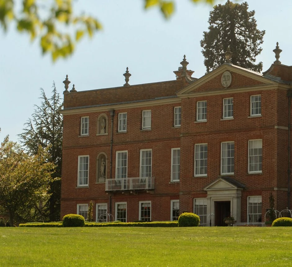
Set within a historic English country estate, Four Seasons Hotel Hampshire is shaped by the character of its surroundings: the manor, the landscape, and a distinctly English sense of retreat. Following a guest room renovation that introduced nature-inspired textures and historical detail, we were brought in to extend that thinking across the hotel’s guest-facing collateral. The opportunity was to create something unmistakably Hampshire, carrying the history and character of the estate into the smaller moments of the guest experience.
The Challenge
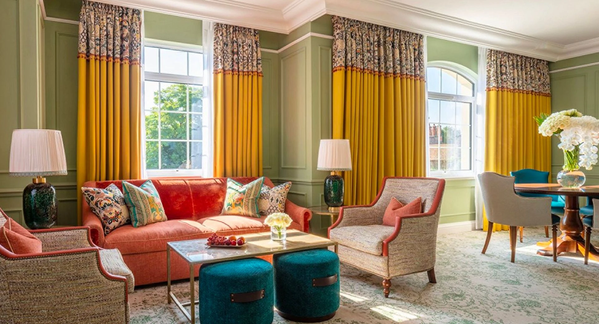
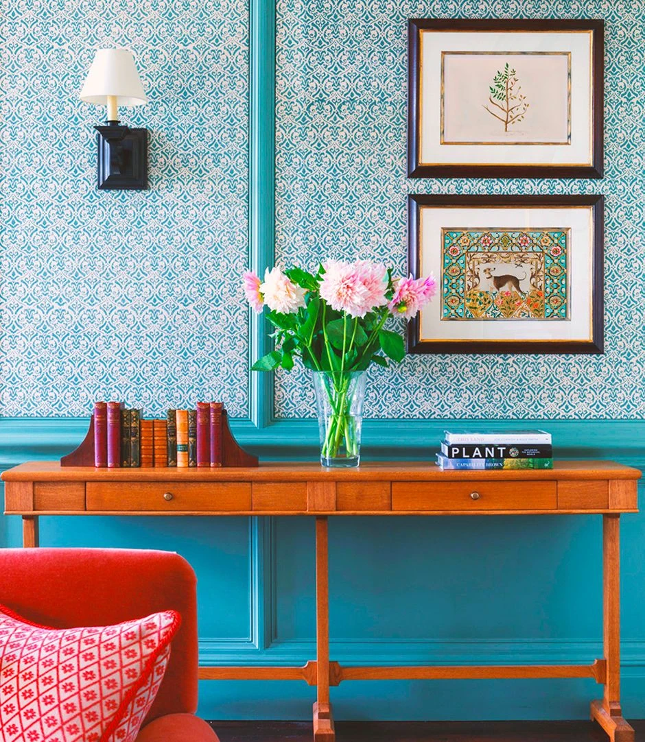
The newly renovated interiors established a rich visual language of botanical references, tonal pattern, and historical influence. The collateral needed to feel at home within that environment without simply reproducing it. Ornament and detail offered plenty to work with, but also required careful judgement. Too little and the connection to the property would be lost; too much and functional pieces could quickly become overwhelmed. Knowing what to draw from the estate, and how much of it to use, became central to the design.
Our Approach
We began with research into the history of the manor, its natural surroundings, English decorative arts, and the interiors created by RPW Design. These references gave us the ingredients for a visual language that could feel historical without being nostalgic, and decorative without becoming overly traditional.
Drawing from the Estate
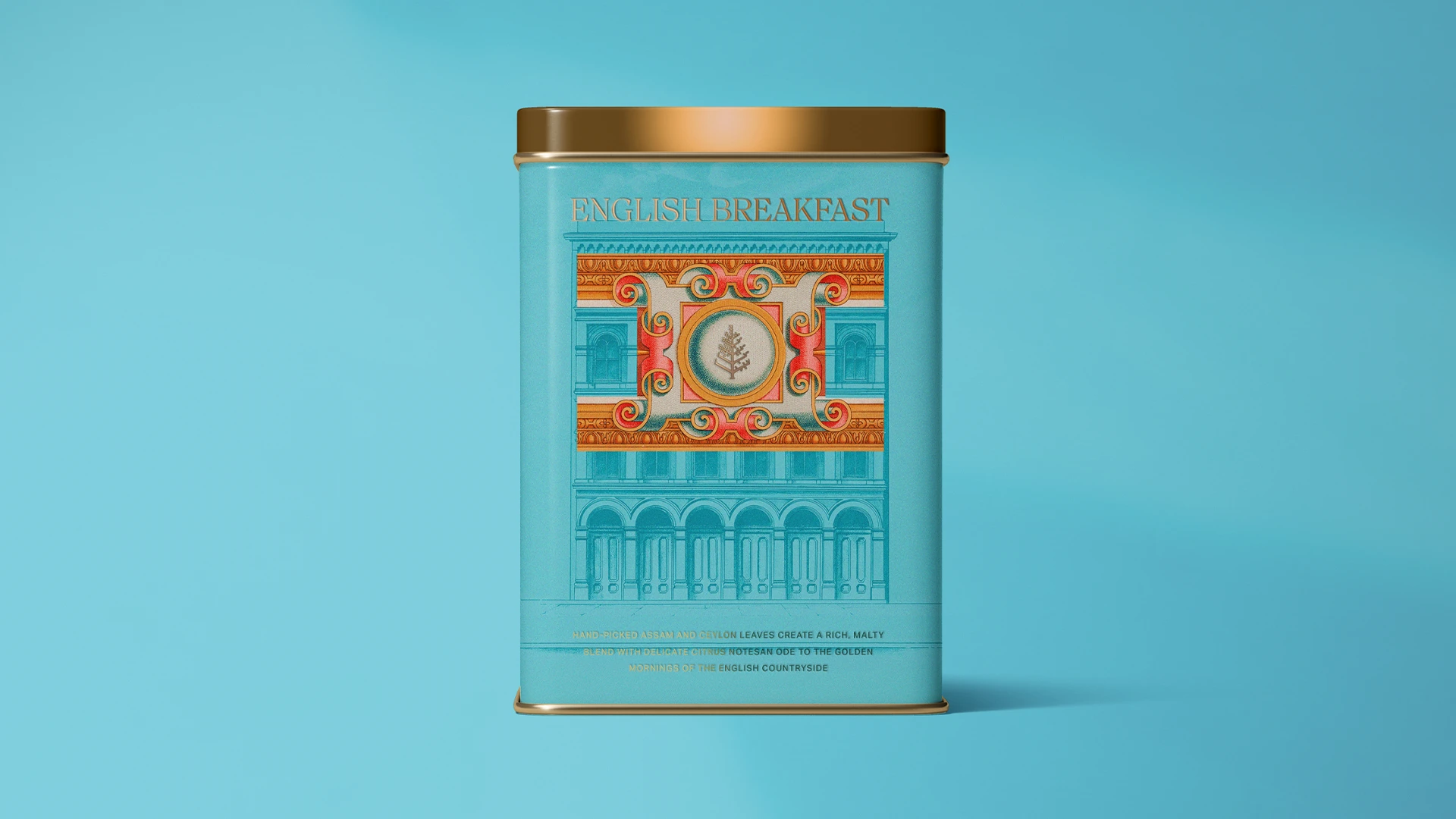
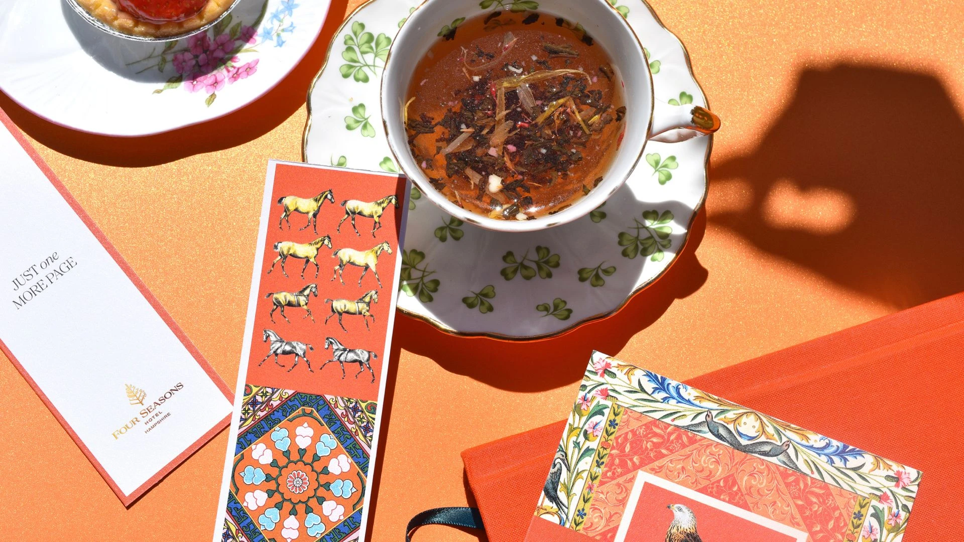
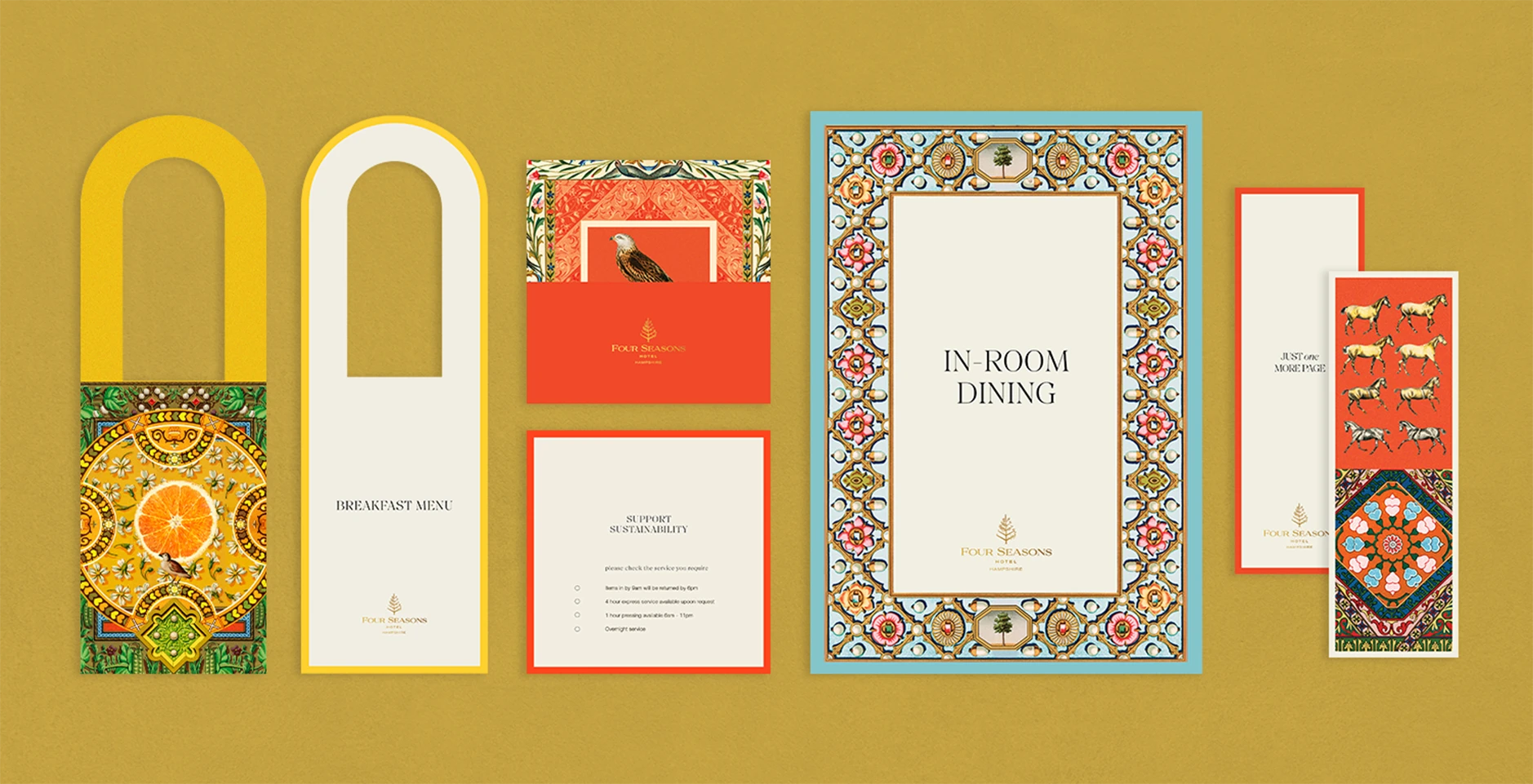
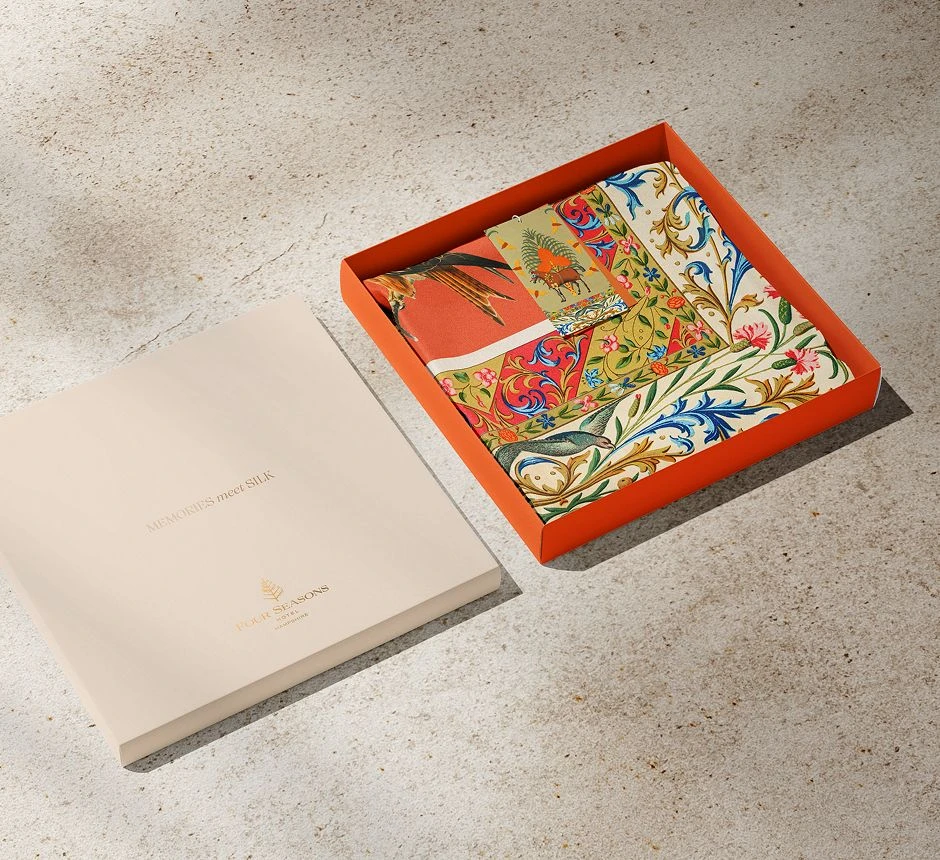
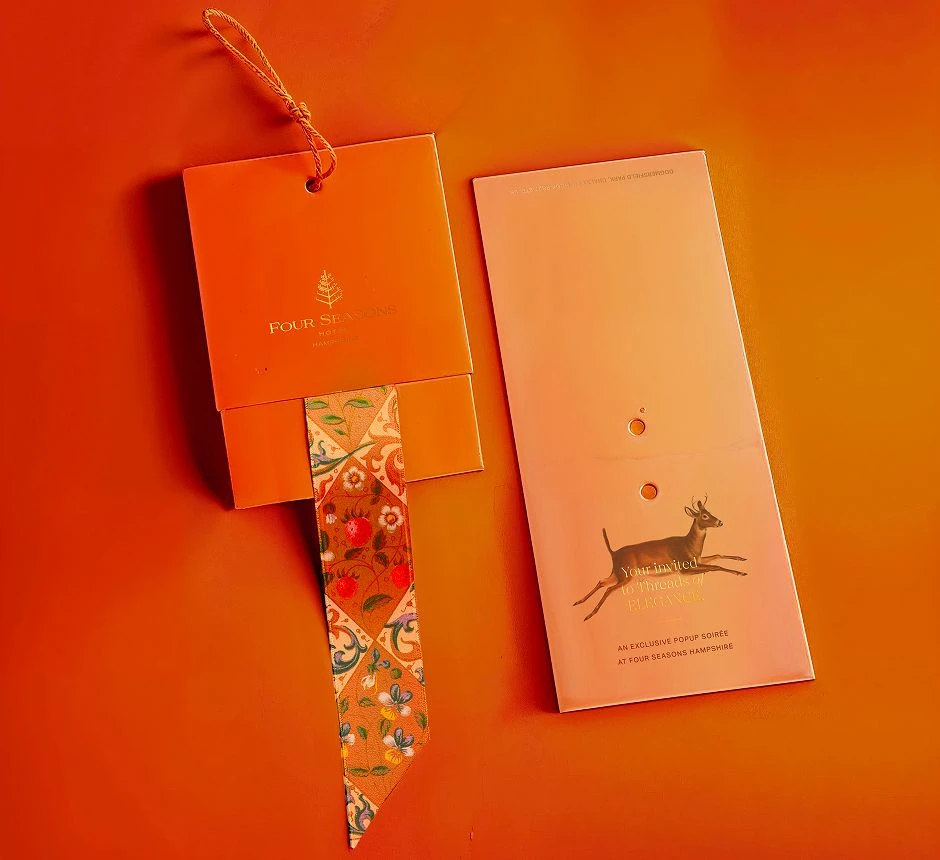
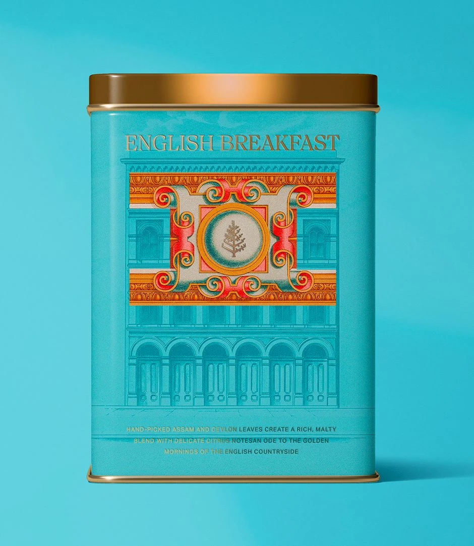
Illustration became central to the expression. Woodland creatures drawn from the estate's habitat brought its natural surroundings into the collateral, while bespoke borders inspired by Tudor textiles and period motifs introduced pattern and ornament.
Rich in detail and almost tapestry-like in places, the illustrations were paired with contemporary typography to create a more current interpretation of these references. The result brought together influences from different periods and sources without recreating any one of them literally.
A Curated Maximalism
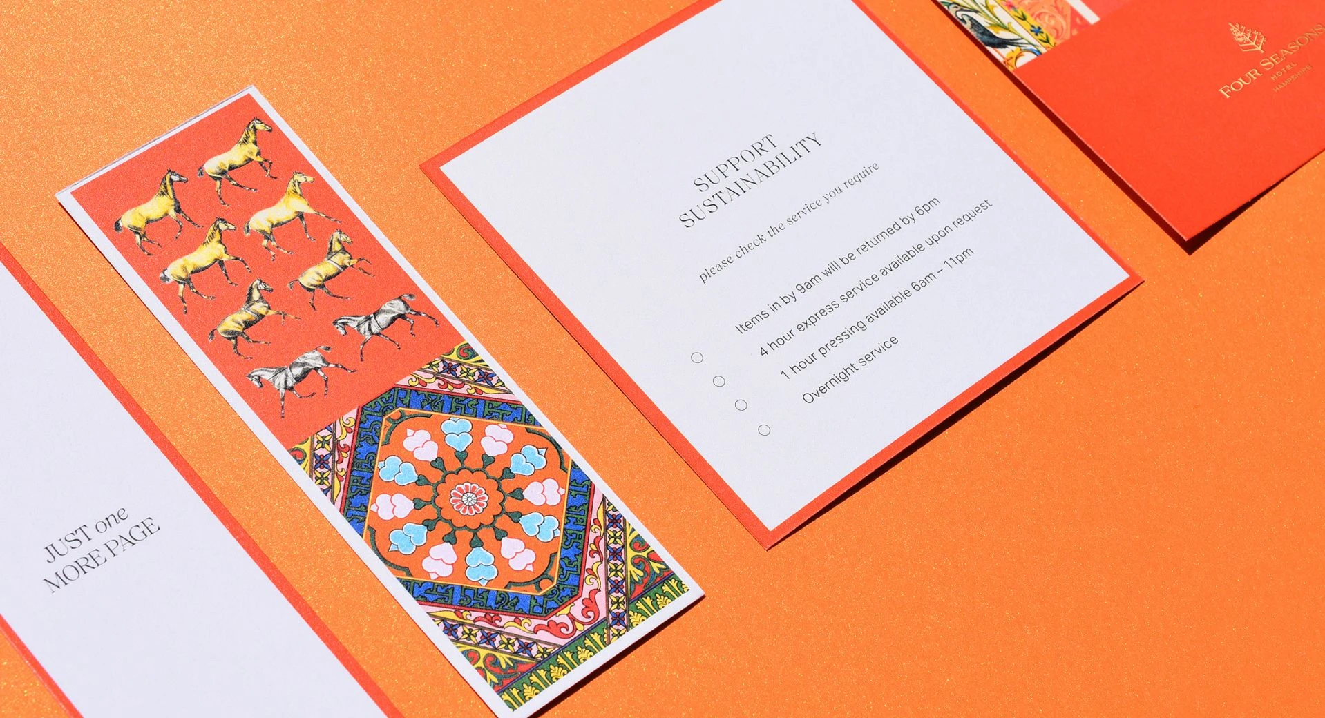
Working with such a rich visual language required a considered approach to composition. Illustration, pattern, borders, and typography could be layered generously, but each application called for a different level of expression. Some pieces could carry the full richness of the system, while others needed only a small detail or flourish.
The aim was to make maximalism deliberate about where it appeared and how the elements came together. The richness comes from curation: knowing when to layer, when to simplify, and how to give every detail its place.
Outcome
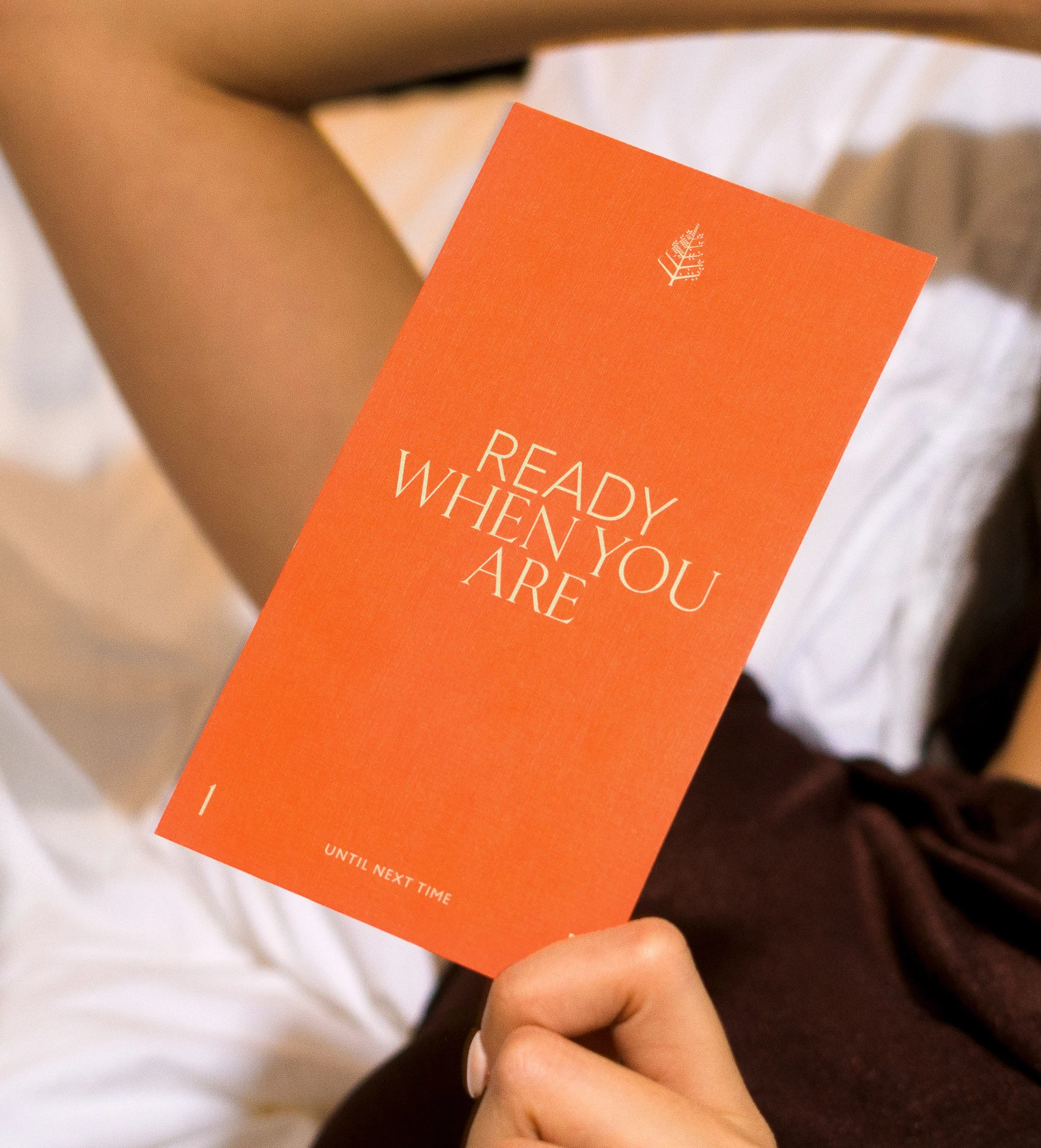
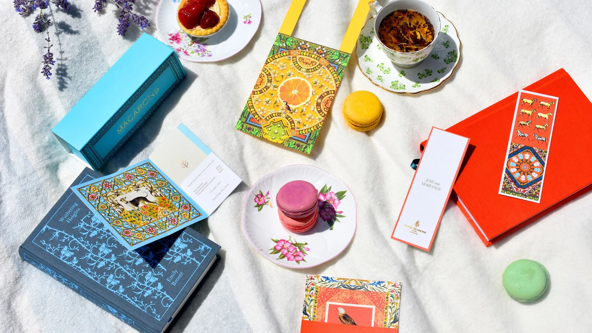
The collateral extends the character of Four Seasons Hampshire beyond its interiors and into the everyday details of a stay. Illustration, typography, material, and print production come together in an expression shaped specifically for the estate—rich in English art, nature, and craftsmanship, yet considered for a contemporary Four Seasons experience. The work gives the history of Hampshire a new expression, allowing the story of the estate to continue through the details guests encounter throughout their stay.