






























Choosing Wisely Canada
A national healthcare advocacy organization in Canada advancing evidence-based care, shaped through strategic branding.
Project Overview
Choosing Wisely Canada is an organisation within Unity Health focused on reducing unnecessary tests, treatments, and procedures in healthcare. With a comprehensive brand strategy already in place, we were approached to give that thinking a visual expression: one that could capture its values, voice, and purpose while establishing a distinctive presence of its own.
Taking cues from the organisation’s philosophy of reducing overuse, we created a visual language rooted in clarity. The brand needed to stand apart within the medical landscape without feeling disconnected from it, while providing a flexible foundation for the many campaigns and reports Choosing Wisely Canada brings to life.
The Challenge
Choosing Wisely Canada needed to communicate with dual intent: as both an educator and a challenger. On one hand, the brand needed to feel credible, informed, and grounded in clinical expertise and evidence. On the other, it needed to encourage reflection, inviting physicians and healthcare professionals to reconsider established habits and act with intention rather than convention. The challenge was to create an identity capable of holding both positions: authoritative enough to earn trust, yet bold enough to prompt a second look.
Our Approach
With the strategy as our foundation, our approach centred on distillation. We looked for ways to communicate more with less, translating the idea of reducing overuse into a visual system where every element had a reason to be there.
A Visual Language of Reduction
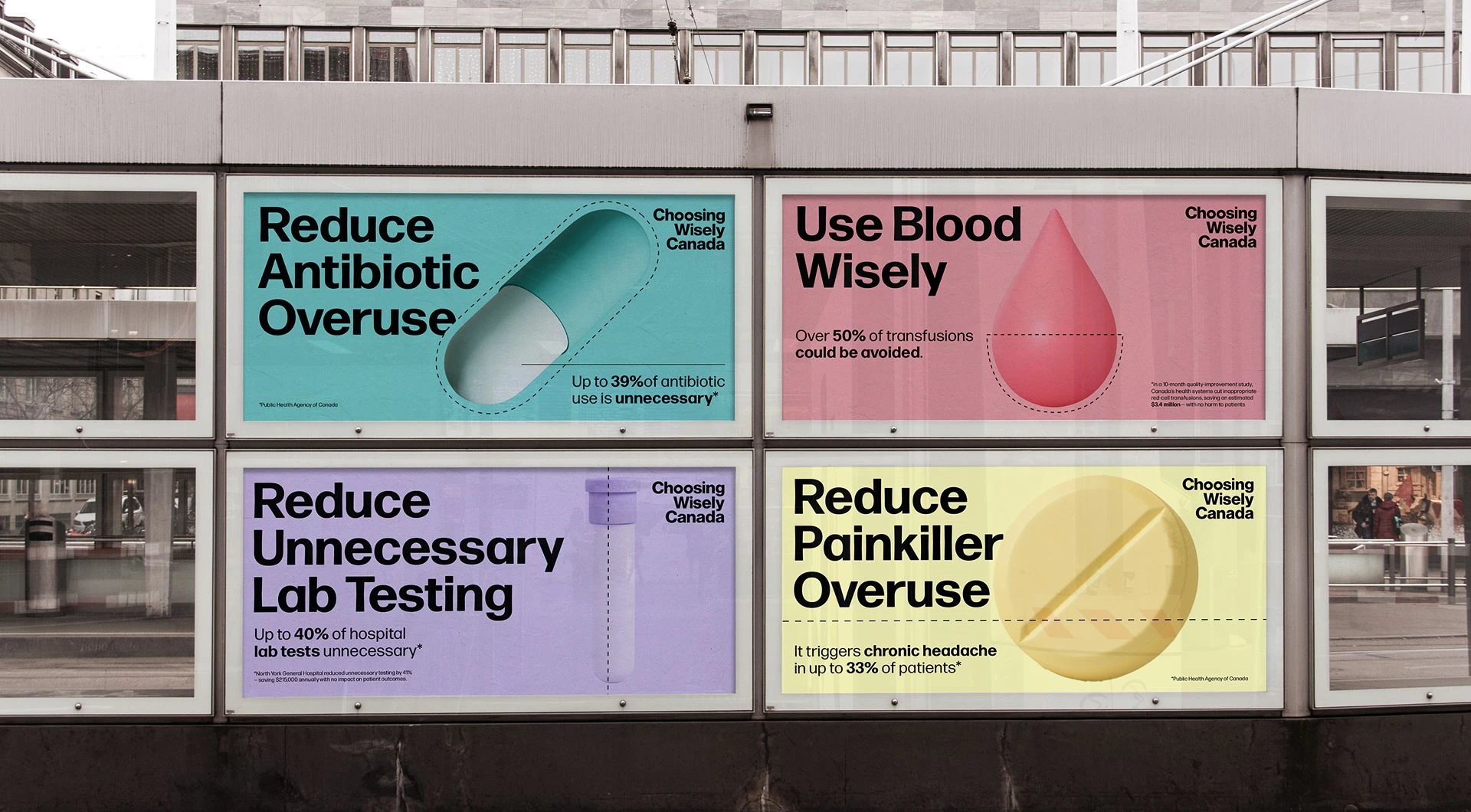
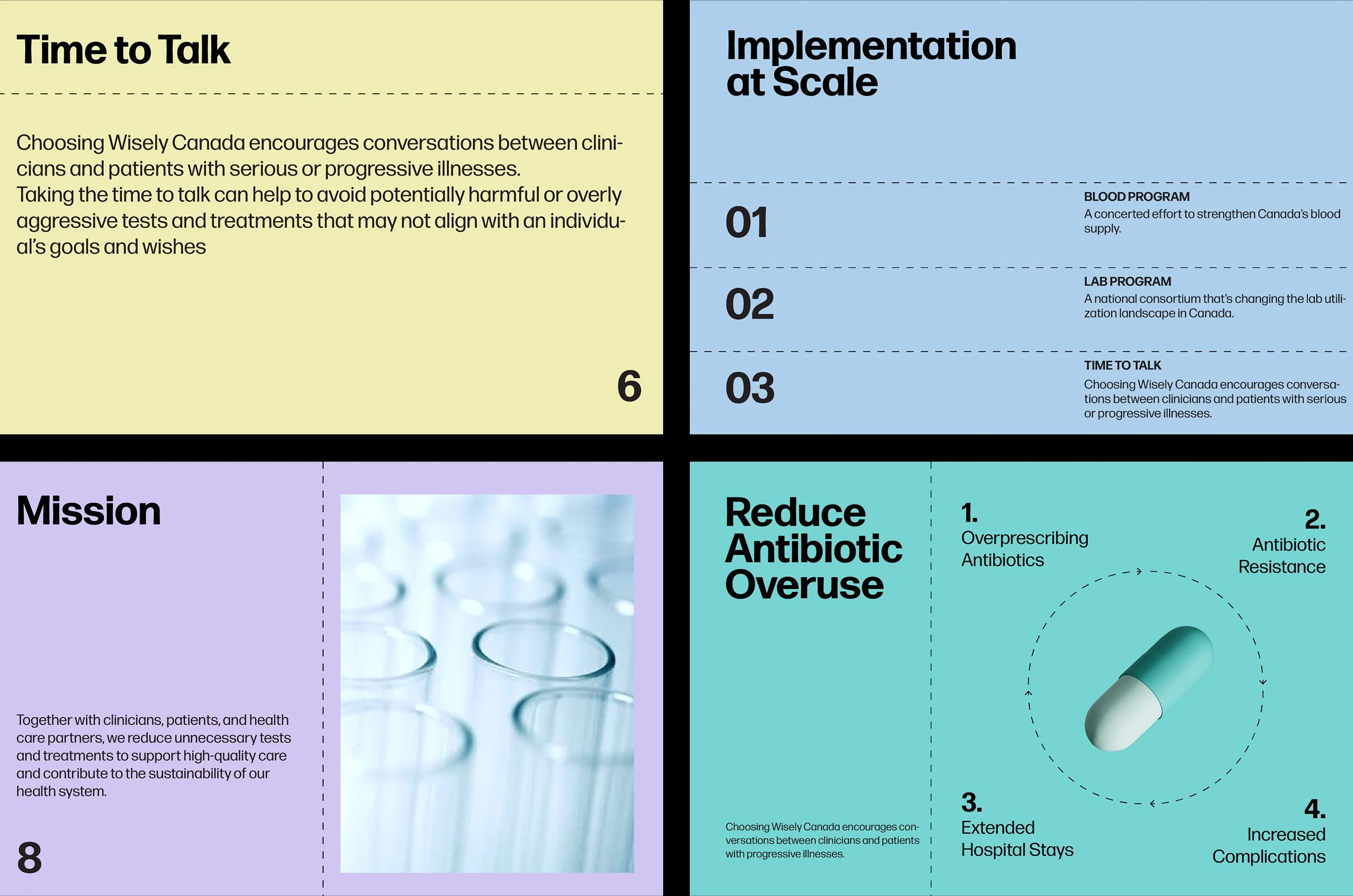
A simple cut line became a recurring motif within the brand, embodying the idea at the heart of Choosing Wisely Canada. It suggests subtraction, interruption, and the deliberate decision to hold back when less is the better choice. Simple in form but distinctive in application, the cut line gave the identity a recognisable graphic device that could extend across the brand. Paired with a flexible grid, modern typography, and a refined colour palette, it created a system that could be both restrained and bold.
Making Complex Information Clear
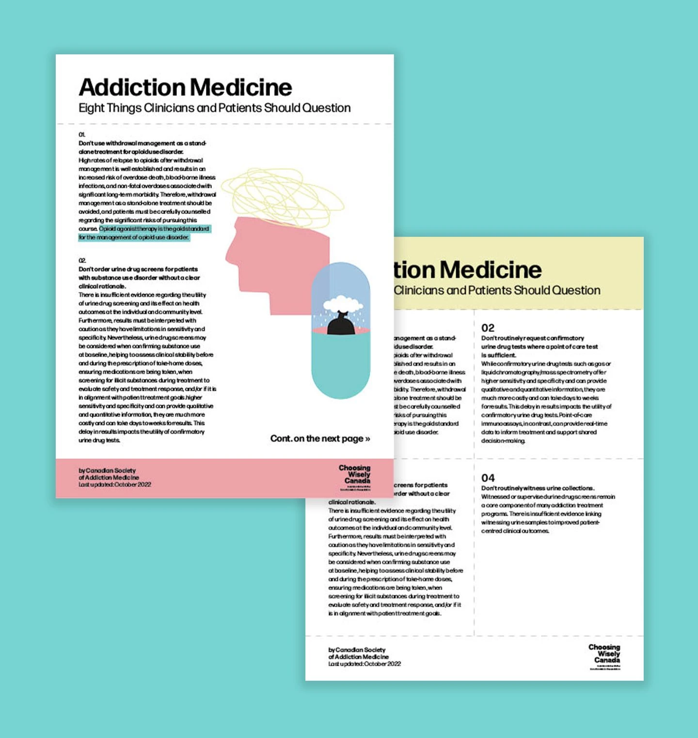
A library of medical iconography—including pills, beakers, diagnostic tools, and other familiar forms—created an accessible visual language rooted in healthcare without relying on a traditionally clinical aesthetic. Designed to work alongside information-rich content, the iconography helped bring structure and immediacy to complex subject matter, making communications easier to navigate while giving the brand a more approachable point of view.
Outcome
The resulting system gave Choosing Wisely Canada a cohesive framework that could stretch from editorial reports and educational resources to campaigns and digital communications. Individual initiatives could take on their own tone while remaining recognisably part of the broader brand. Clear guidelines gave the internal team the tools to apply and evolve the identity with confidence, creating a system built not only for launch, but to grow with the organisation over time.