


Surface Dermatology Clinic
A modern dermatology practice shaped by brand and spatial design, balancing clinical expertise with human warmth.
Artifacts
the Cultural fragments, references, and research that shape the soul of OUR world for this project.
What if dermatology celebrated the surface not as a flaw to fix, but as a story to understand?
Dermatology carries a responsibility to care for the body. To tend to appearance without vanity. To serve science with humanity. To educate without overwhelming. To welcome without condition. Here, the work is not only in what is seen—but in what is felt.
Archetypes
Enduring personas that guide a brand’s spirit and presence.

enchanting, insightful, visionary, inspiring
to reveal hidden possibilities and create transformative experiences

affectionate, warm, rich, indulgent, spellbinding
to entice desire, to appeal to all of the senses
The brand sits between the sage and the lover—knowledge and warmth in equal parts. This mirrored the brand strategy precisely: evidence and empathy.
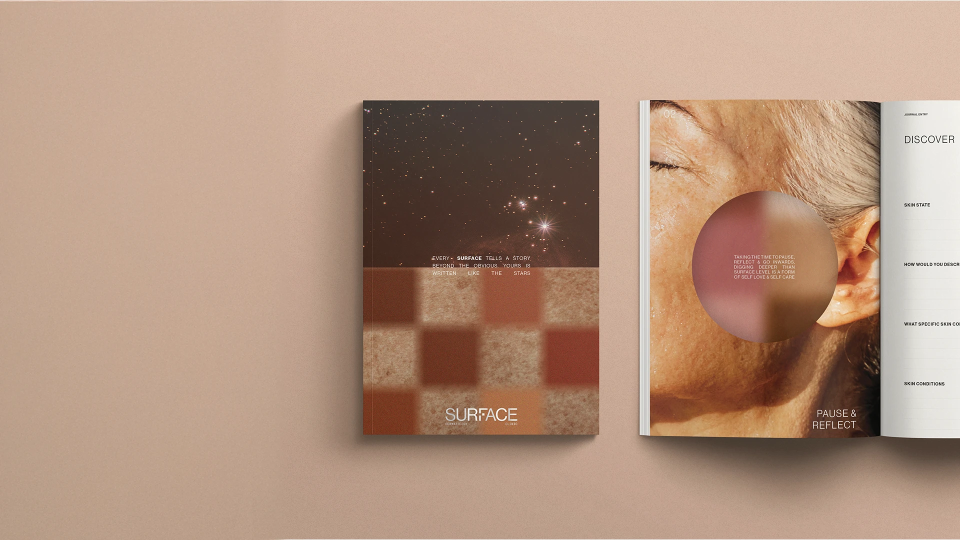
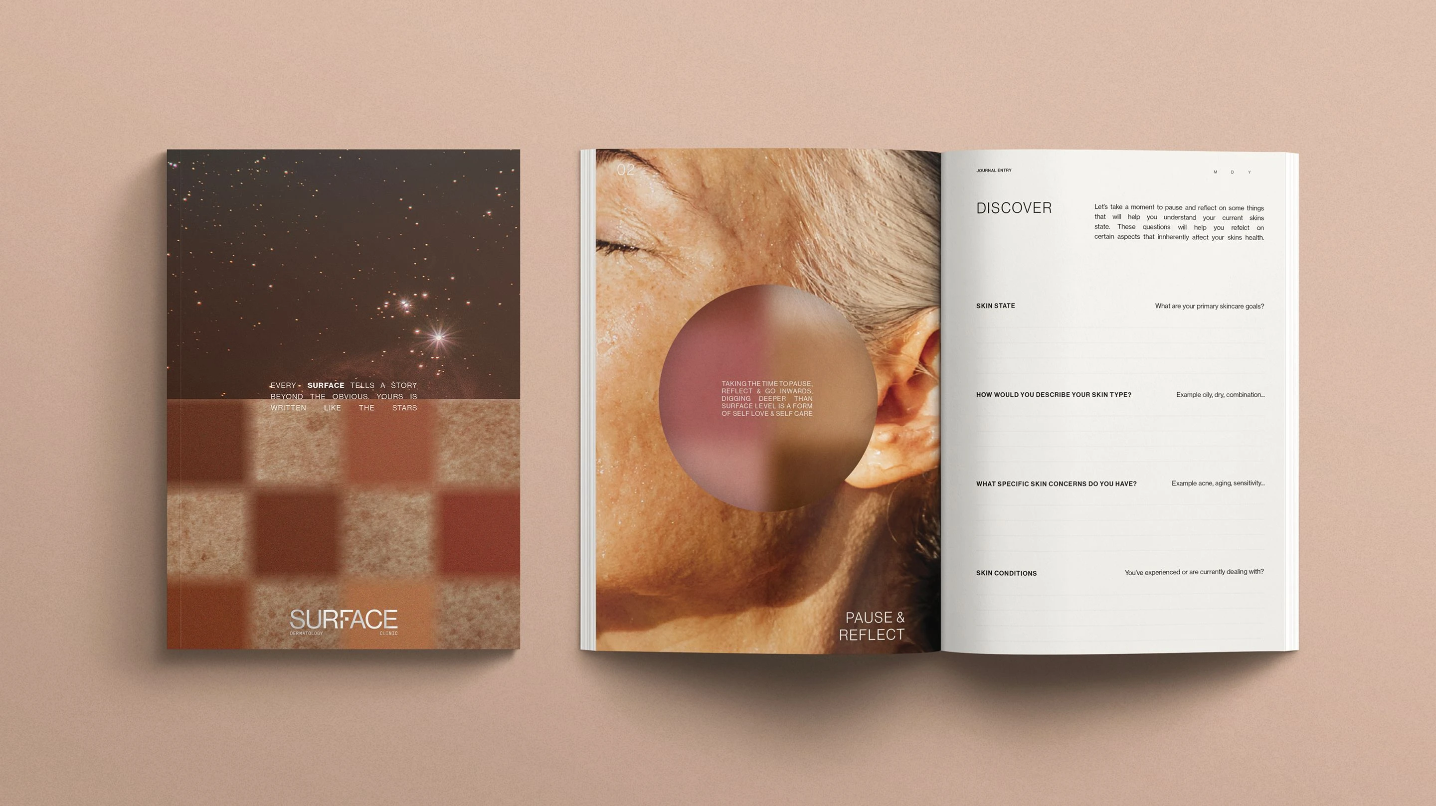
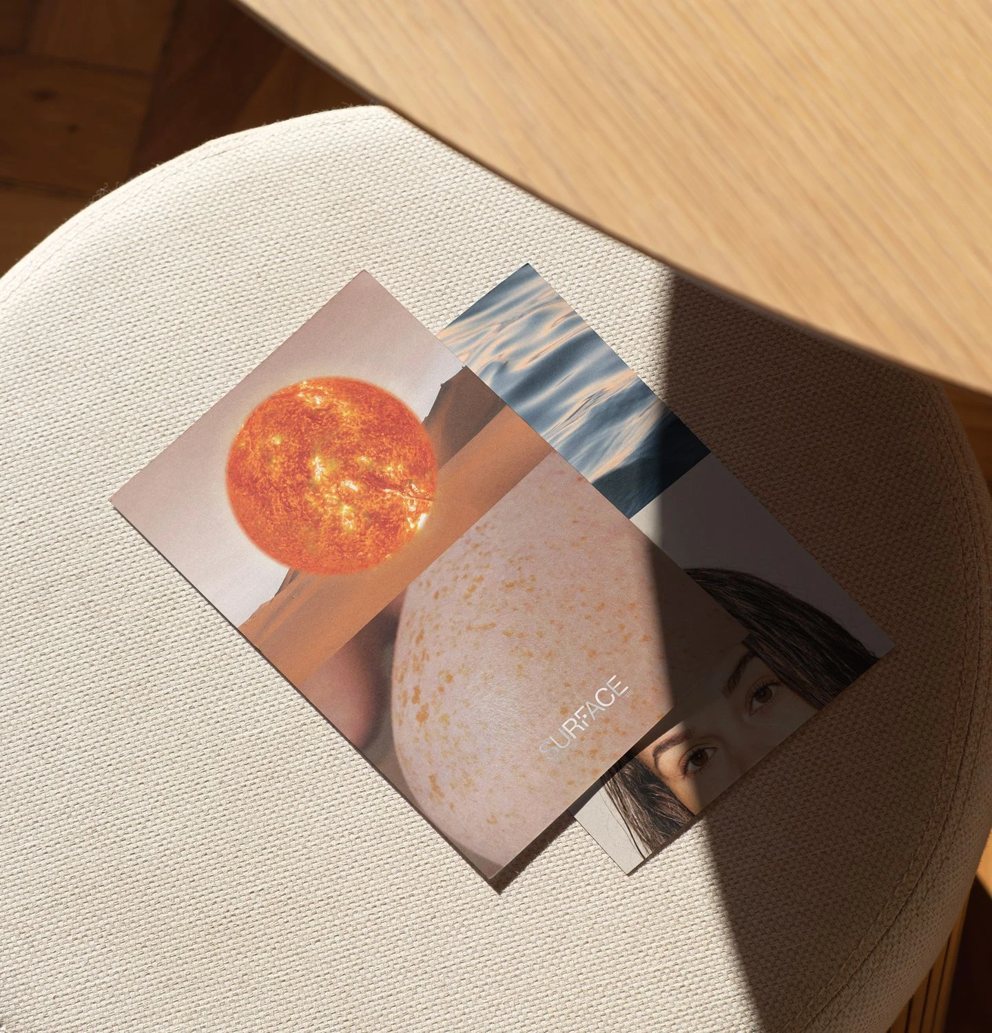
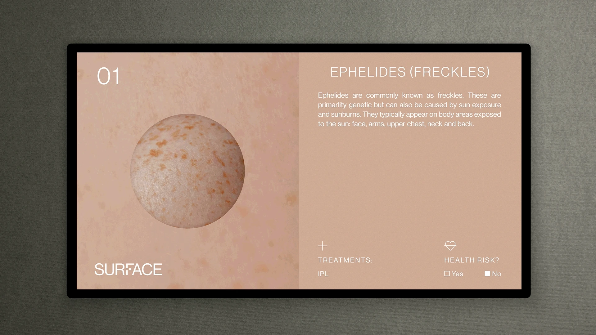
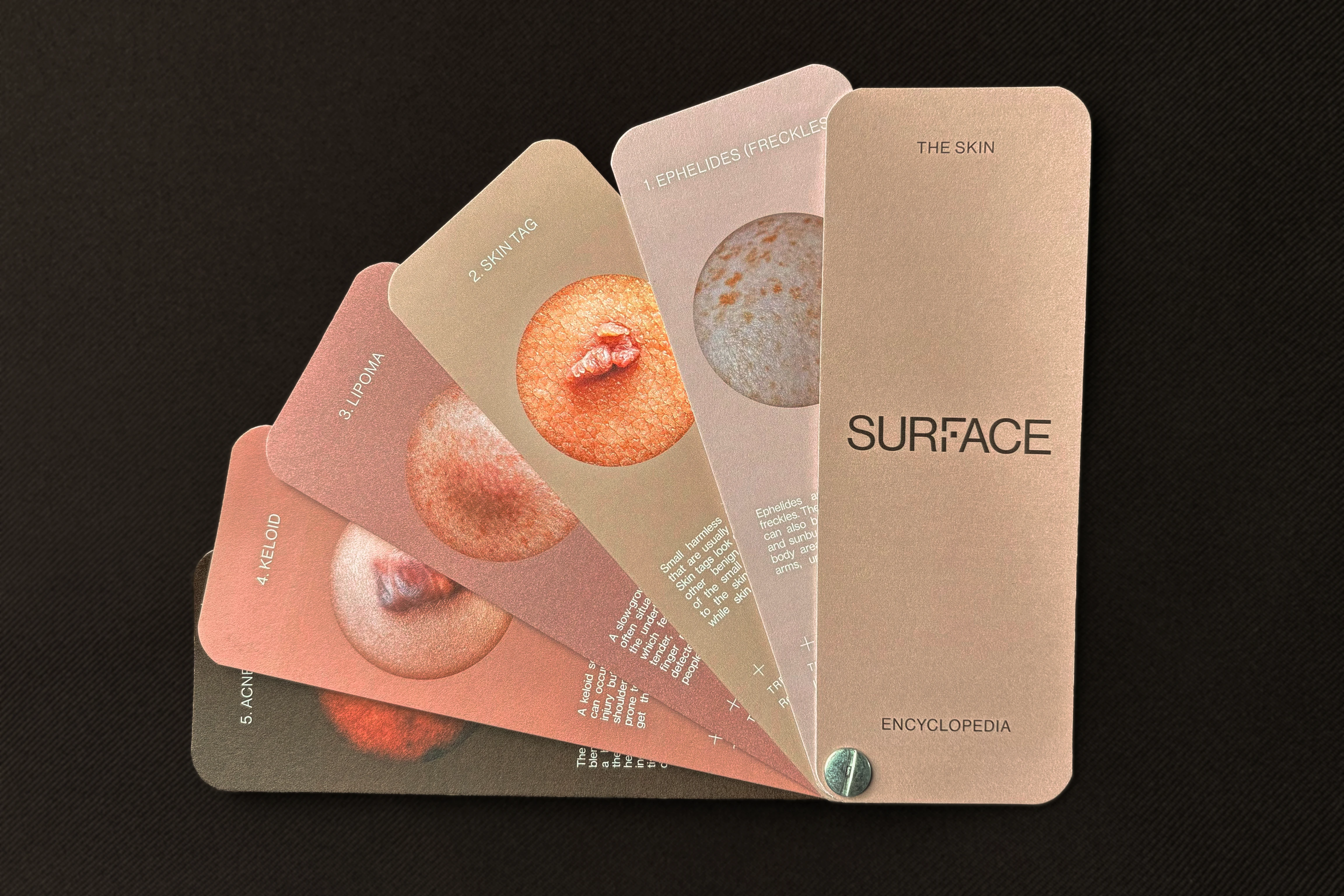
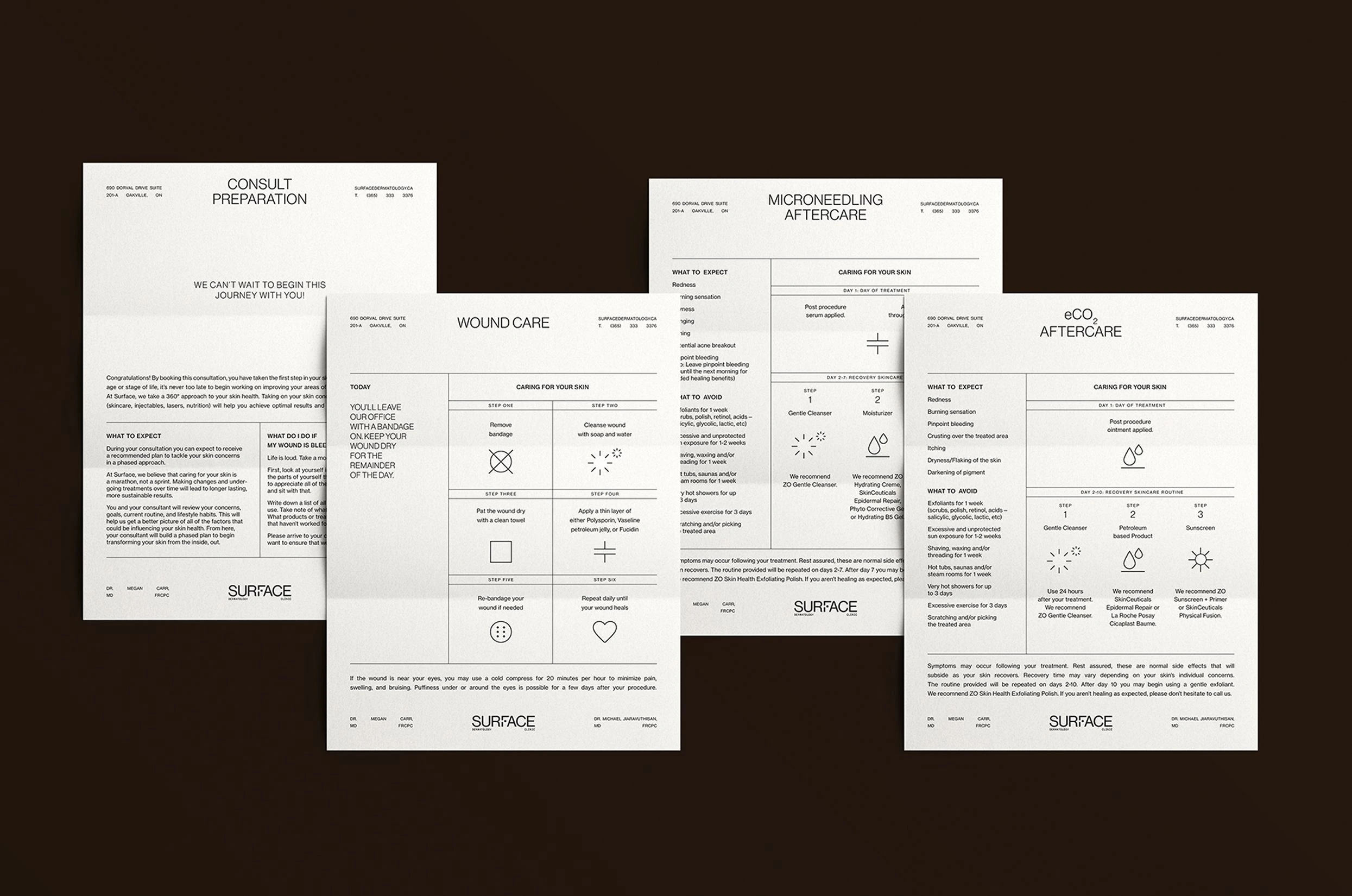
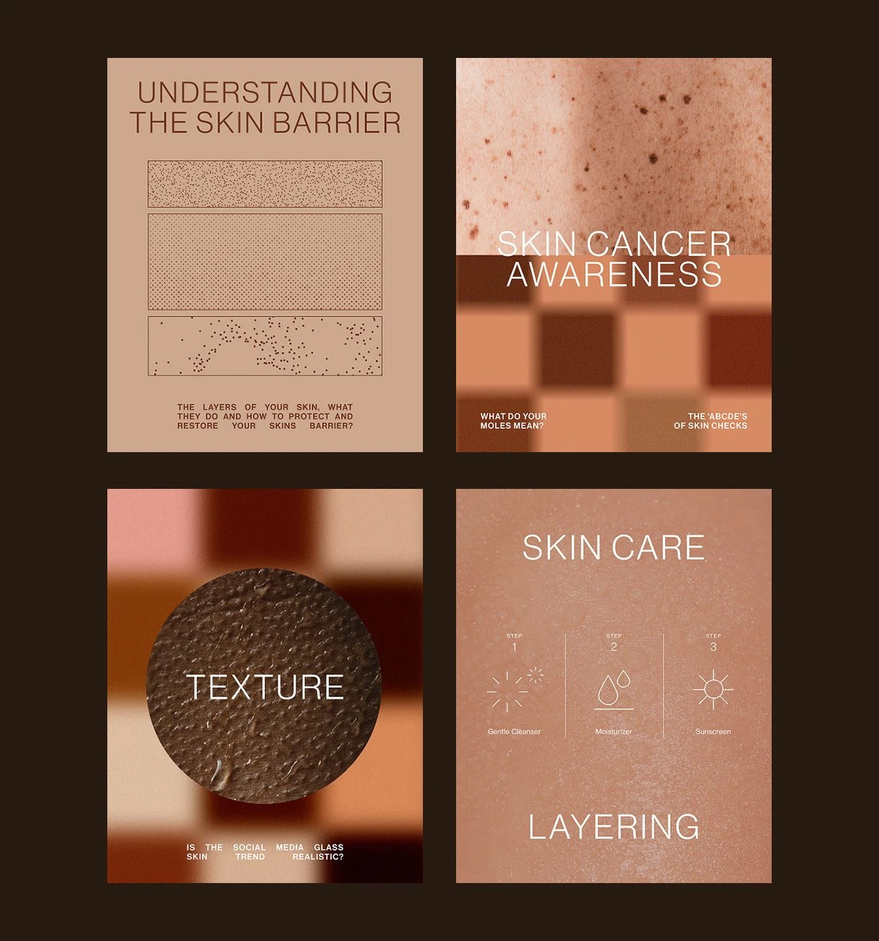
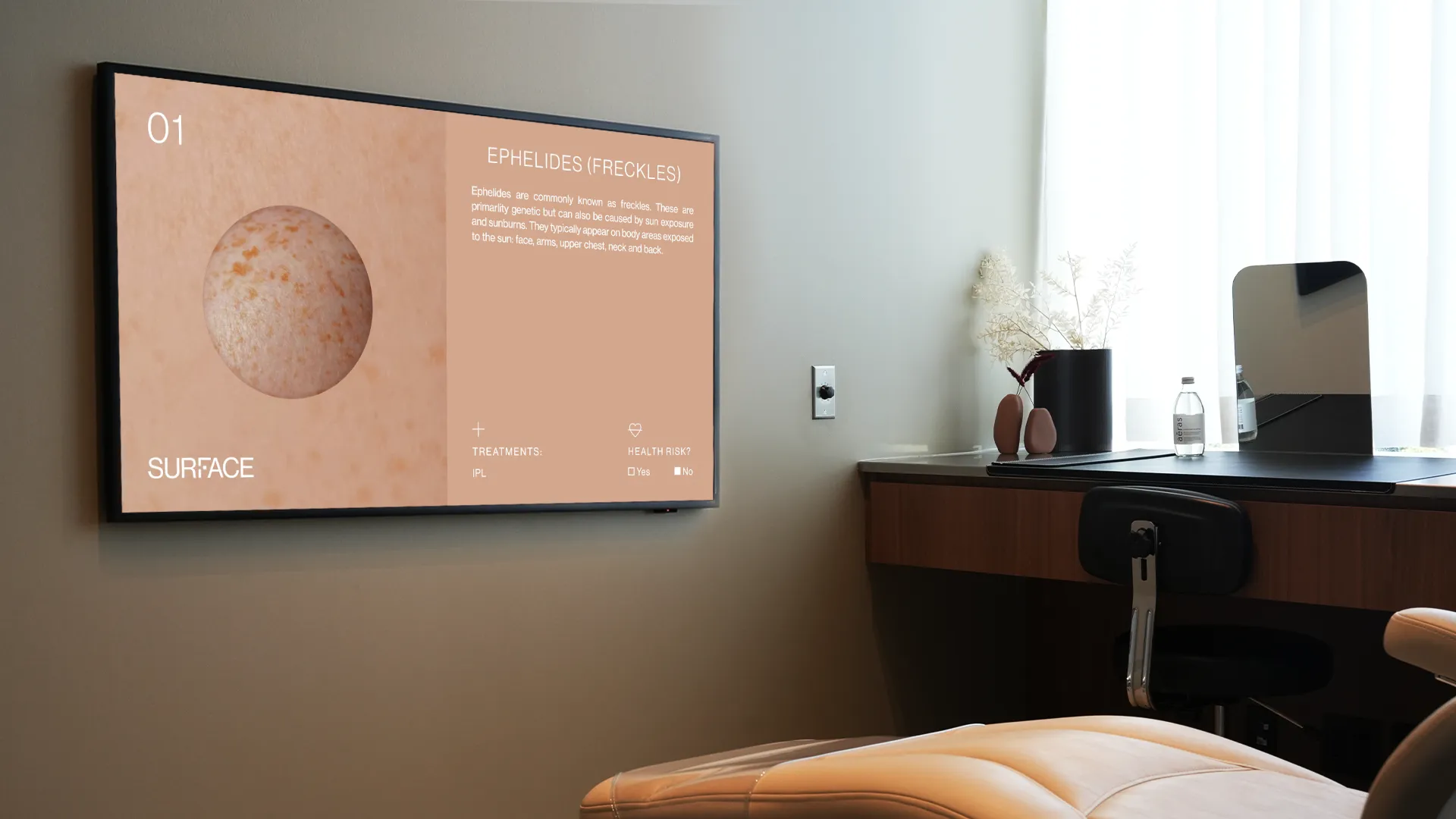
Colour came first. The skin tone palette, warm and expansive, became the foundation. It allowed the brand to speak to inclusivity. Next came information design. Typography was chosen for legibility without sterility, paired with a modern icon system to bring clarity to complex information.
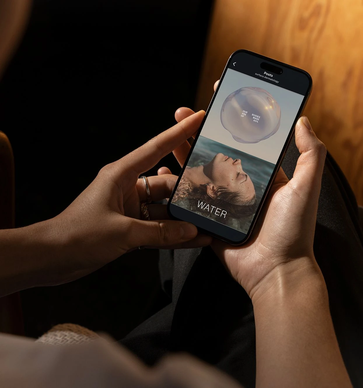
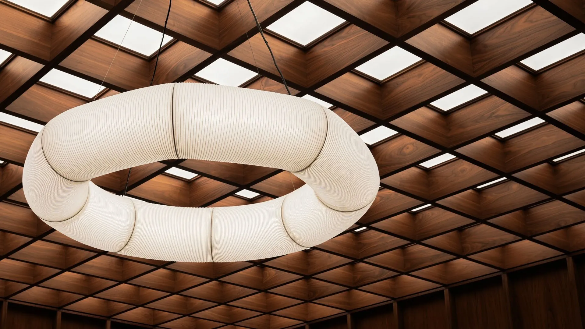
Photography and visuals followed. Texture became the throughline. Instead of relying solely on images of skin, the team looked to nature—mirroring the richness and variation found in the world around us. This interplay of human and natural textures created a visual system both grounded and alive.
A visual system that felt almost self-evident. Born from strategy, it carried a calm confidence and made immediate sense. The brand wasn’t just cohesive, it was obvious in the best way. So considered, it could only belong to this clinic and its interiors already shaped with care.
Project Overview
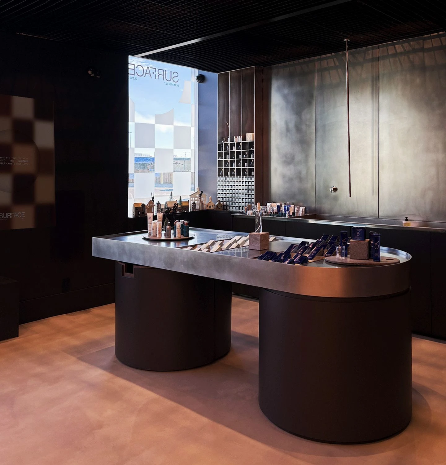
In a saturated field, differentiation often begins with surface-level shifts. Here, the aim was deeper: to build a brand that could reflect a way of practicing medicine grounded in knowledge and care. Inspired by the interiors, the doctors' appreciation for thoughtful design was extended into every patient experience, from entry to aftercare.
The husband-and-wife dermatology team behind the practice, Dr. Jiaravuthisan and Dr. Carr, approached the Agency of Love and Logic when they sought something more considered—a space designed not just to serve, but to reflect their values. Their appreciation for intelligent design extended beyond architecture. They sought a creative partner who could shape the brand with the same precision and purpose. What emerged was a shared commitment to create a brand for all, where cosmetic and medical care would be offered in equal measure, and every part of the experience would echo the same sense of thoughtfulness.
The brand began with a simple question: what makes this clinic feel different? Already in operation for several years, there was no lack of success. But there was a desire to articulate what made the practice distinct. Conversations with the team revealed an approach anchored in two core principles: evidence and empathy. Knowledge was foundational, but never clinical. And care was delivered with intimacy and intention.
This clarity allowed the brand to take form with purpose. A visual system that wouldn't need over explanation and could bring science and beauty side by side.
Evidence
A commitment to knowledge, research, and precision. Every diagnosis, treatment, and recommendation rooted in science.
Empathy
A practice of listening, explaining, and guiding with care. Building trust through presence, patience, and deep respect.
Evidence and Empathy. This dual foundation shaped a brand designed to empower by offering clarity with care.
The brand strategy served as a compass. It captured the spirit of the founders, clarified the vision, and set the tone for every part of the brand identity that followed. A love for design ran through it all, not as ornament but as function.
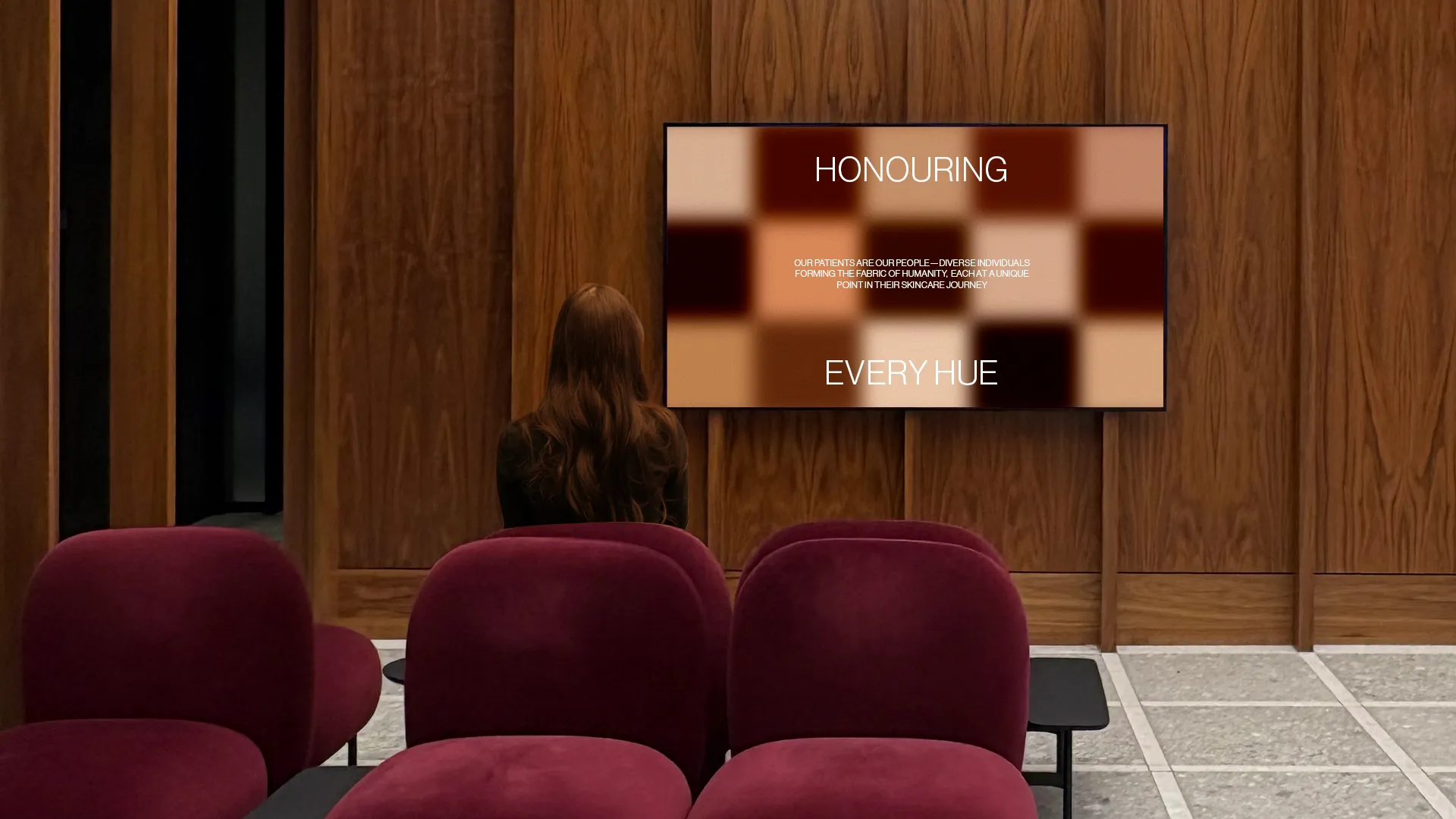
One of the early insights was the diversity inherent to dermatology. Skin, in its infinite tones and textures, became a central inspiration. The colour palette was drawn from the Pantone SkinTone Guide, creating a graphic system that was both expansive and inclusive. The visual language mirrored this ethos: macro and micro textures from nature, reflecting the intricacies of skin itself.
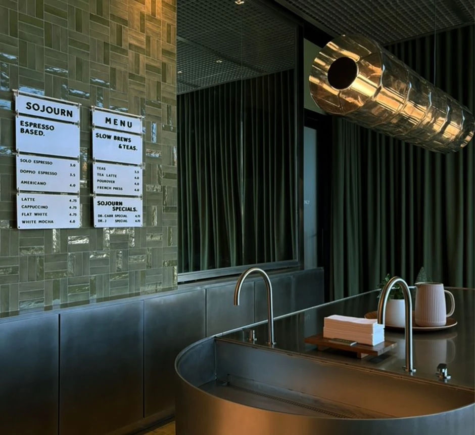
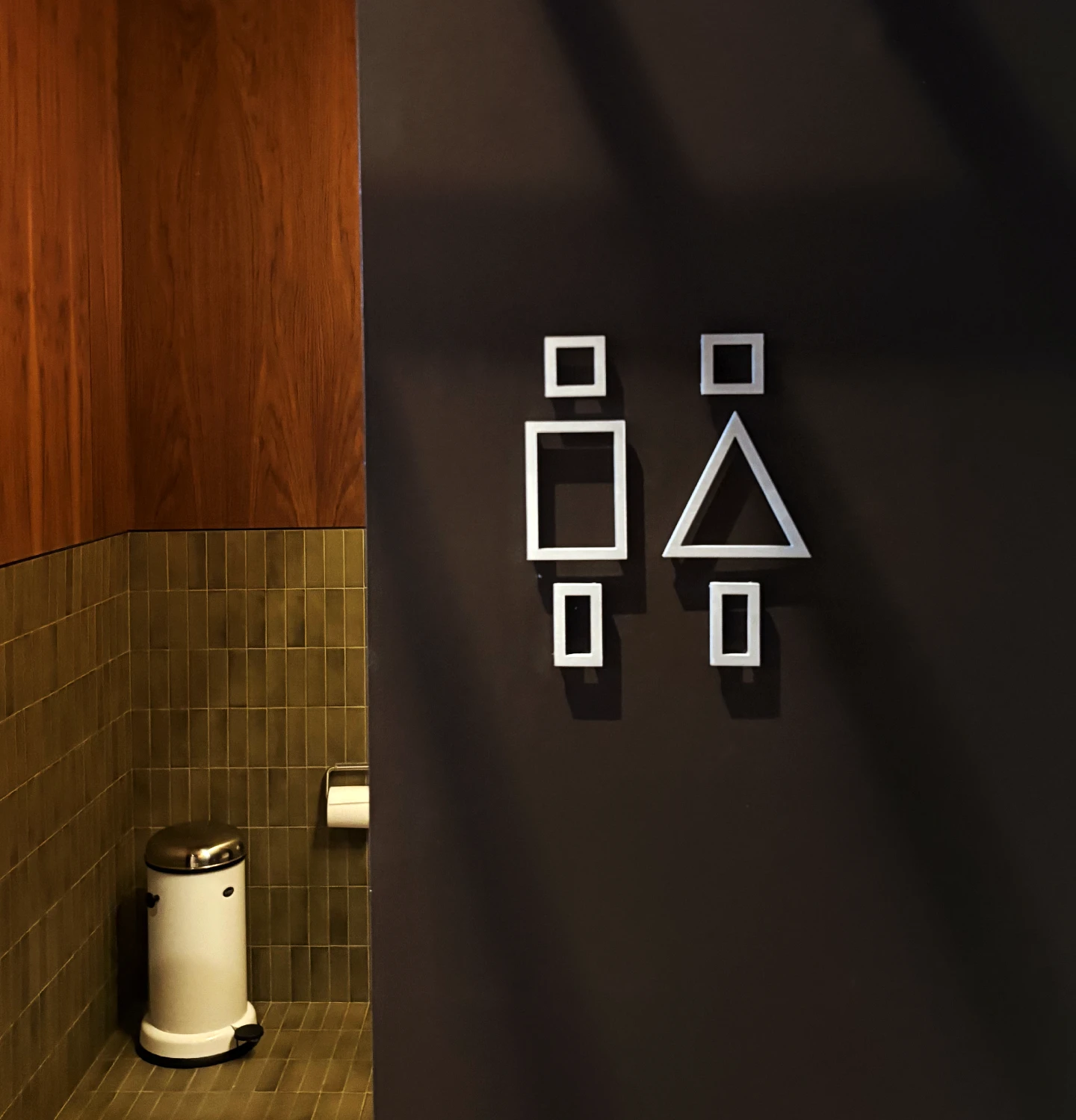
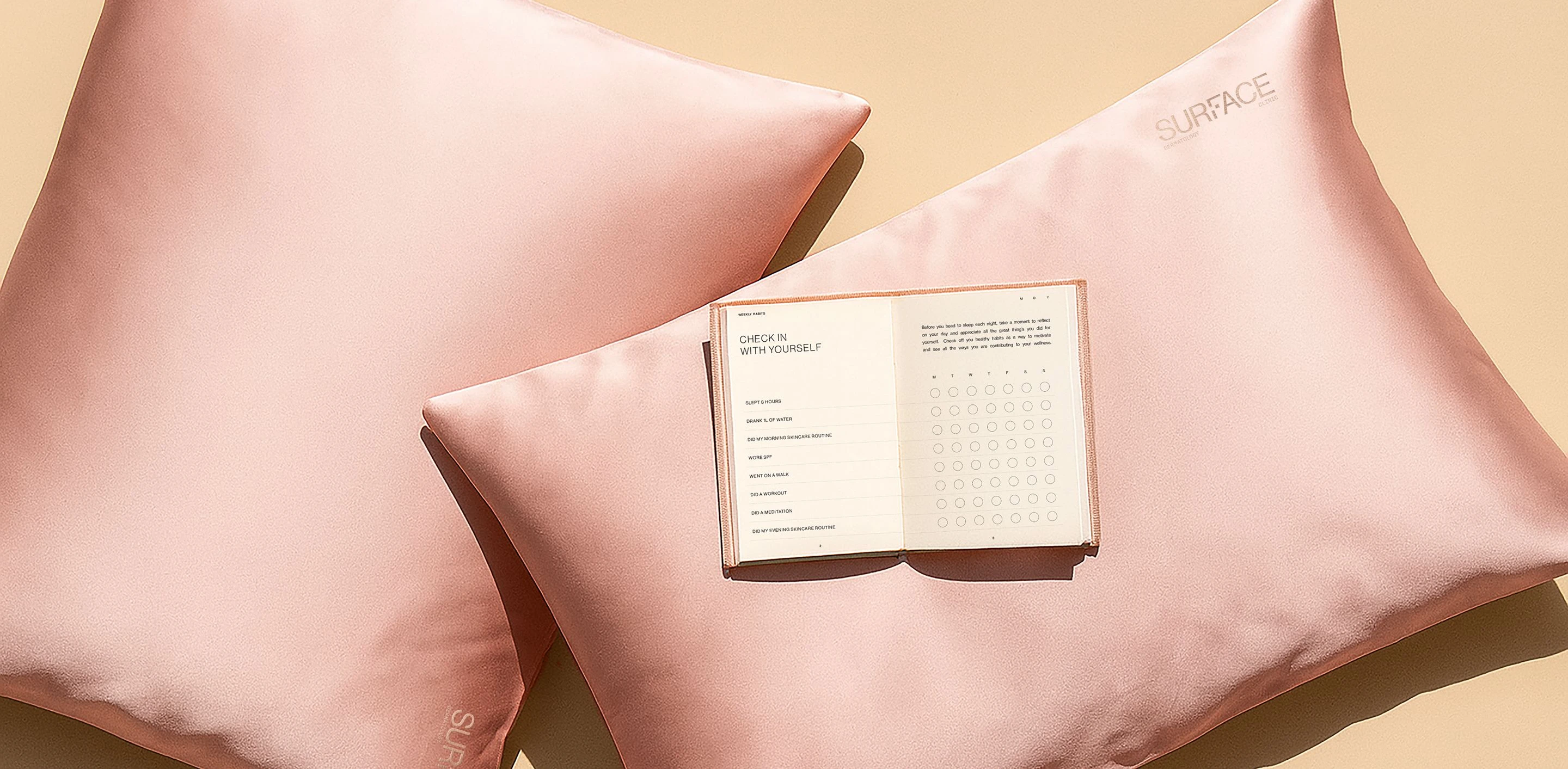
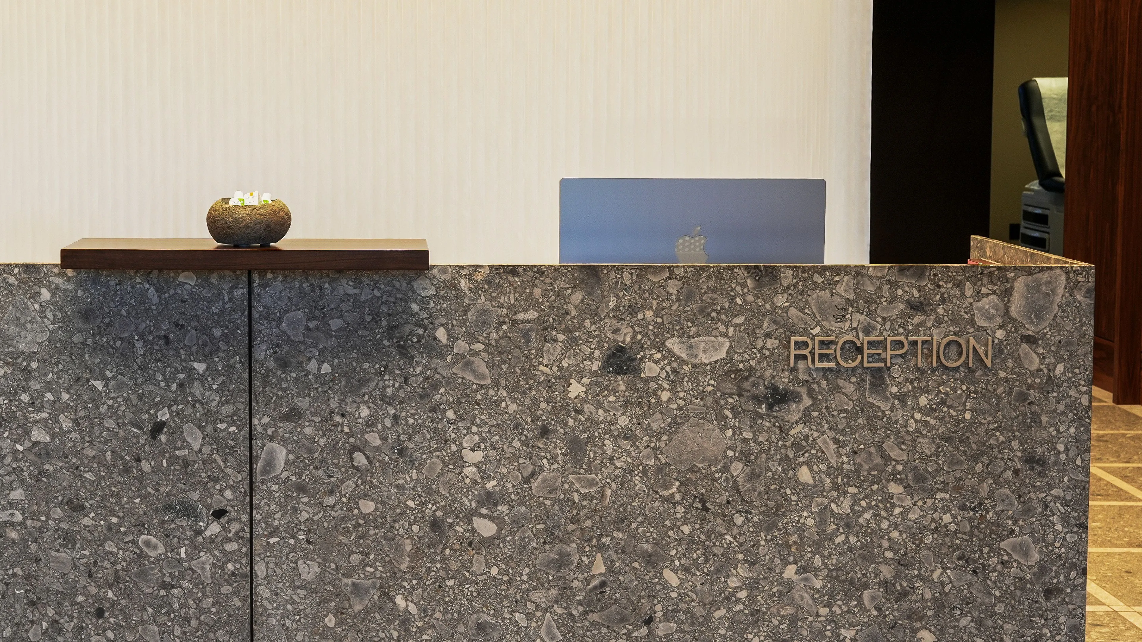
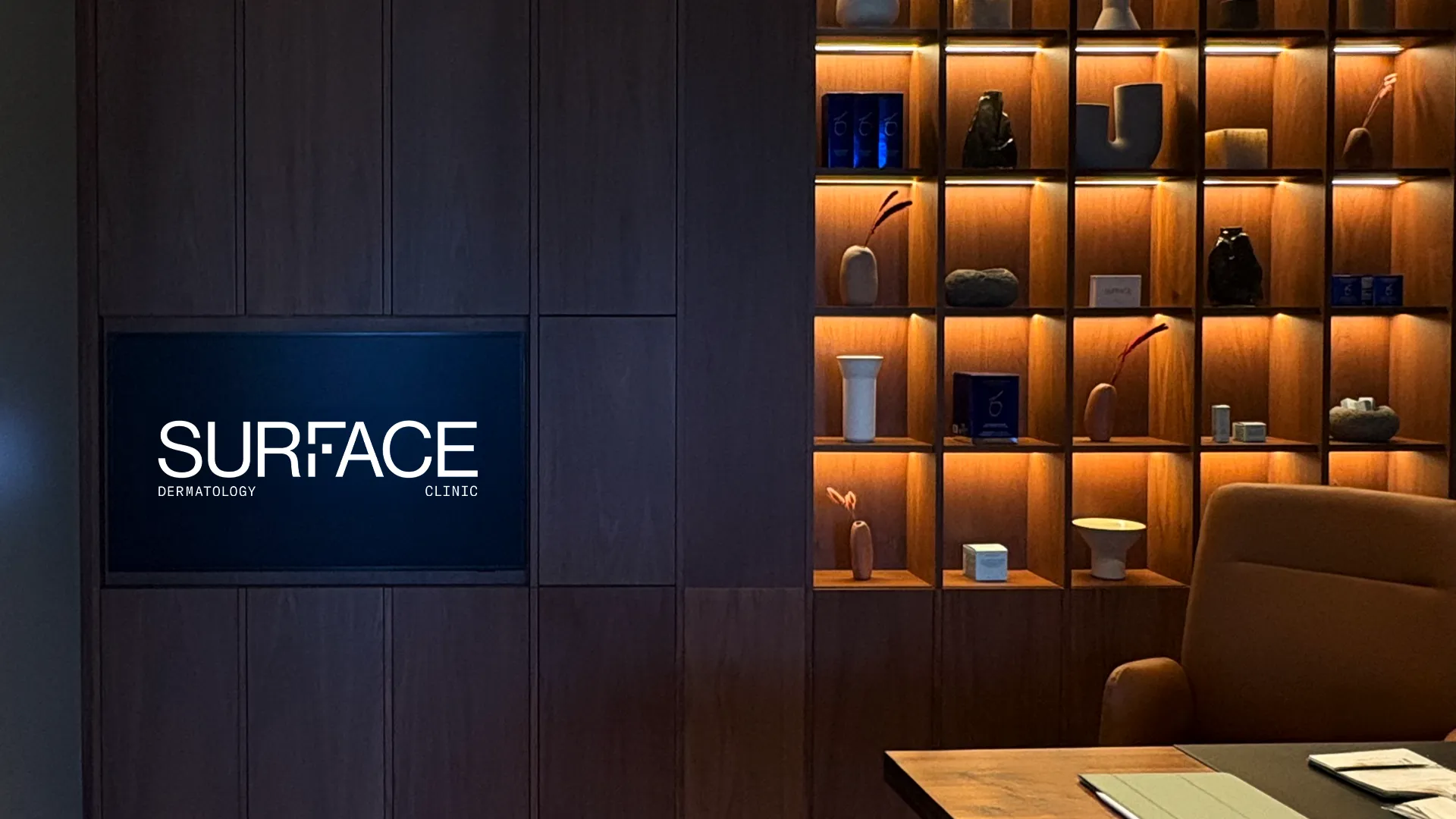
Applications spanned digital and physical. The website, built in phases, encompassed e-commerce, education, and care resources. Signage and wayfinding blended seamlessly into the interiors. Even information design was treated with care, allowing aftercare materials to serve as both instruction and design that supports, never distracts.
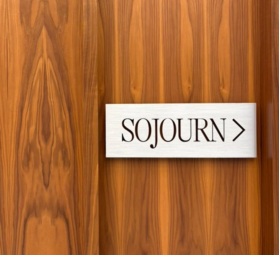
A defining element was the adjoining coffee shop—a passion project of the doctors and a thoughtful extension of the clinic experience. Named Sojourn, it offered pause and presence. Not an add-on, but a continuation.
Sojourn
TRANSLATES TO A TEMPORARY STAY, A MOMENT OF RESPITE WITHIN THE GREATER JOURNEY.