


















E11even
A high-energy restaurant by MLSE, shaped through branding that reflects rhythm, identity, and place.
Project Overview
Located steps from Scotiabank Arena in the heart of Toronto, E11even is a restaurant within the Maple Leaf Sports & Entertainment portfolio. Already well established, the restaurant had built a loyal following, but its brand lacked the clarity and distinction.
We were engaged to reimagine E11even from the ground up, bringing greater meaning to the name, sharpening its identity, and creating a brand with enough presence to hold its own within Toronto’s competitive dining scene, and within the much larger world of MLSE.
The Challenge
E11even sits in a unique position. It is part of one of Canada’s most recognisable sports and entertainment organisations, yet it needed to feel like a restaurant with identity beyond its proximity to the arena.
The opportunity was already hiding within the name. Eleven points on the maple leaf. Eleven sides on the loonie. Even the clock on Canadian currency sits at 11:00. These details created an unexpected connection between E11even, Canada, and the MLSE portfolio.
The challenge was to turn those associations into something meaningful without becoming overly literal or nostalgic. E11even needed to feel unmistakably connected to its place and culture of the city today.
Our Approach
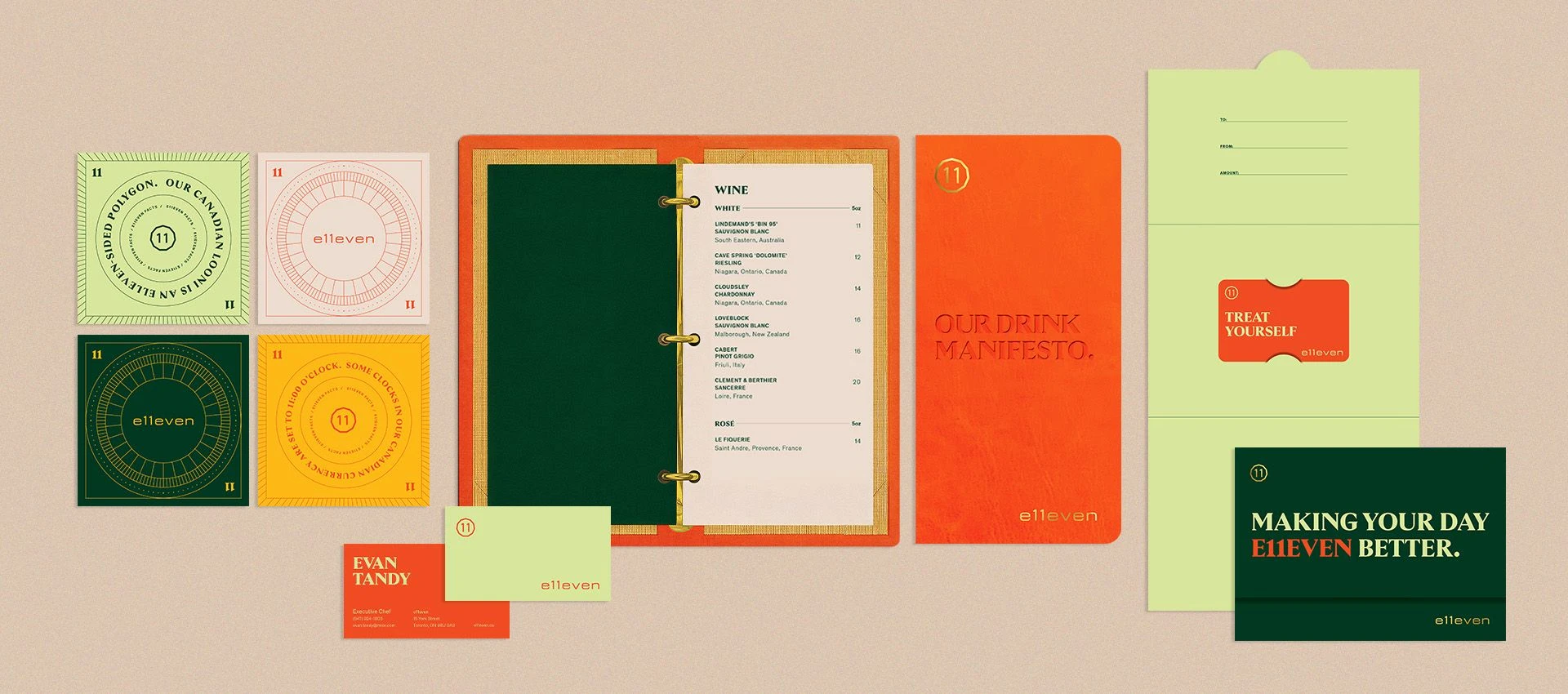
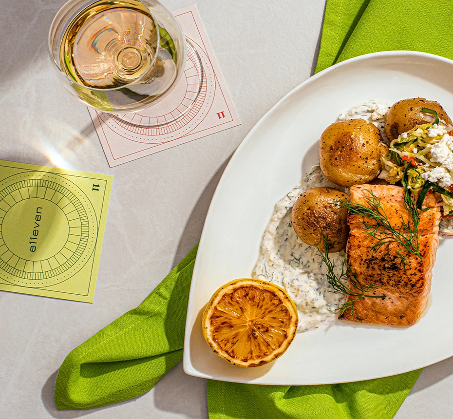
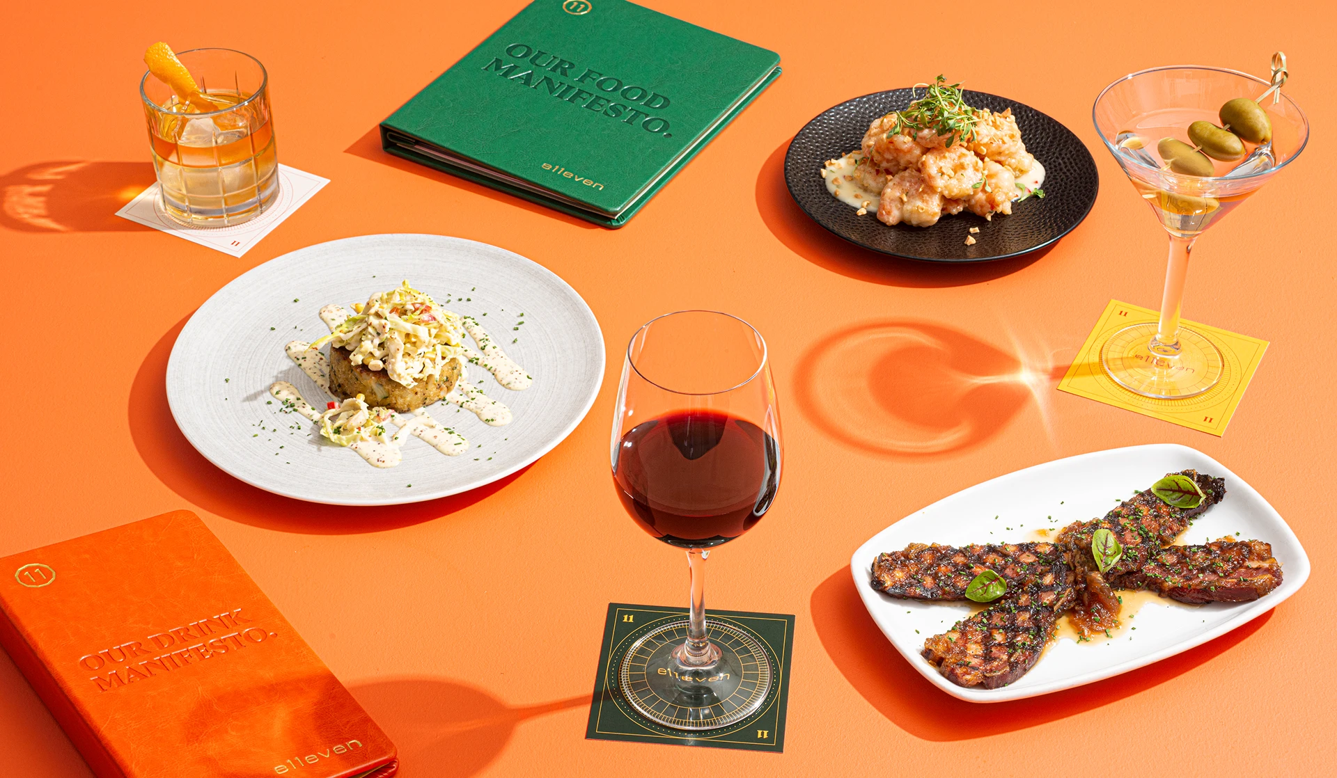
We created a bold, contemporary identity that gave greater meaning to E11even and its connection to Toronto. Canadian references were embedded into the story with a light touch, while high-contrast typography, unexpected colour, strong art direction, and a conversational tone gave the restaurant a distinctive presence of its own.
Designed for a Larger Stage
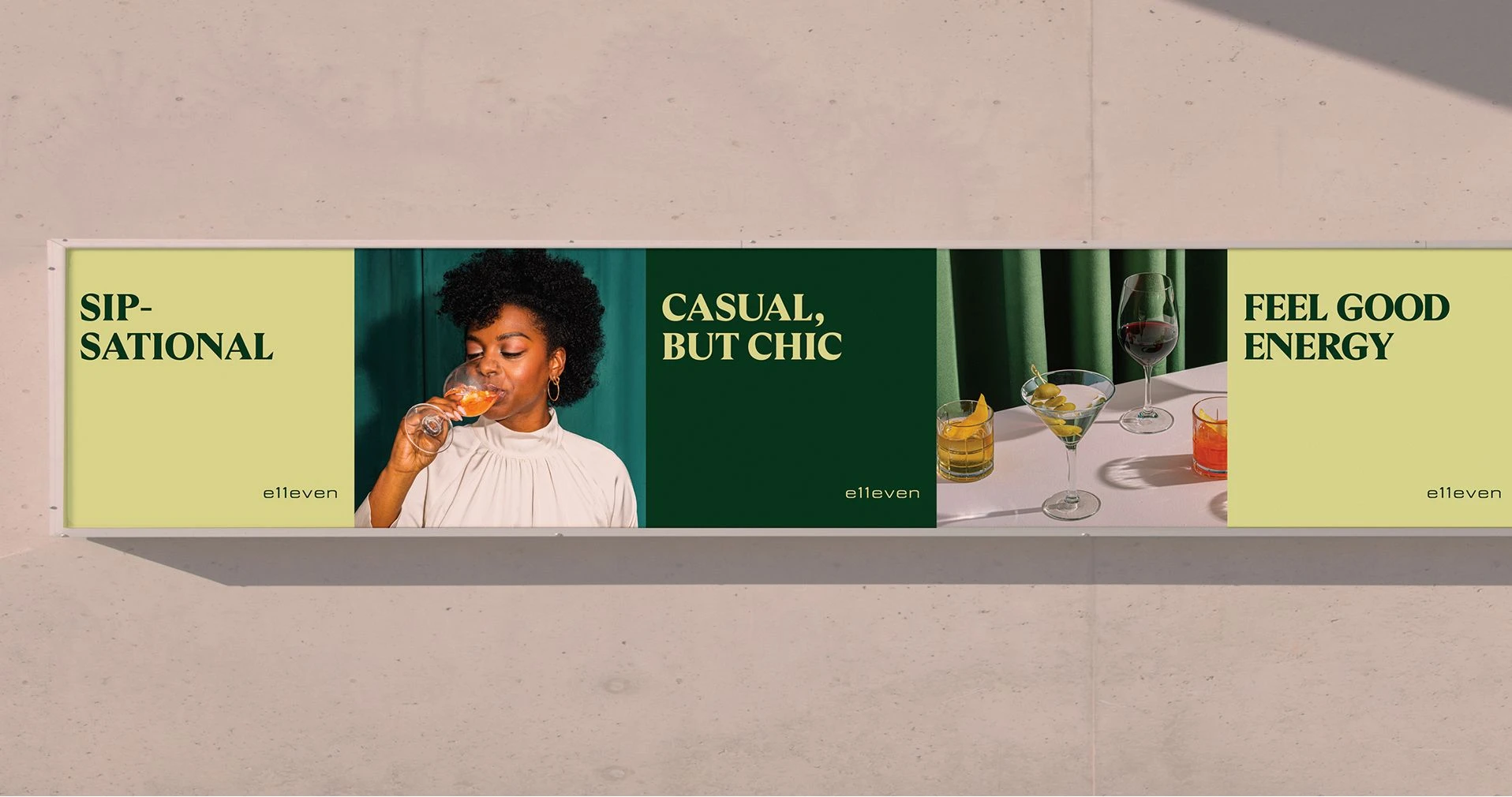
Being part of MLSE gave E11even access to a level of visibility and media support uncommon for a restaurant. The brand could live far beyond its physical space, appearing across arena screens, digital displays, advertising, out-of-home placements, and other channels within the broader MLSE network.

We designed the identity with that scale in mind. Motion became an important part of the system, allowing the brand to take advantage of these larger platforms while remaining recognisable across more traditional restaurant touchpoints. From a menu or coaster to an arena screen, the same identity needed to hold its own.
Outcome
From the outset, the brand was designed to be carried forward. MLSE has a large in-house creative team with the resources and capabilities to continually apply, evolve, and grow E11even across new campaigns, platforms, and opportunities.
Our role was to give that team a strong foundation: a clear idea, a distinctive visual language, and a flexible system with enough range to remain consistent without becoming repetitive. The result was a brand built not only for launch, but for everything MLSE could do with it next.