

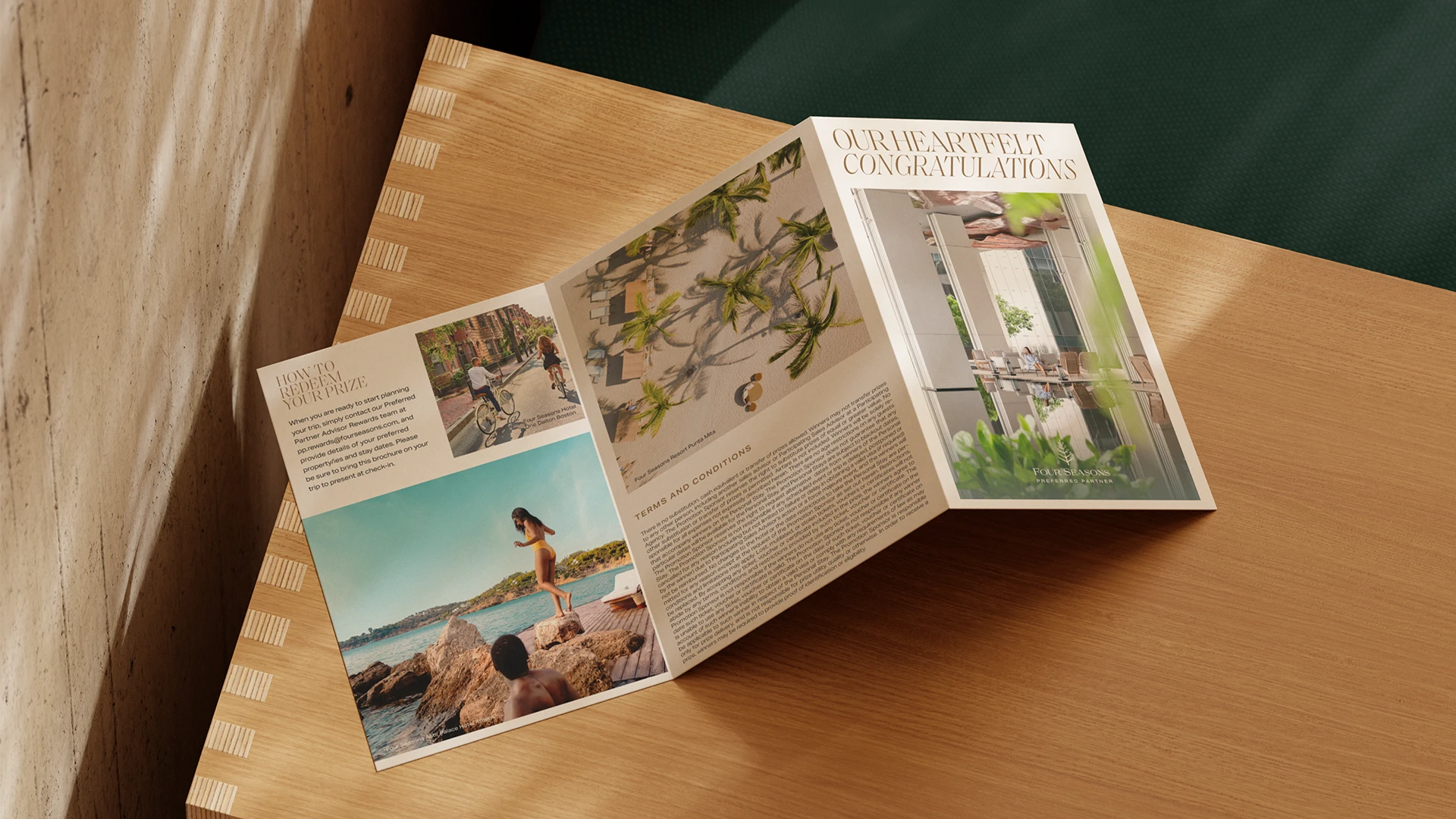


Four Seasons Boston One Dalton
A modern landmark brought to life through a brand language that honours intellect, influence, and the power of presence.
Artifacts
the Cultural fragments, references, and research that shape the soul of OUR world for this project.


What if collateral could set a tone from the very first moment, inviting a certain mindset and subtly signalling that this is a place shaped by thought and taste.
This was the starting point. A shift away from materials that simply serve, toward pieces that reflect the people they are made for. An audience that is culturally aware, visually literate, and attentive to detail. Designing for that level of awareness is a privilege. It invites a more deliberate approach. Where the interplay of elements carries more weight than any single component.
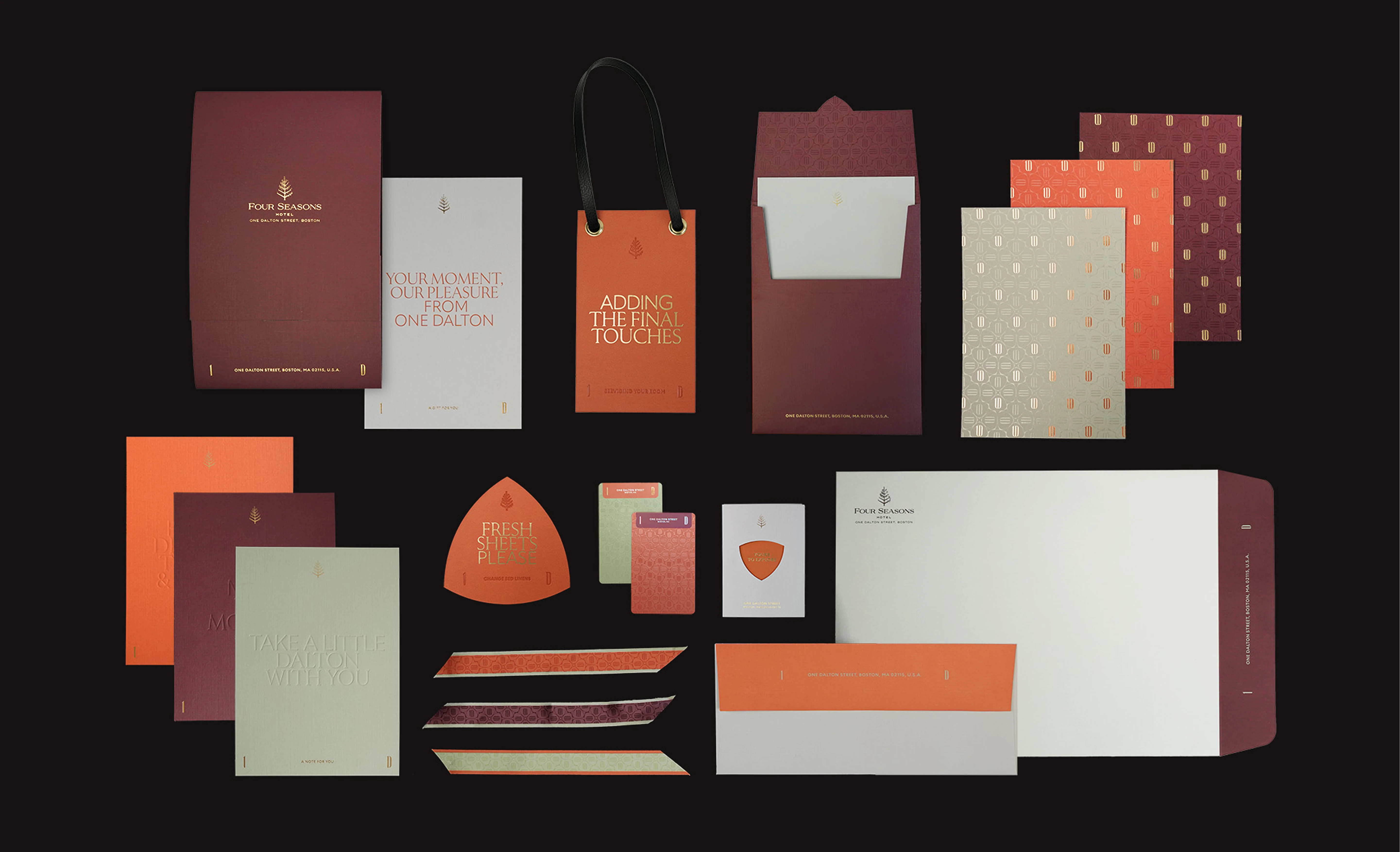
“omne trium perfectum” latin for everything that comes in threes is perfect
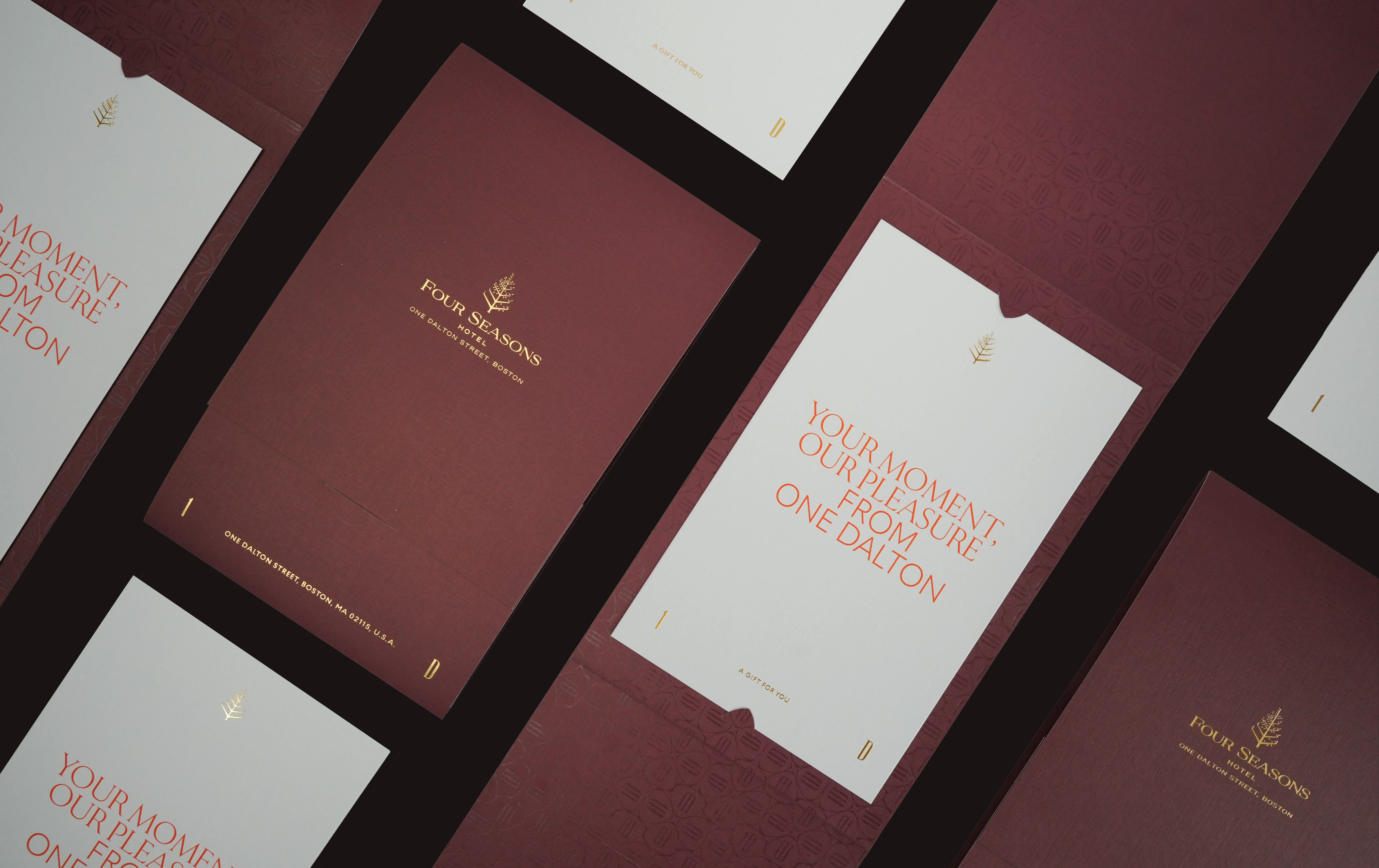
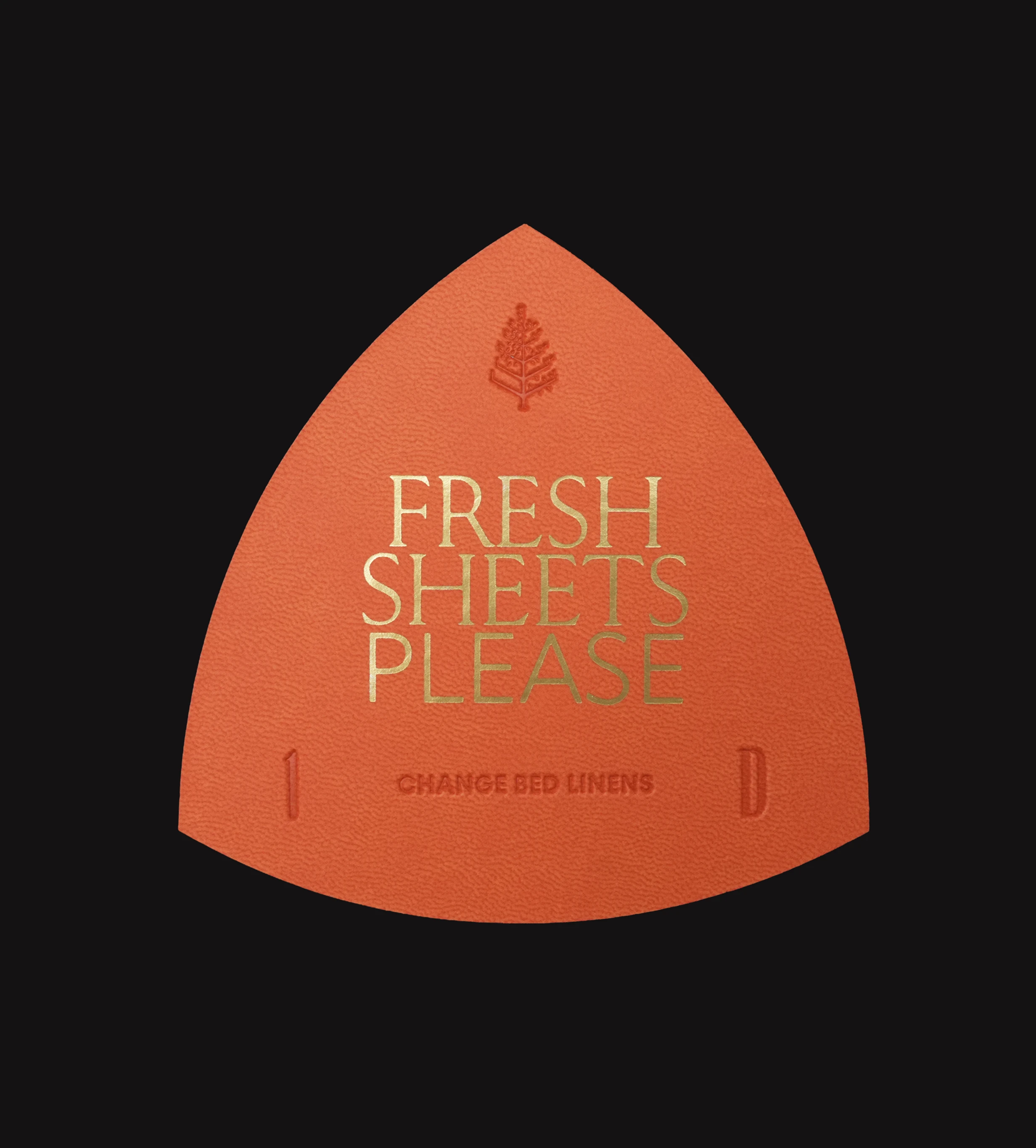
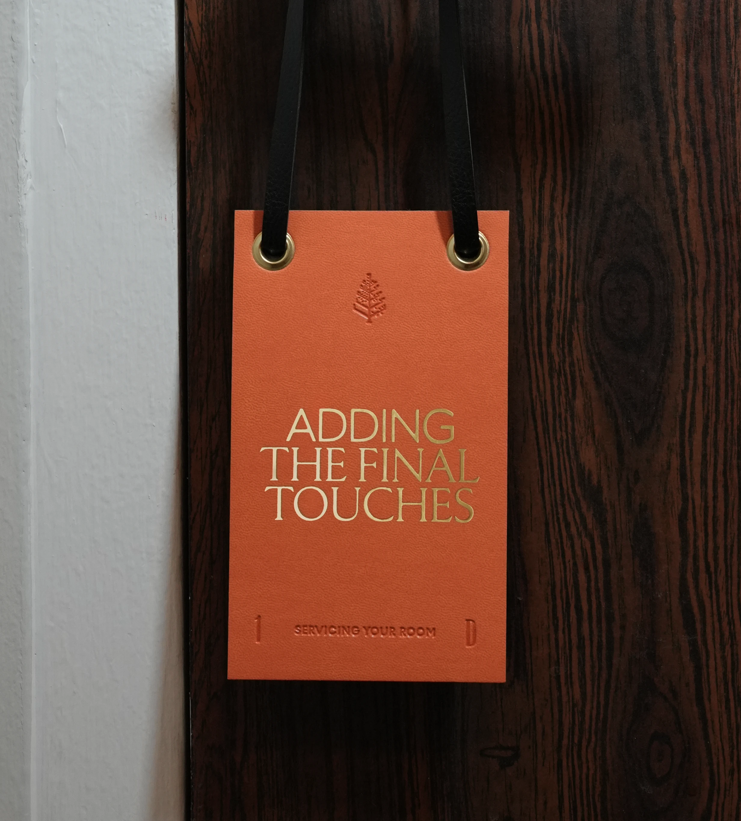
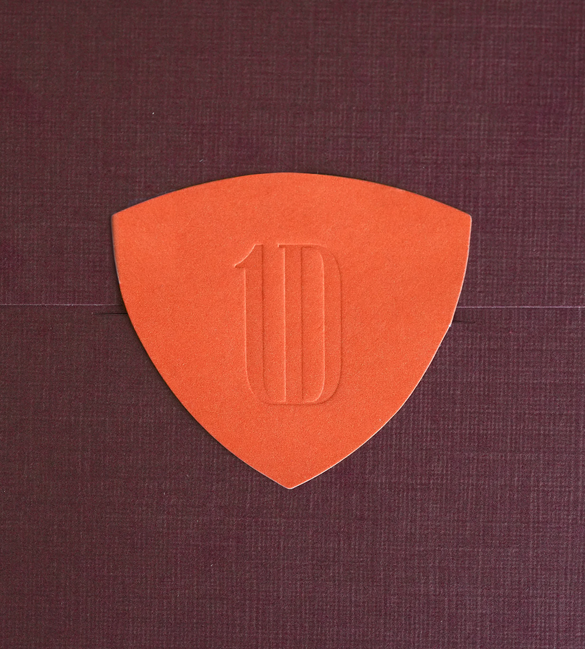
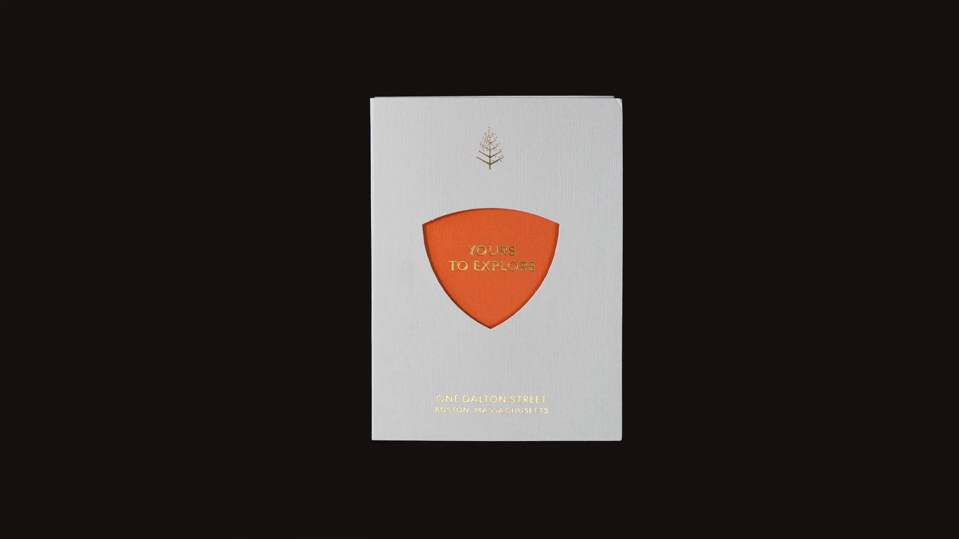
The inspiration began with the building itself. Its iconic footprint, a rounded triangle set within the Boston skyline at One Dalton, introduced a distinct geometry. This form became the foundation for a broader principle that shaped the system across every touchpoint. From composition and layout to colour and language, a rhythm of three brought cohesion and clarity without becoming prescriptive.
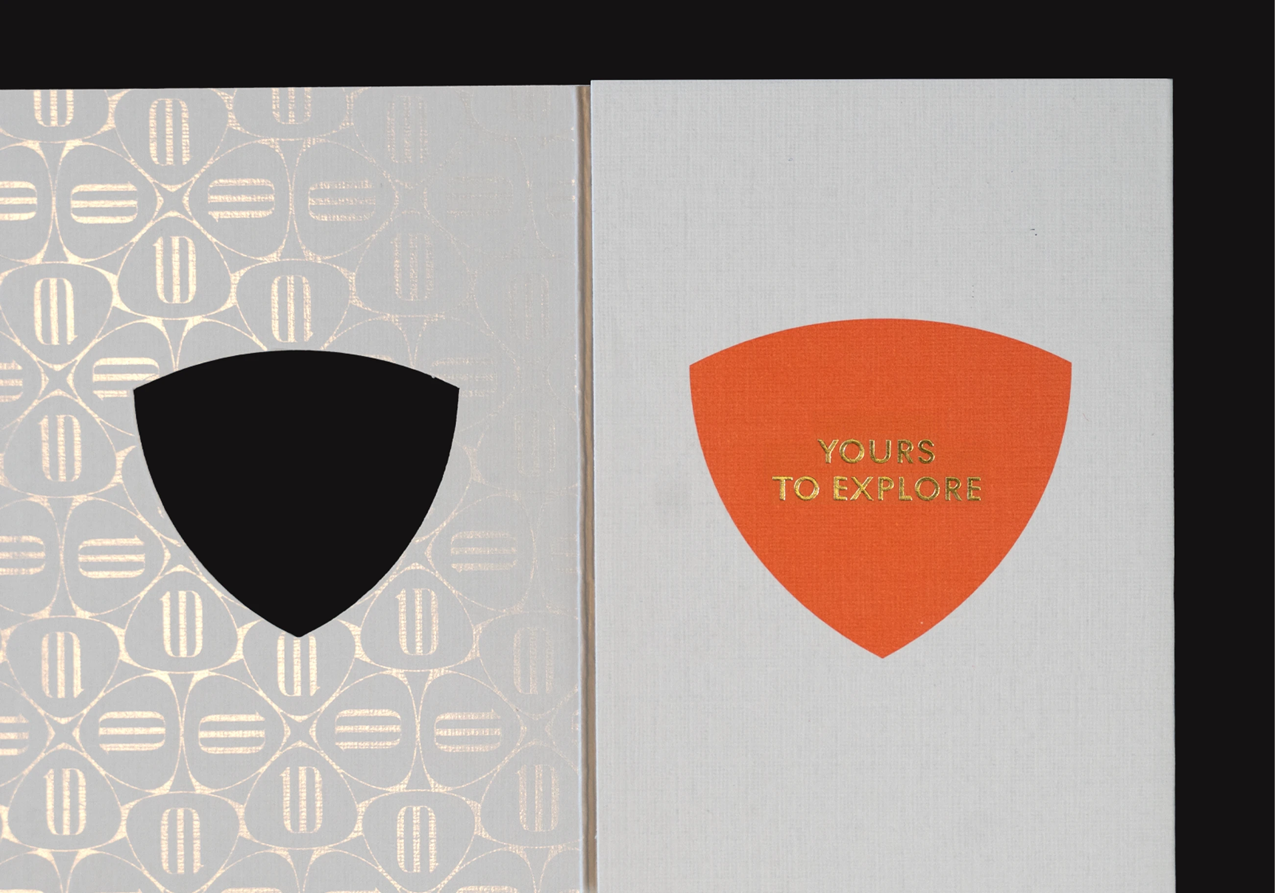
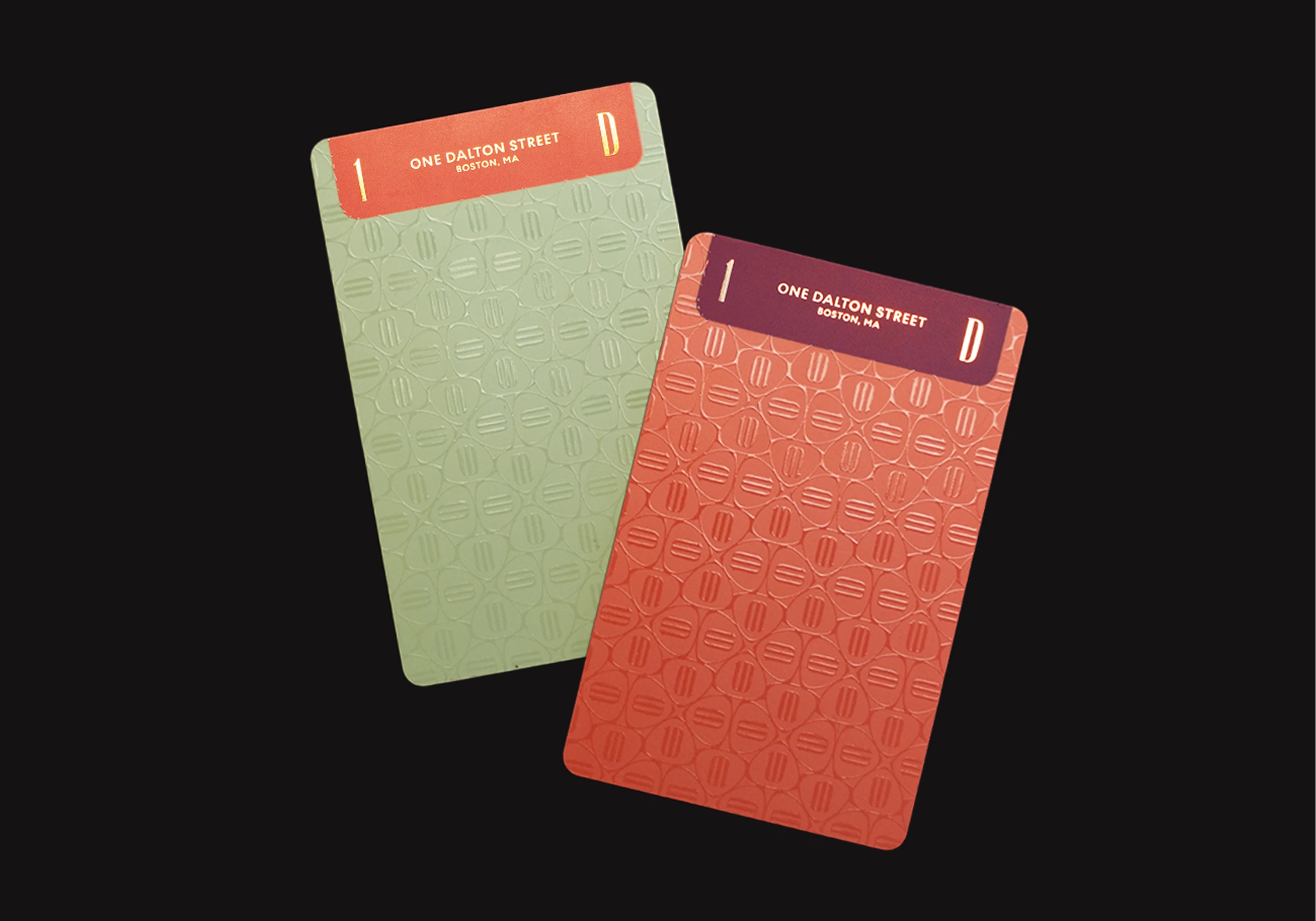
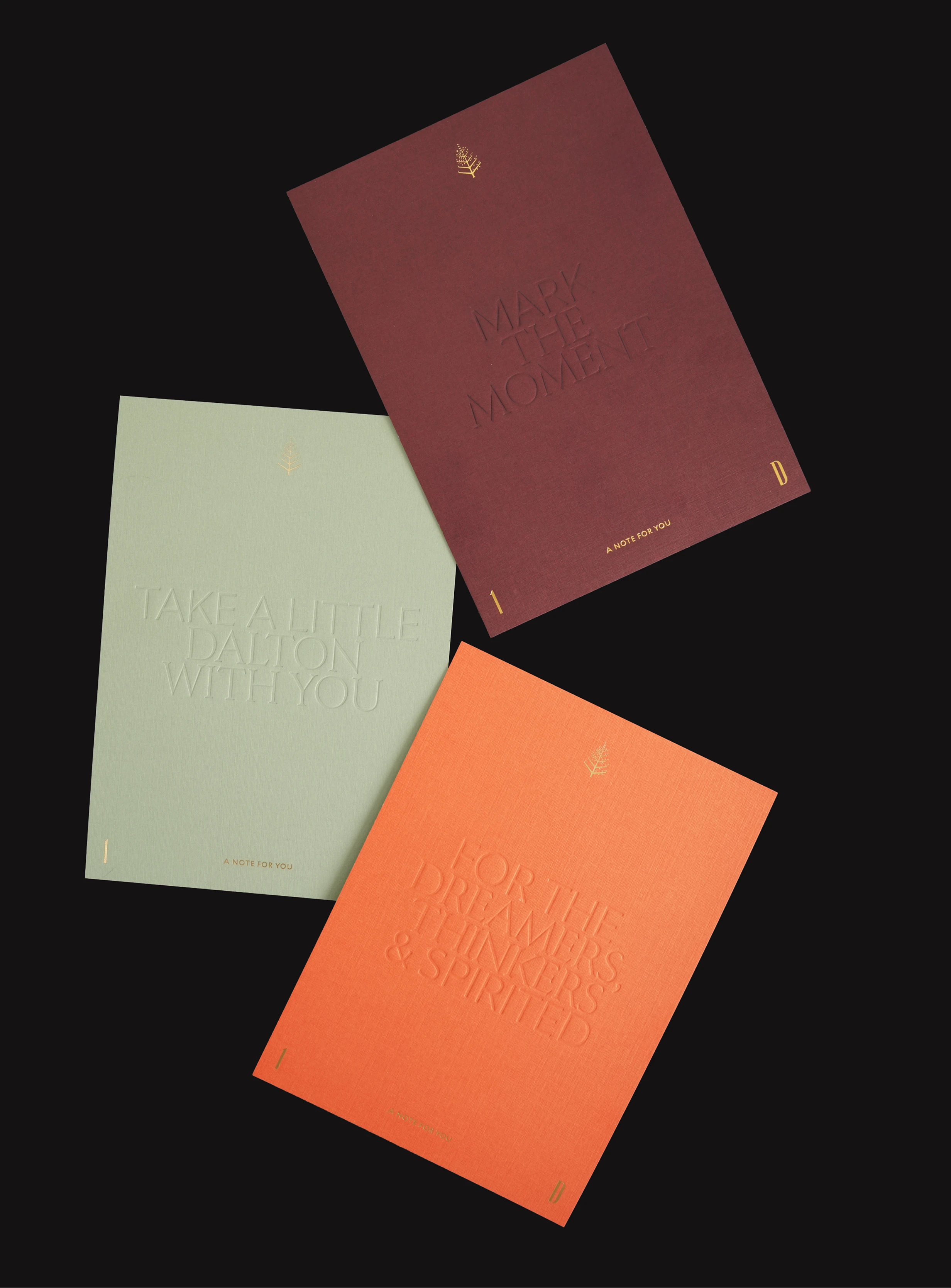
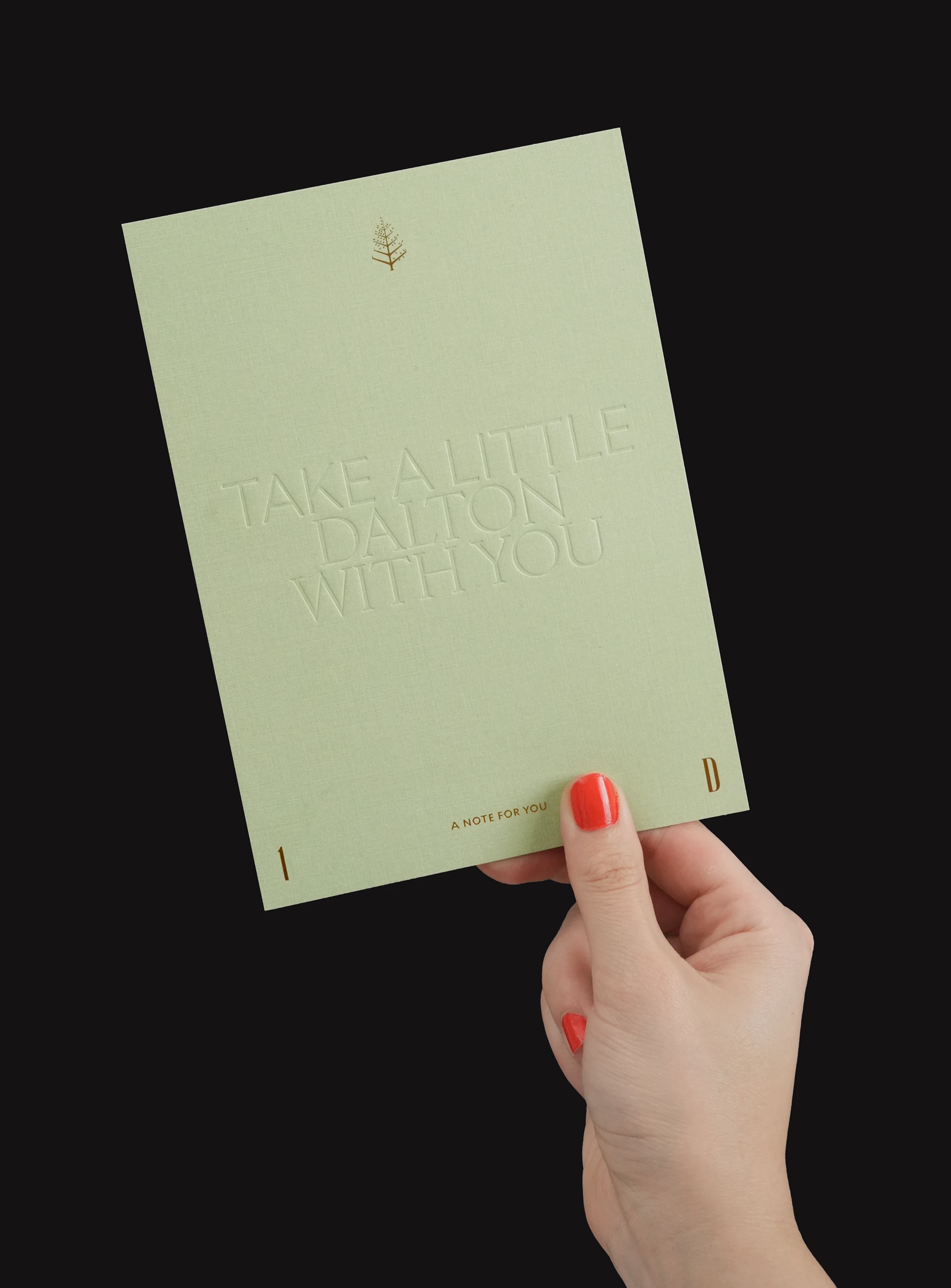
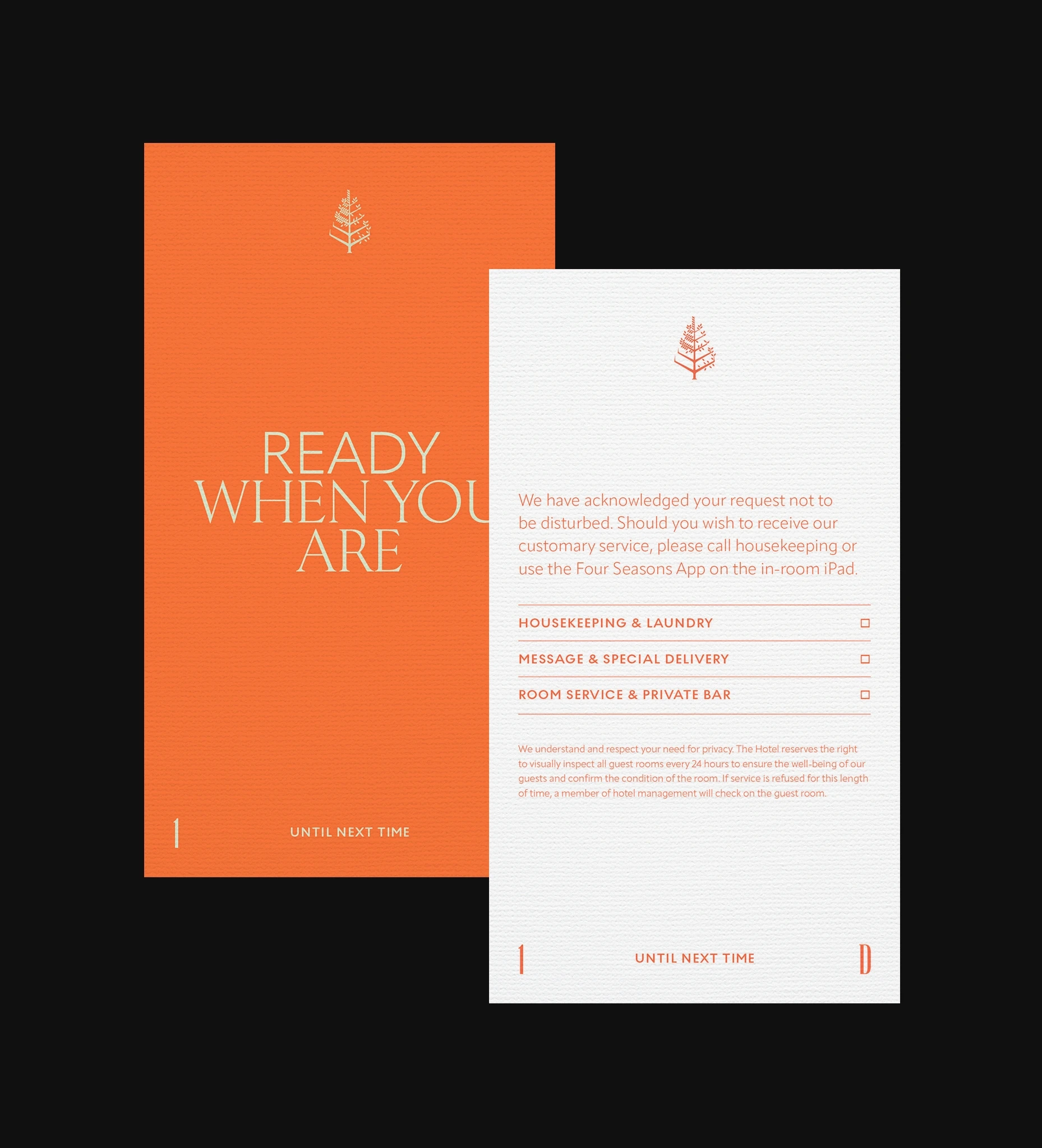
Colour became the primary expression of energy. Inspired by Boston’s academic culture and strong sense of identity, the palette draws from the familiarity of school colours, reinterpreted with restraint. Bold and confident, yet carefully balanced. The intention was to reflect a space that feels active and engaged, rather than quiet or reserved in the traditional sense of luxury.
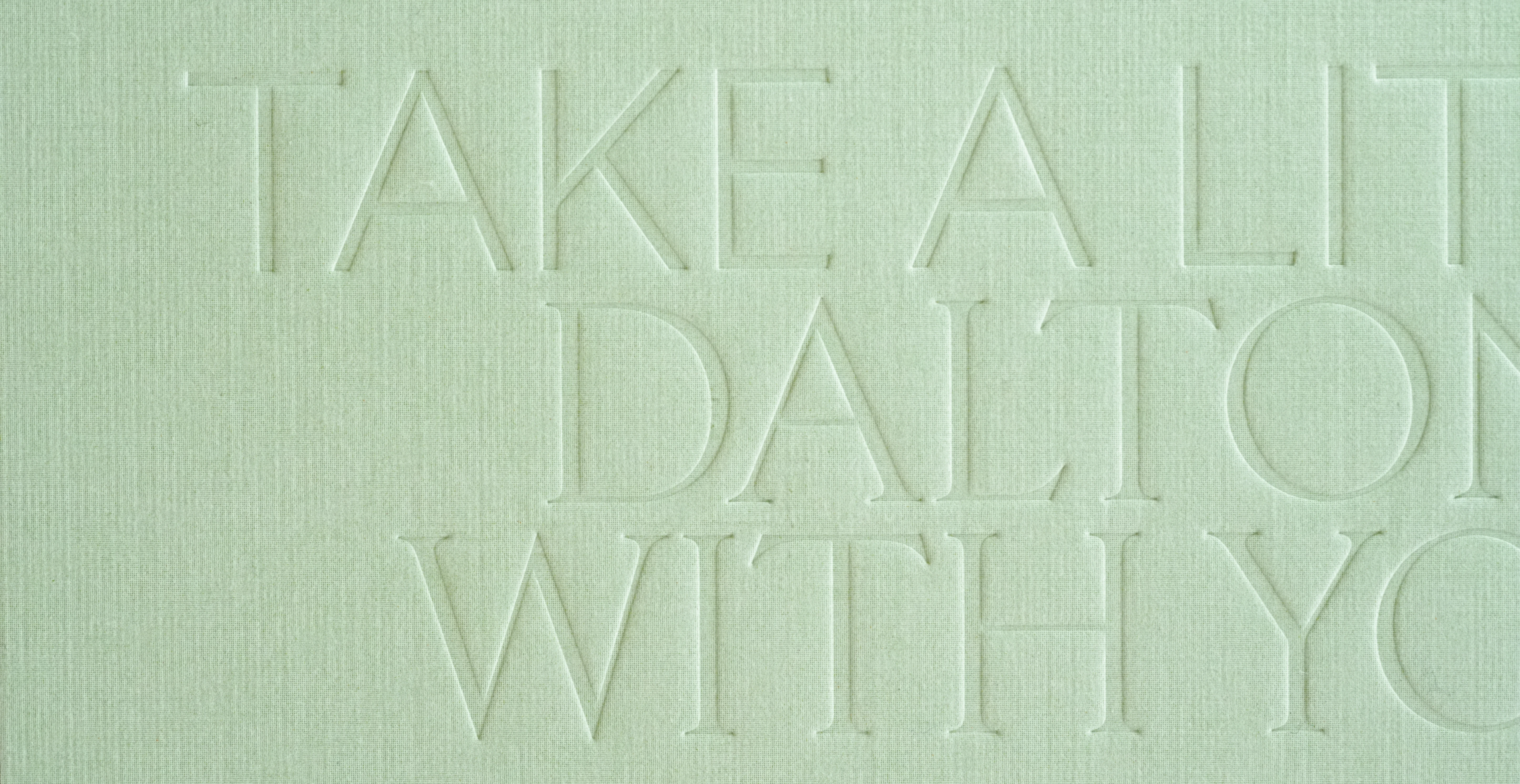
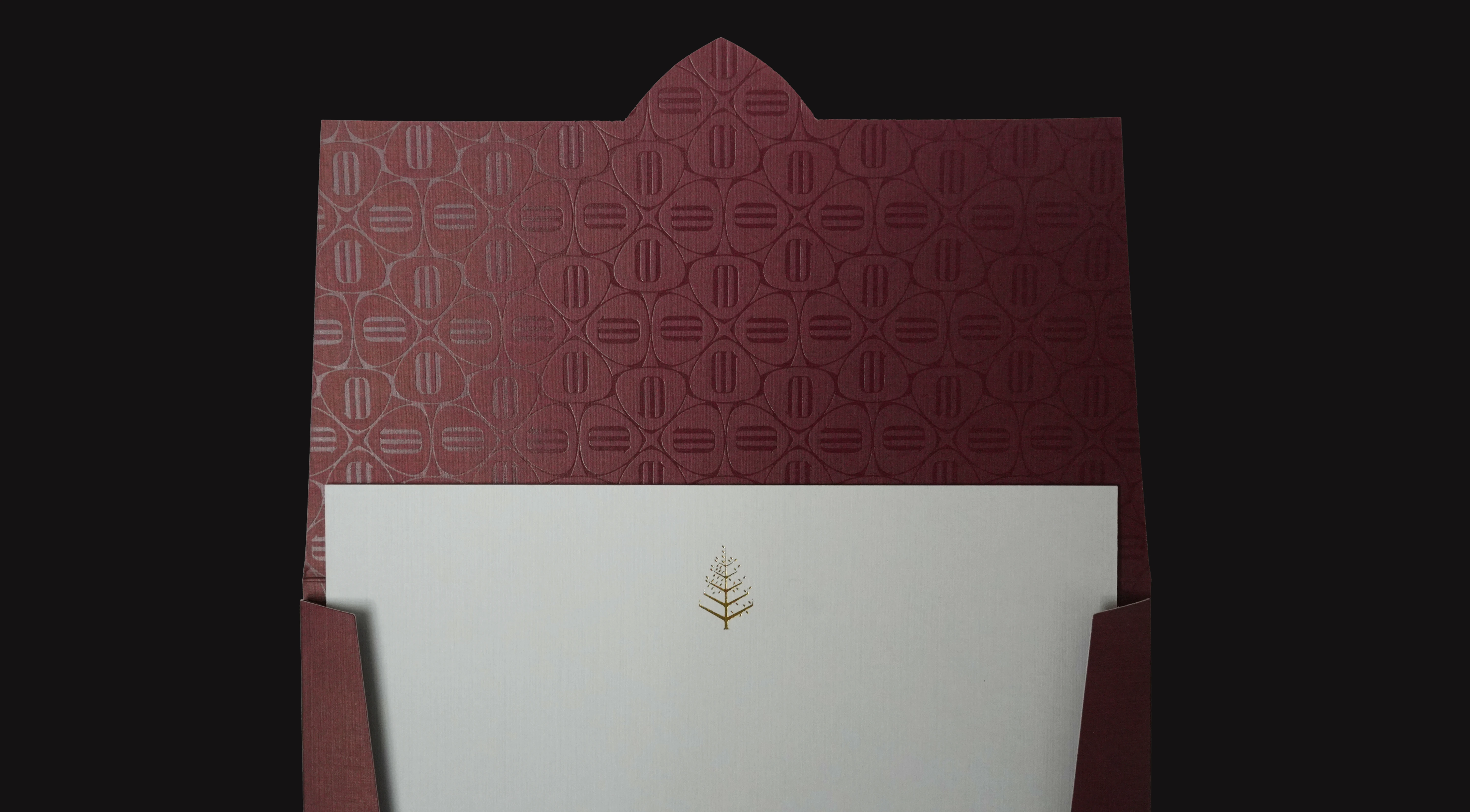
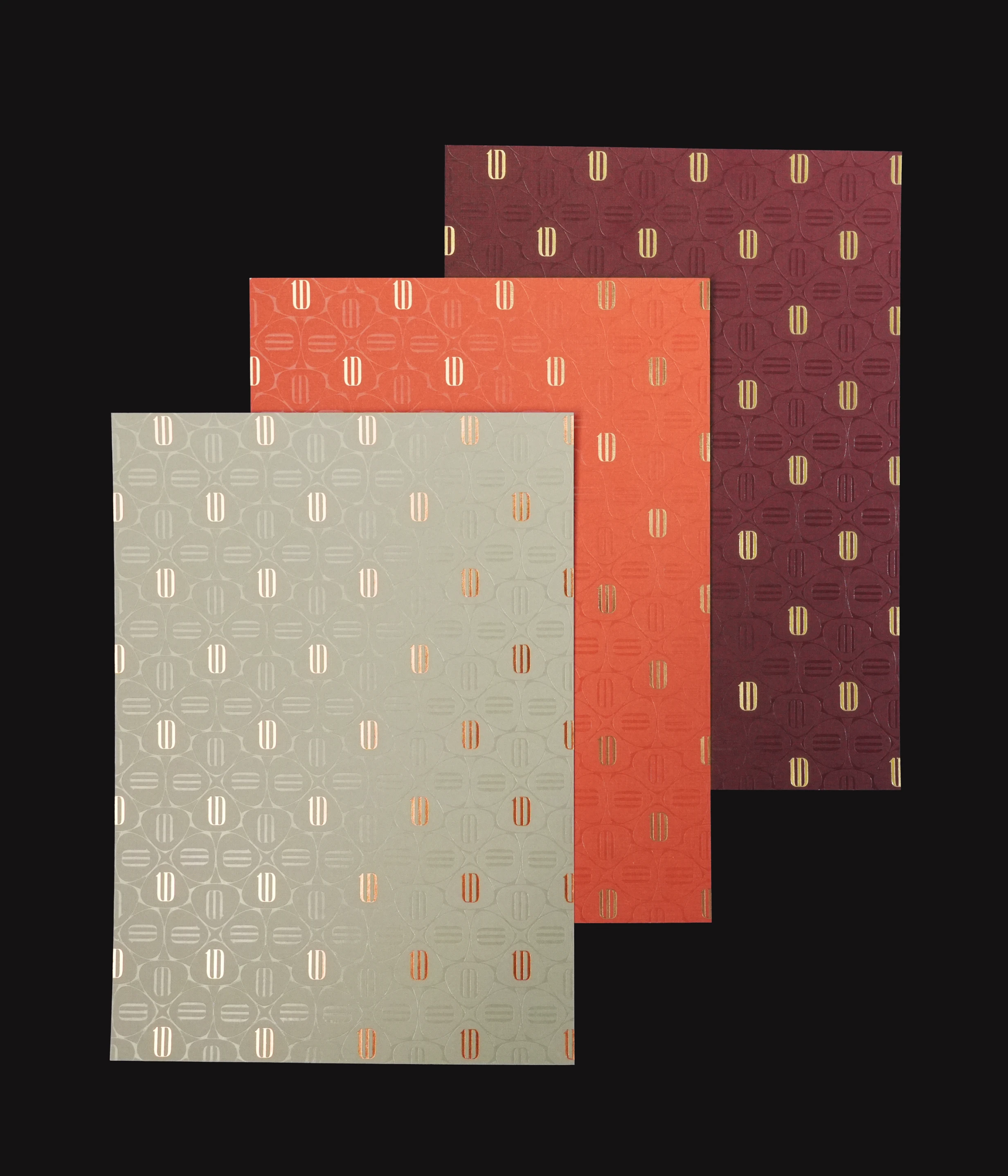
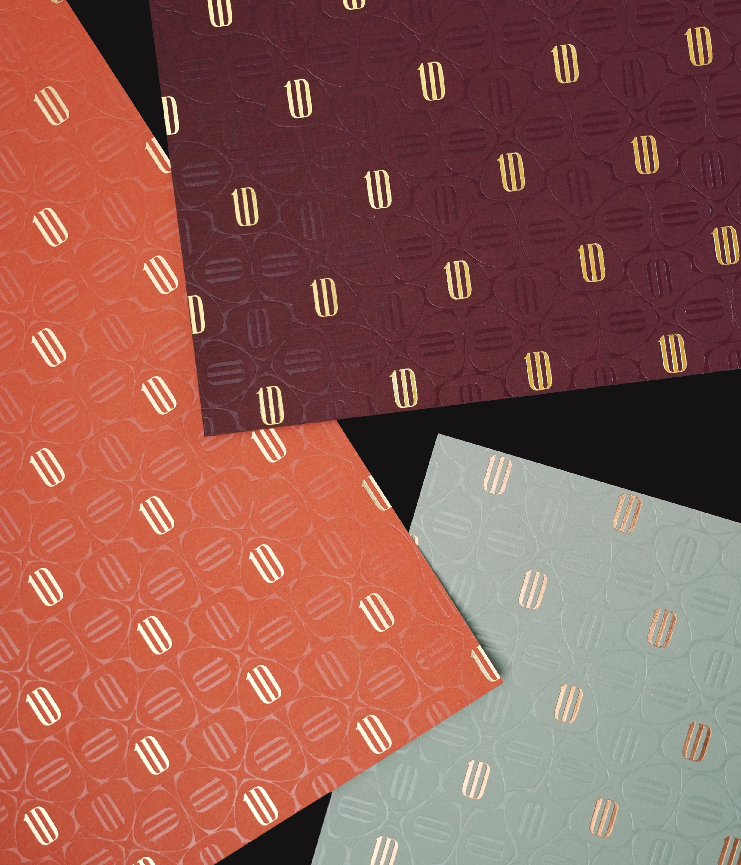
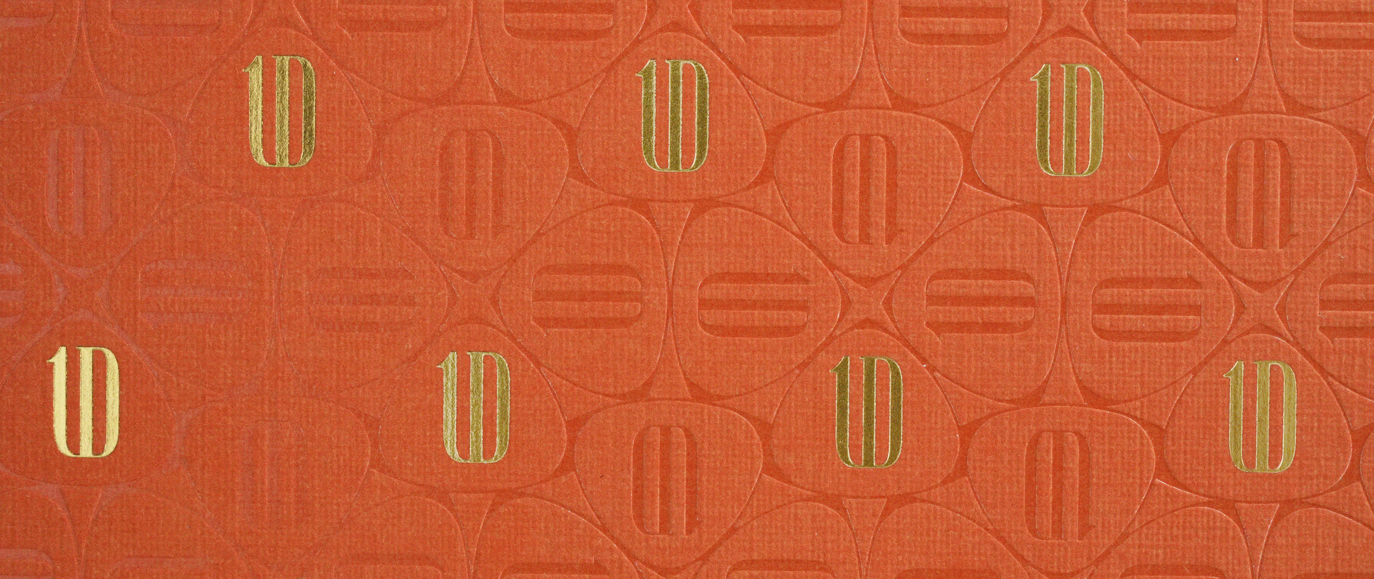
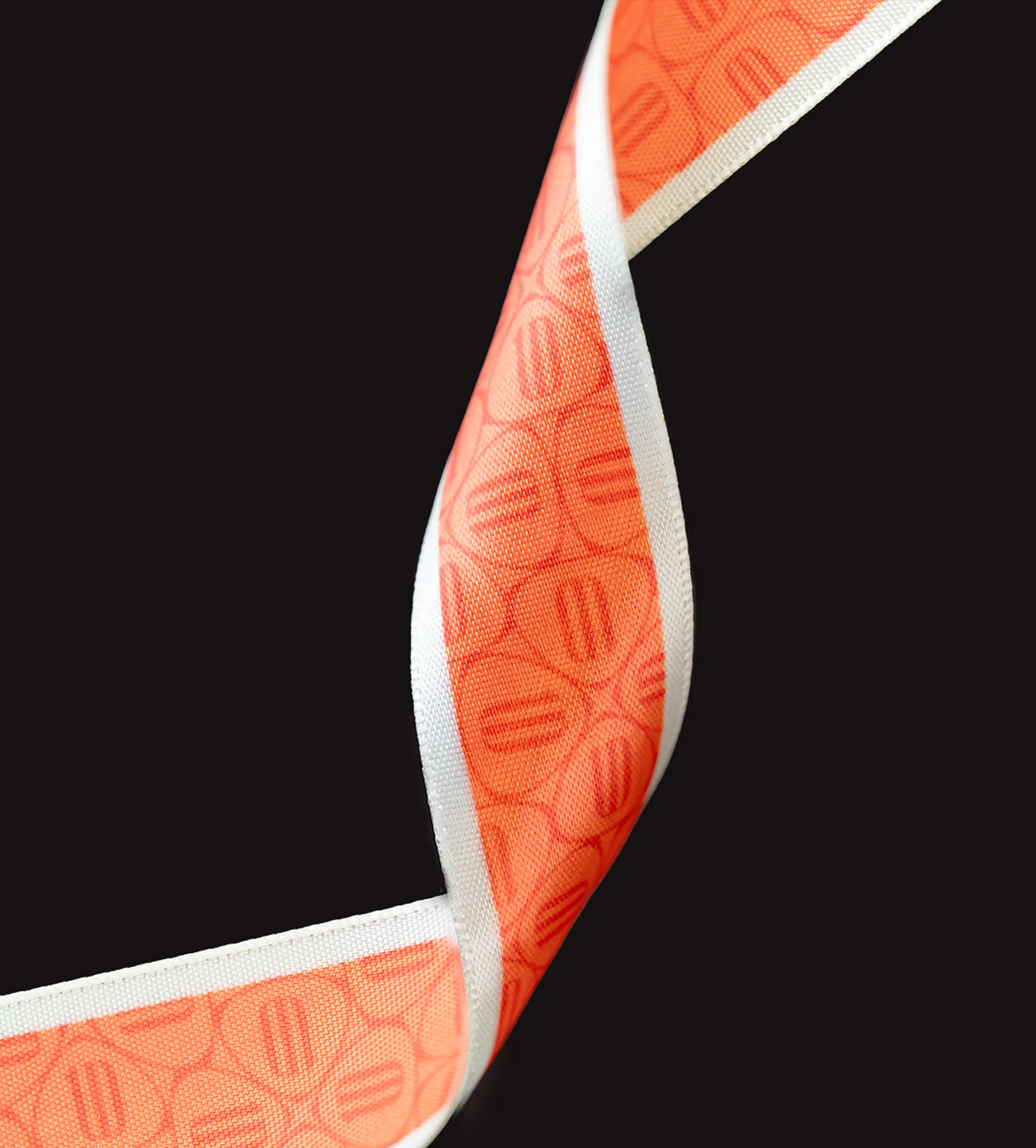
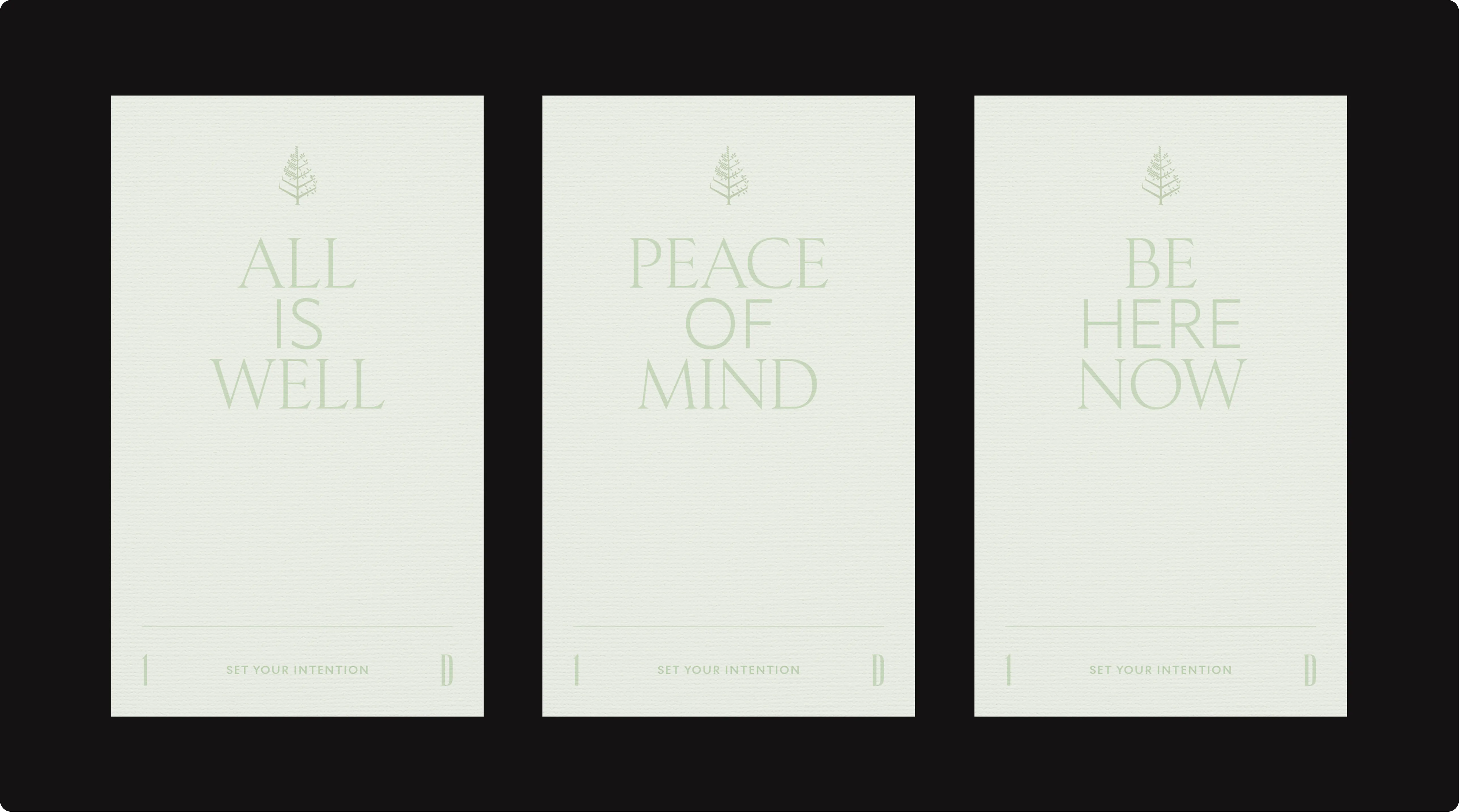
Across the system, detail carries meaning. Patterns derived from the “1D” monogram unfold through die-cut forms and considered layouts. Typography and copy follow the same measured rhythm, while production techniques such as foil stamping and debossing introduce a tactile layer that reveals itself the closer you look. These were the softer moments designed for those who notice.
AESTHETICS

The result is a system that settles naturally into its environment. It does not compete for attention, but holds it through clarity and intention. Energetic, yet composed. Distinct, yet appropriate to its setting. A reflection of a guest who values substance, and a hotel that meets that standard with confidence.
project overview
We developed a flexible collateral system for Four Seasons One Dalton that reflects its distinct guest profile—individuals defined by influence, purpose, and confidence. It bridges Boston’s legacy of ideas with a contemporary, design-forward expression across all guest touchpoints.
Boston is a city shaped by ideas—where history is in constant dialogue with what comes next. As the hotel came to better understand its guests, it became clear they were not the traditional luxury traveller, but individuals who shape industries, lead conversations, and define culture in their own right. The question became: how can the hotel reflect their presence through its collateral?
At the heart of One Dalton flows a vibrant energy—a pulse inspired by Boston’s rich heritage where history and innovation converge—driven by passion, pride and spirit
We built a system that introduces character through moments of boldness. Colour, typography, and graphic elements were intentionally selected and deliberately placed to create compositions that feel both precise and expressive.
The challenge, however, lay in restraint. Each element carries its own visual strength, and without careful consideration, the system risked becoming overwhelming.
Rather than competing, these elements were thoughtfully balanced to maintain clarity and hierarchy across every touchpoint. At first glance, the pieces feel simple—but reveal a layered richness upon closer look.

evolving expressions
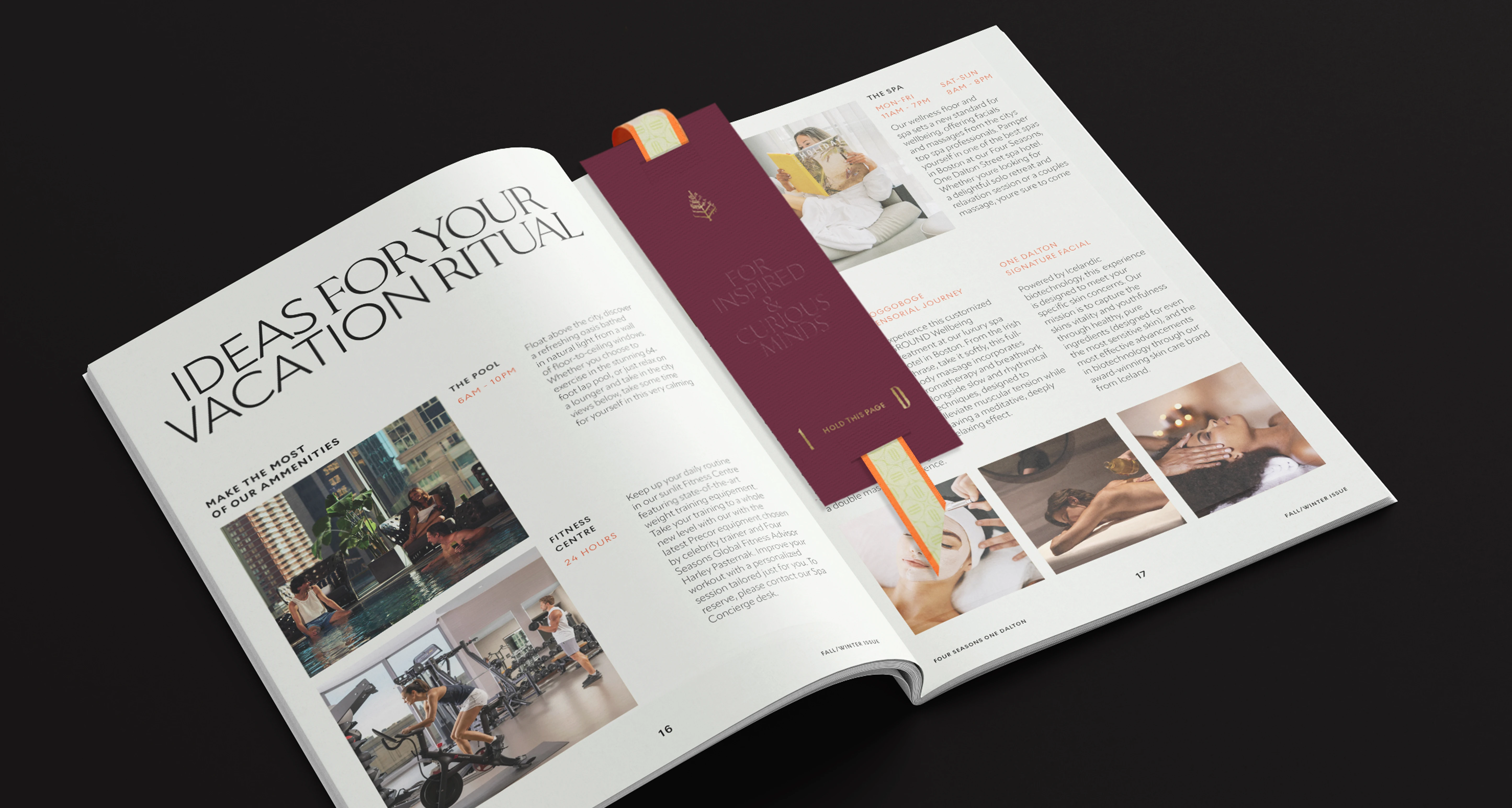
Parts of the graphic system were intentionally designed for variation, with seasonal patterns becoming a key expression of this approach. This allows the experience to evolve over time, inviting guests to discover something new with each visit while continuing to build depth and familiarity within a consistent visual framework.
experiential sensitivities
Recognizing that the hotel encompasses a range of experiences, the system was designed with flexibility in mind. In quieter, more introspective spaces such as the spa, the visual language is intentionally dialed back, with expression coming through materiality, finish, and tone of voice rather than overt graphics—allowing the environment to guide the experience.
Guided by a flexible framework, the collateral system extends seamlessly across the property, adapting in tone while maintaining a clear and cohesive identity.
The result is a system that not only reflects the character of the hotel, but supports it operationally, ensuring consistency across touchpoints while allowing for evolution over time. It equips the team with a structured yet expressive toolkit, enabling the brand to remain relevant, distinctive, and aligned with the calibre of its guests.