


Sensei porcupine creek
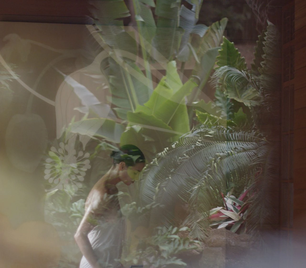
A luxury wellness retreat where intentional living is guided through considered experiences in a desert setting.
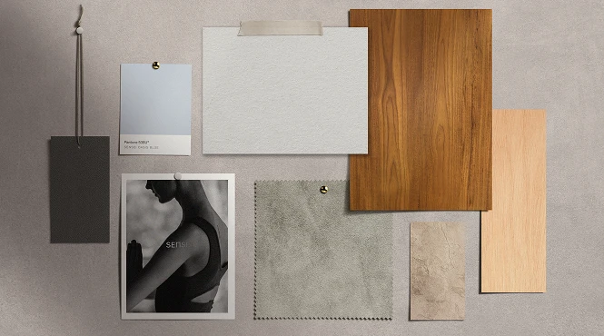
Artifacts
the Cultural fragments, references, and research that shape the soul of OUR world for this project.

What if wellness retreats could invite calm and encouraged practices that linger long after their stay?
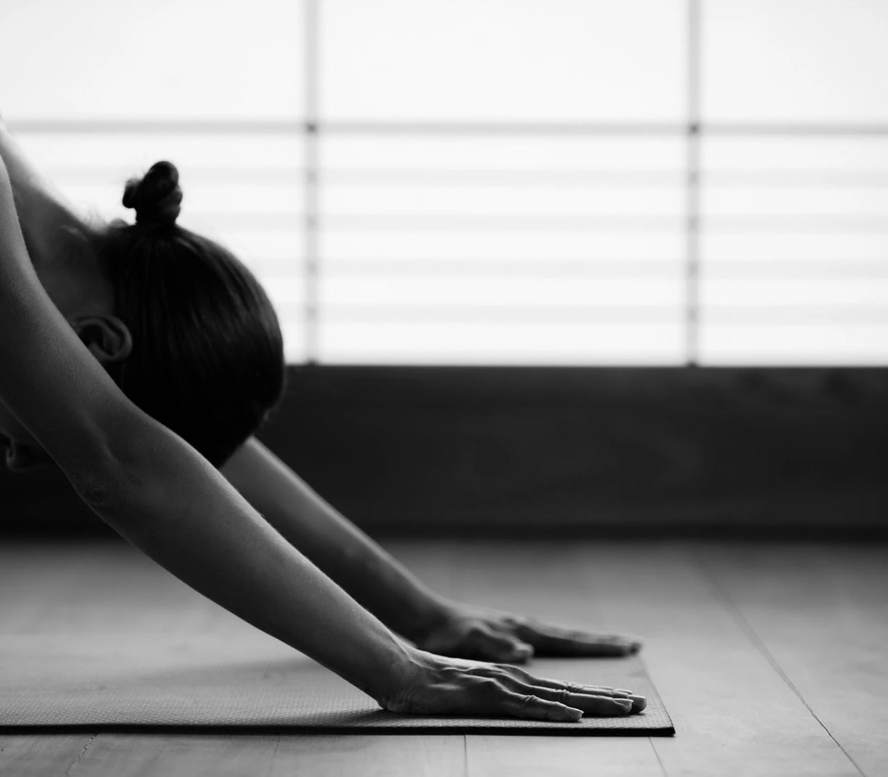
To nourish the whole self is at the centre of the Sensei philosophy—an invitation to arrive as you are, and where the journey matters more than the destination. Within this retreat, reflection finds room to breathe and clarity gently emerges. Guided by the pillars of Move, Nourish, and Rest, the environment is shaped with calm intention, offering a quiet path inward to a renewed sense of presence.
Sensei Porcupine Creek isn’t your typical resort. It’s designed for a very specific guest—high-performing individuals who rarely get a true break. Founded by Larry Ellison and Dr. David Agus, the brand is built on deep insight into that lifestyle. Therefore the collateral had to reflect that: calm, intelligent, and never wasteful.
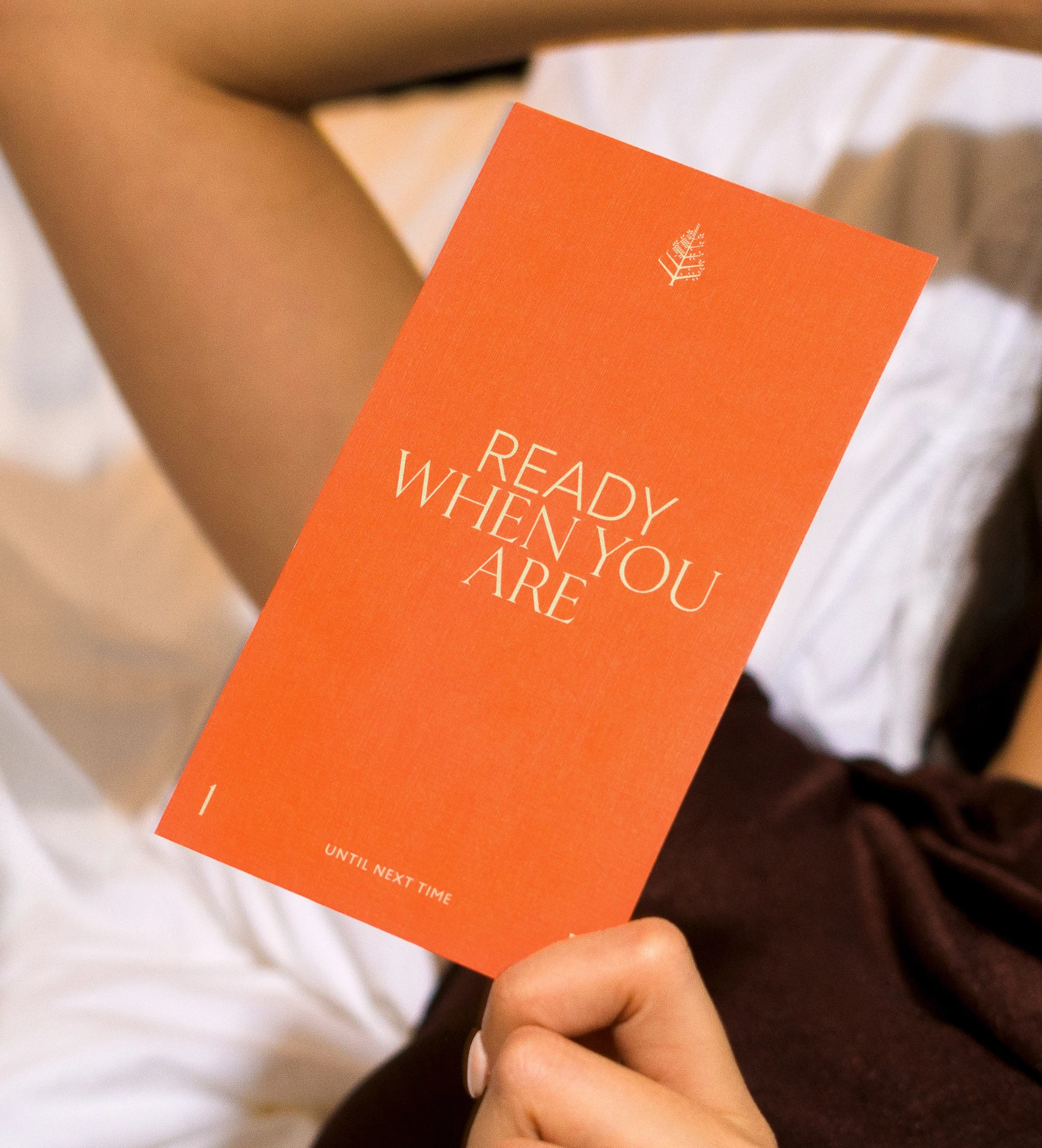
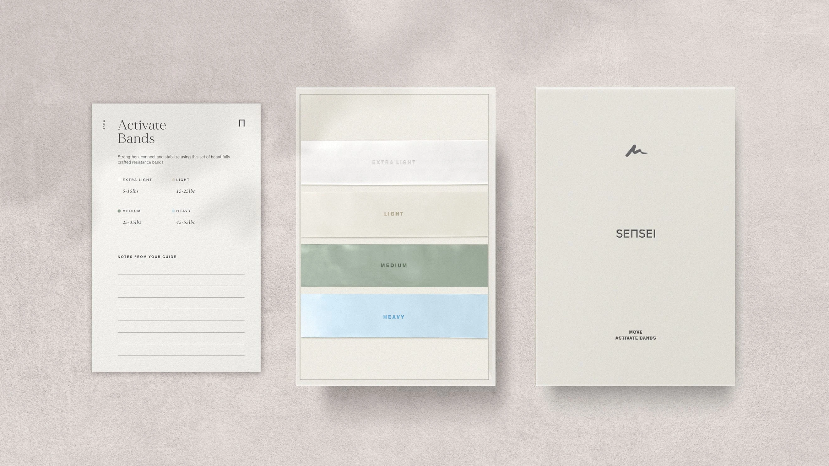
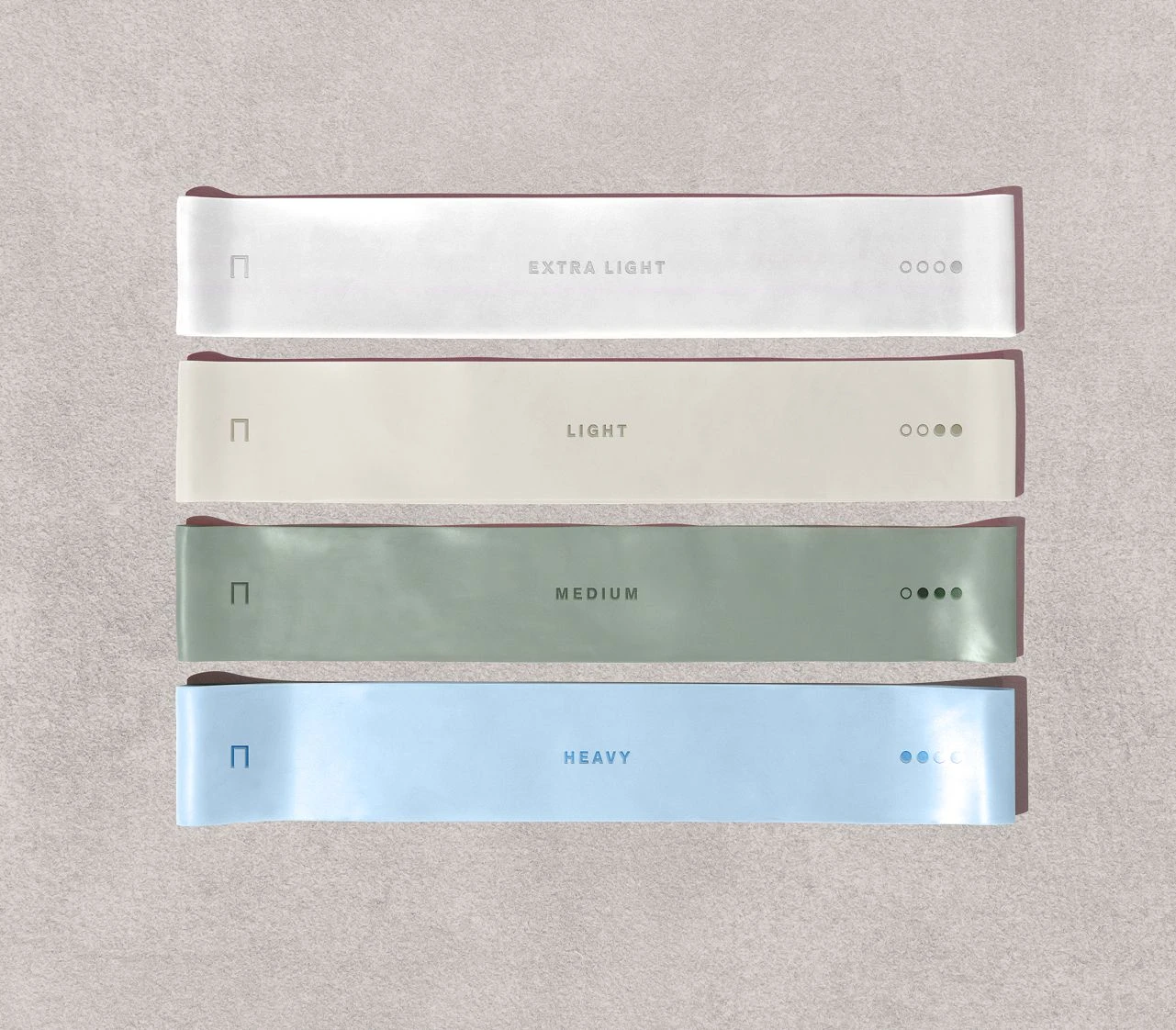
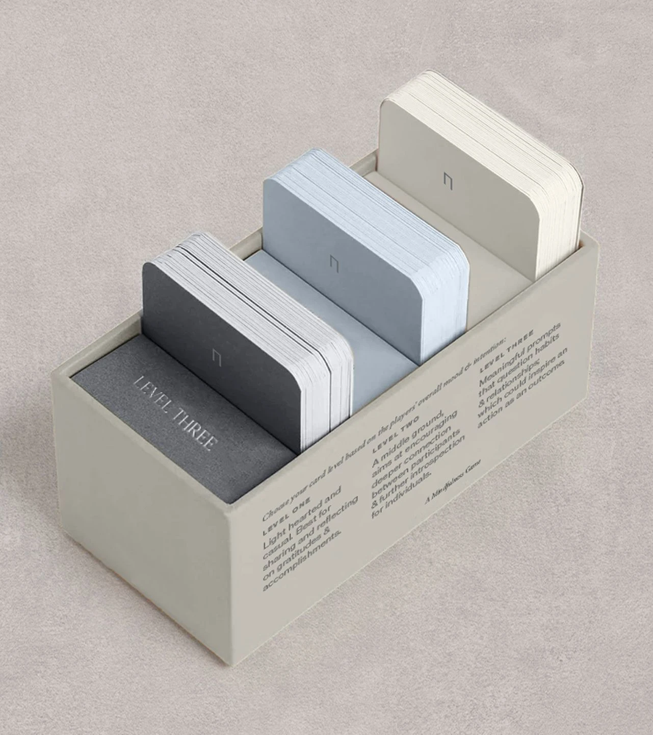
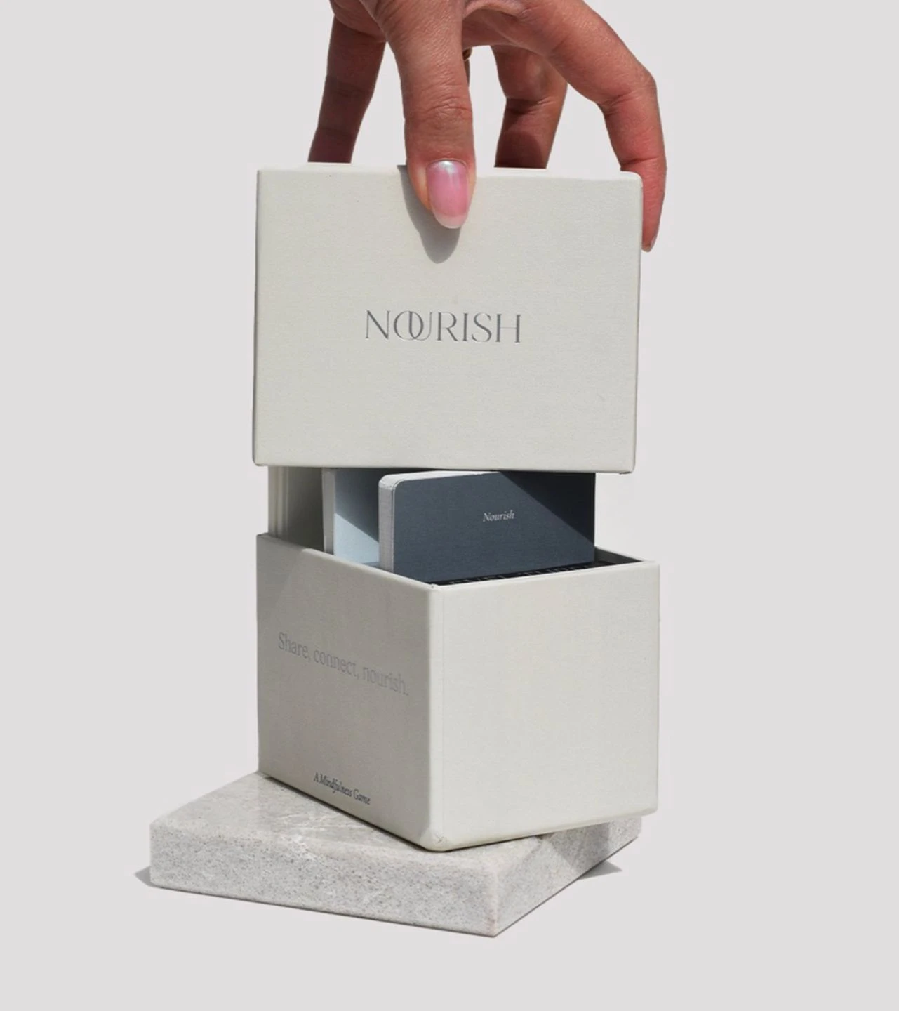
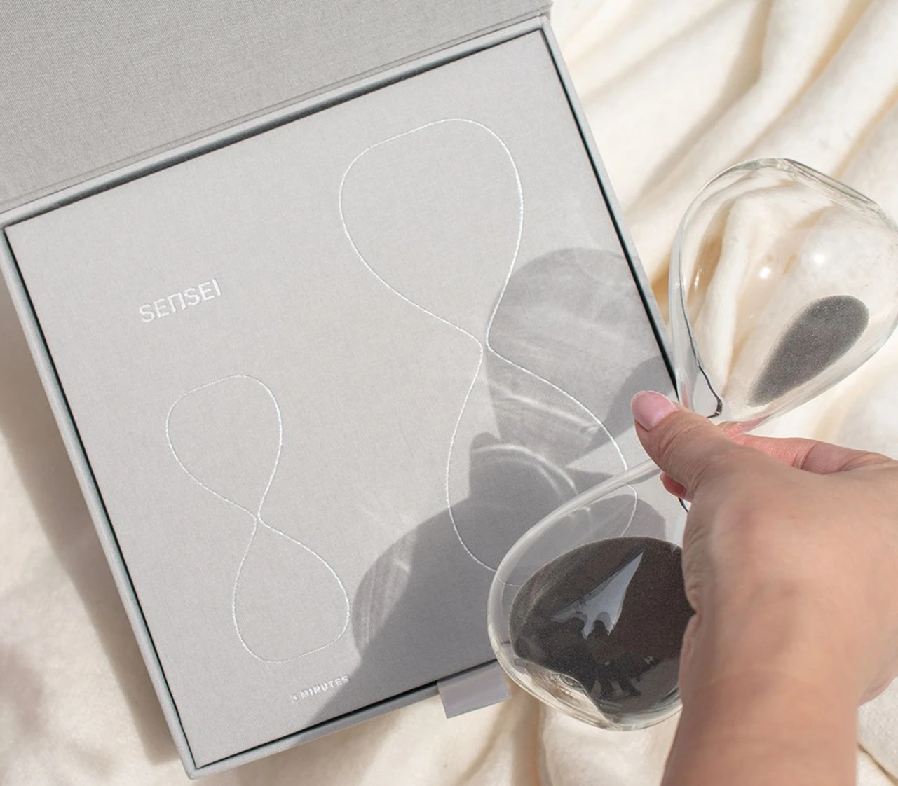
One of the most meaningful aspects of the system was the creation of signature gifting for the property. The Hourglass of Intention and the Nourish Card Game embodied the Sensei philosophy, giving guests tangible ways to continue their practice long after departing. In totality, every element was considered, crafted, and aligned with the philosophy at the heart of Sensei.
From arrival to departure, the collateral suite was cohesive, elegant, and rooted in the Sensei Way. It wasn’t just paper and packaging but a seamless part of the wellness experience. As the brand’s first standalone retreat, this property set the tone for what’s to come. Our role was to help establish that system and design for longevity.
Project Overview
Set on 230 acres of a former private estate in Palm Springs, Sensei Porcupine Creek marks the brand’s first standalone wellness retreat. We were brought in to design a full suite of on-property collateral, with one clear goal: to make sure the brand’s philosophy—Move, Nourish, Rest—flows through every guest touchpoint. From check-in to parting gift, each piece needed to reflect Sensei’s science-backed, practitioner-led approach to wellness.
Sensei is built around a belief of personal transformation. Our task was to design materials that supported that experience. Guests come to slow down, reflect, and reset, so everything we created had to be intentional. We weren’t just producing hotel collateral; we were helping to guide a wellness journey. Every piece needed to echo the three pillars of the Sensei Way.
The philosophy of Move, Nourish, Rest meets guests wherever they are on their wellness journey.
Mapping the Journey
Before any design work began, we mapped the full guest experience to identify the right moments to communicate—when to offer clarity and when to inspire. This helped us keep each piece focused and functional, reinforcing the philosophy without adding unnecessary noise.
Collateral with Purpose
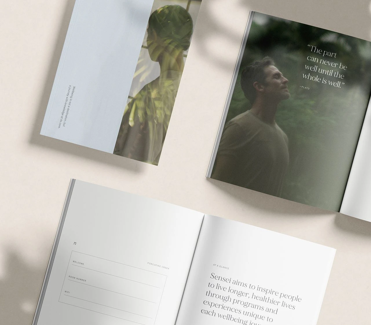
We approached every touchpoint from welcome journals and in-room materials, to spa menus, and turn down amenities as a chance to educate gently. Pieces were designed to support the practitioner-led journey, helping guests understand the intention behind the experience.

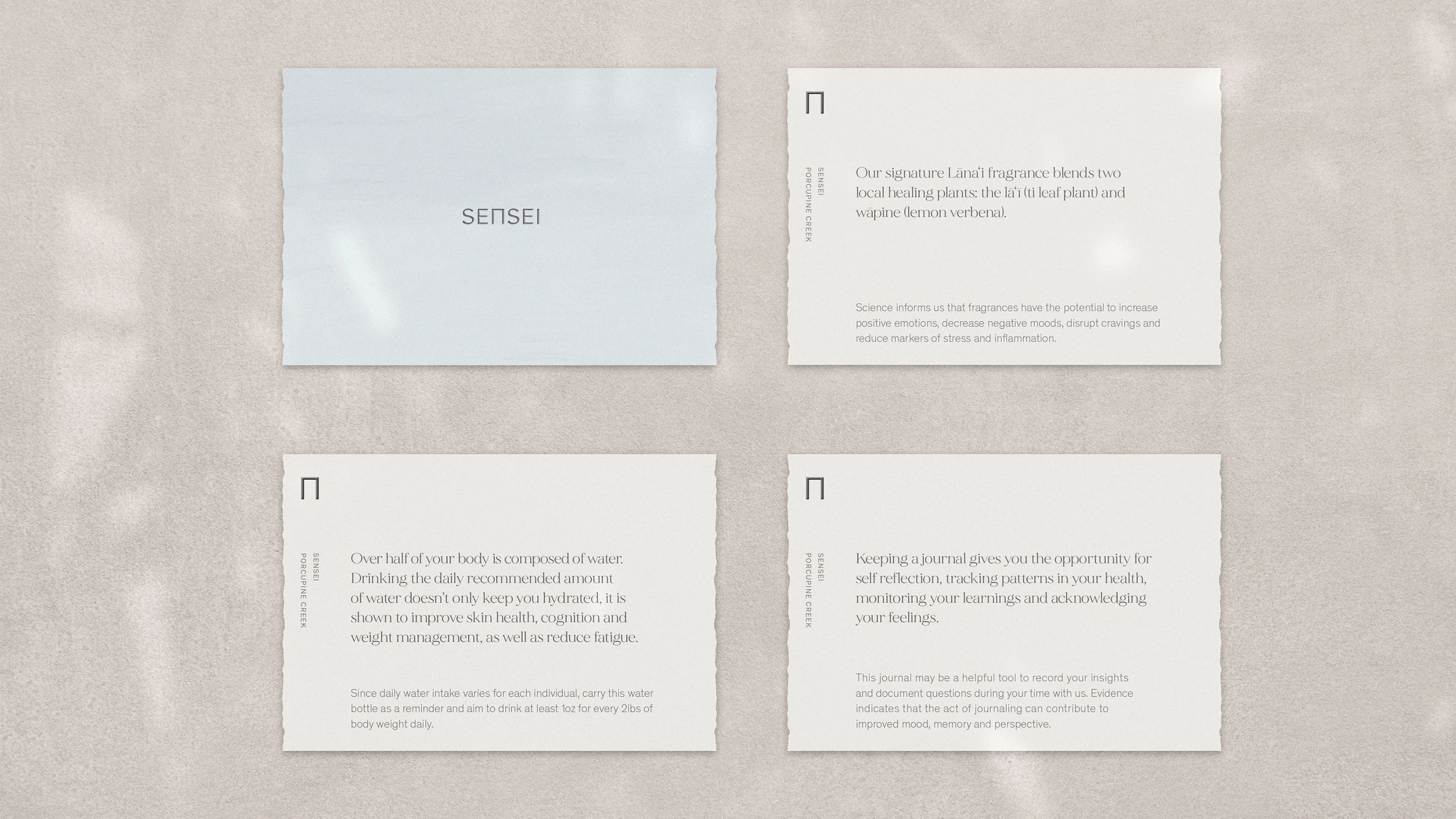
The visual system for Sensei was built on a foundation that all collateral needed to feel as calm and considered as the retreat itself. Every touchpoint was structured to invite and guide, giving guests the space to absorb the Sensei philosophy at their own pace. Information design played a central role, ensuring clarity when reinforcing the rhythm of Move, Nourish, and Rest without ever creating overwhelm.
Production choices were just as essential. As a small and deeply intentional resort, the collateral couldn’t feel mechanical or mass-produced. Each piece needed to feel human, organic, tactile, and inspired by Japanese handcrafted traditions such as stitching, raw edges, and subtle foil. This blend of refinement and imperfection spoke to individuality; just as no two wellness journeys unfold the same way, no two pieces were identical. To further honour the property, a light brushstroke blue was introduced to the brand’s neutral palette. Drawn from the wide desert sky, it offered a moment of serene expansion—a visual cue to pause.