

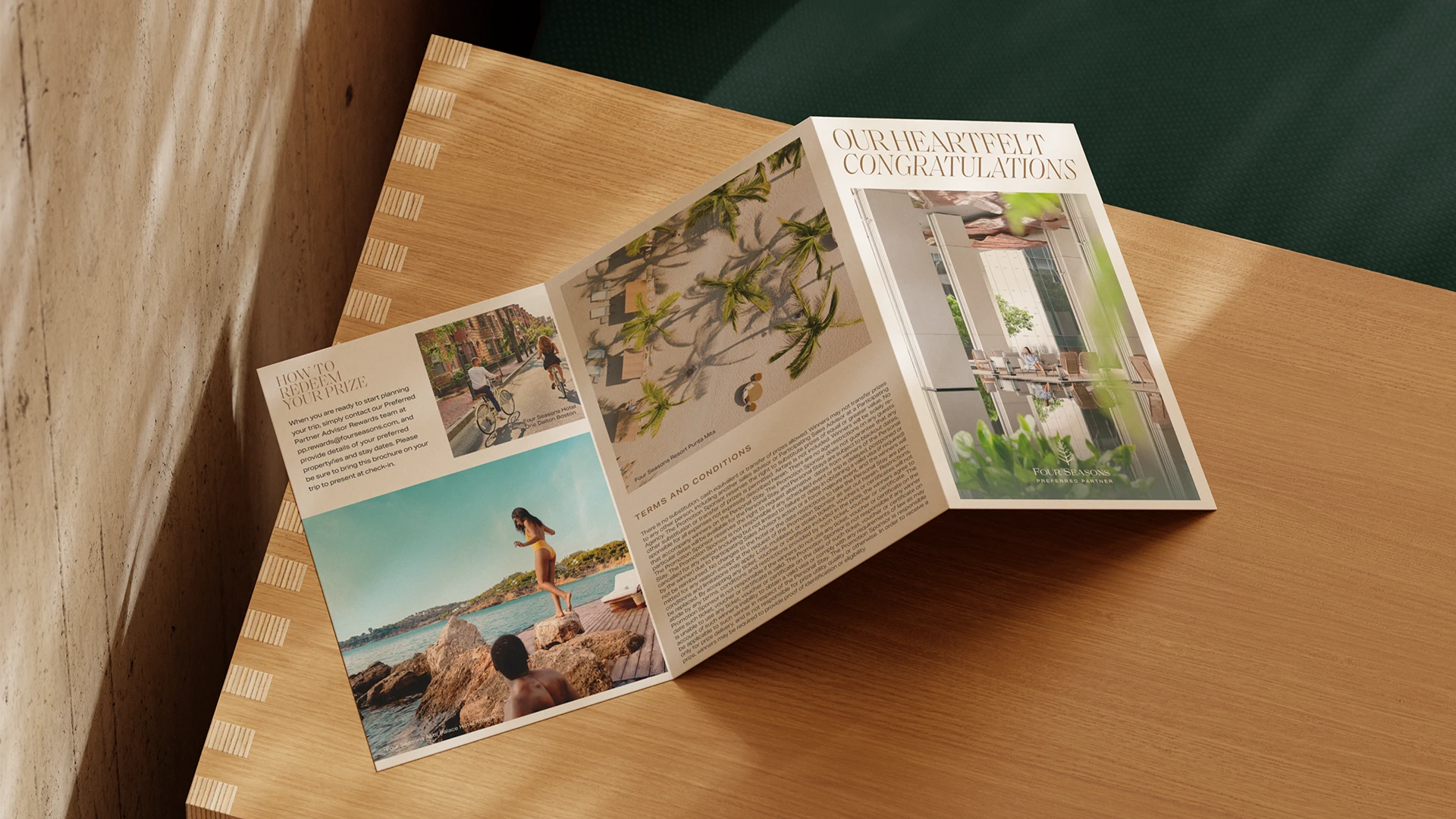


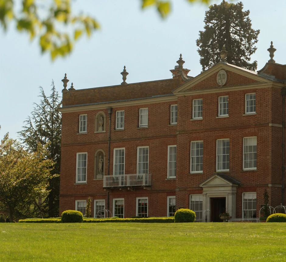


Four Seasons Hotel Hampshire
A historic English country estate expressed through brand storytelling that frames calm, craft, and timeless retreat.
Project Overview
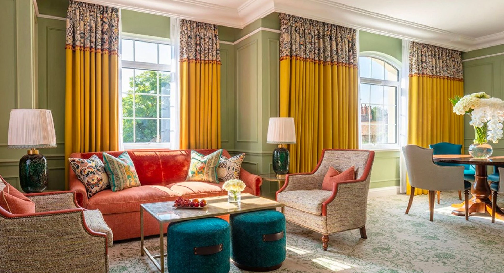
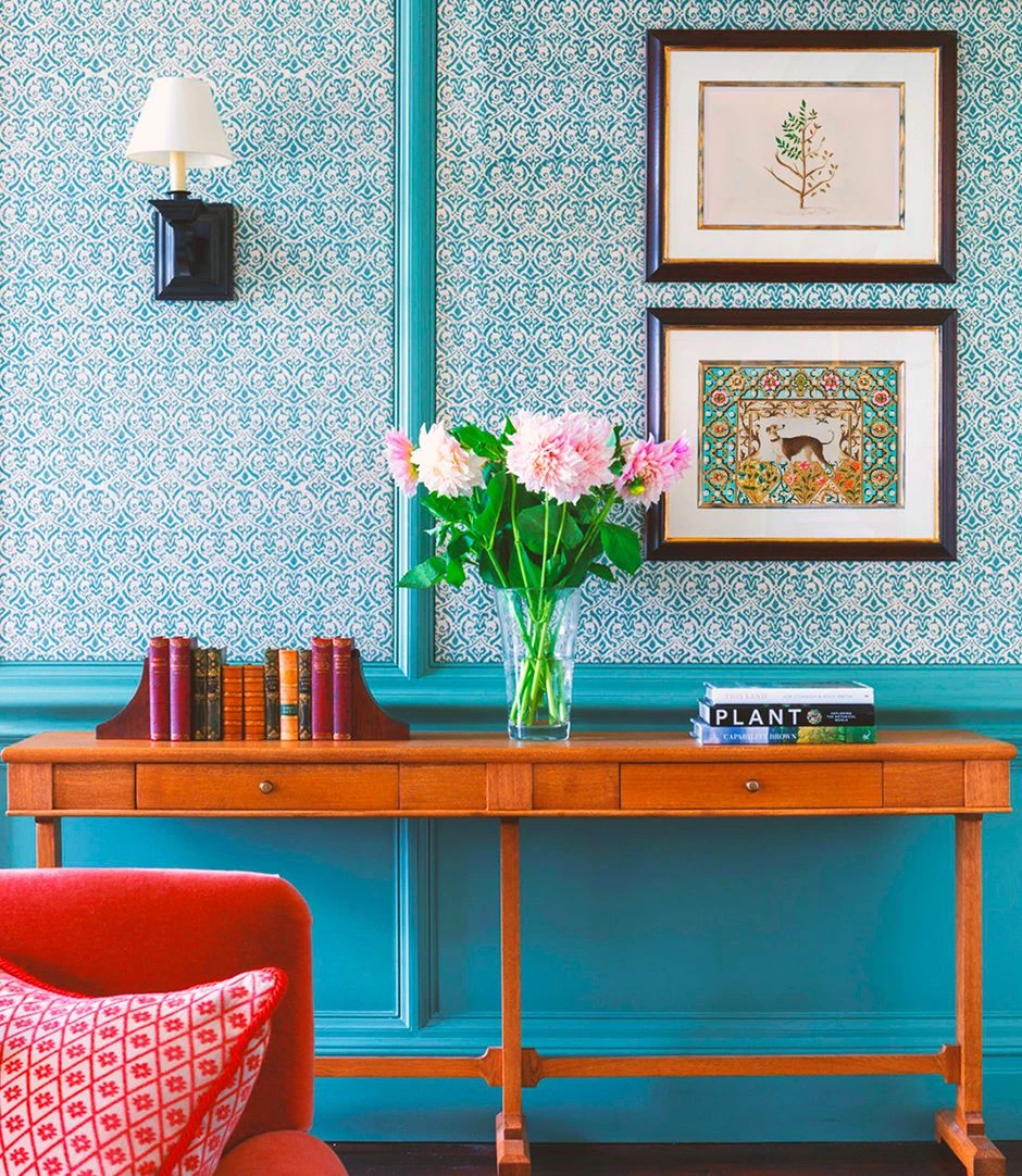
Following a guest room renovation that introduced nature-inspired textures and historical detail, the hotel sought to extend this vision across all guest-facing collateral. Our challenge was to craft a system that felt rooted in place. One that was reflective of the manor’s narrative, in harmony with interiors shaped by heritage and restraint, and entirely bespoke to the property. Every piece needed to weave the visual language of the estate into moments both subtle and seen.

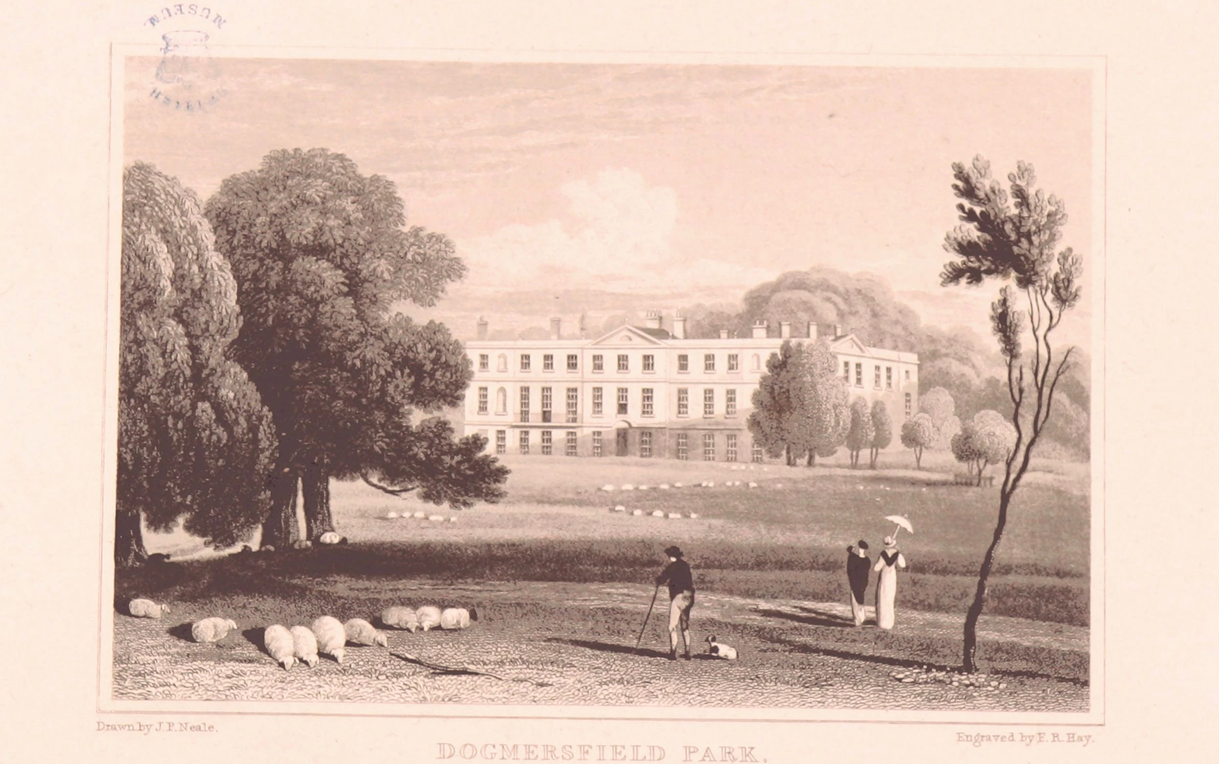
Beginning with research into the manor’s history and design sensibilities, our studio immersed ourselves in the textures of place. We studied the layered textures introduced by RPW Design—the botanical flourishes, the tonal toile, the sense of calm opulence—and built a visual world that would echo these cues. This foundation informed every line and illustrative flourish, grounding our work in authenticity and respect for the property’s storied character.

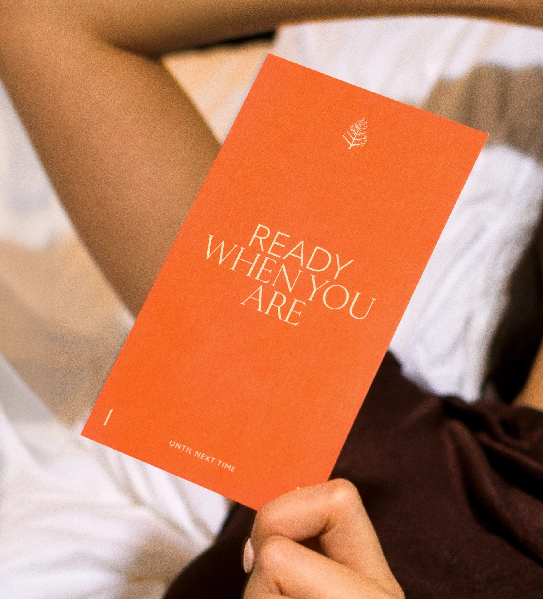
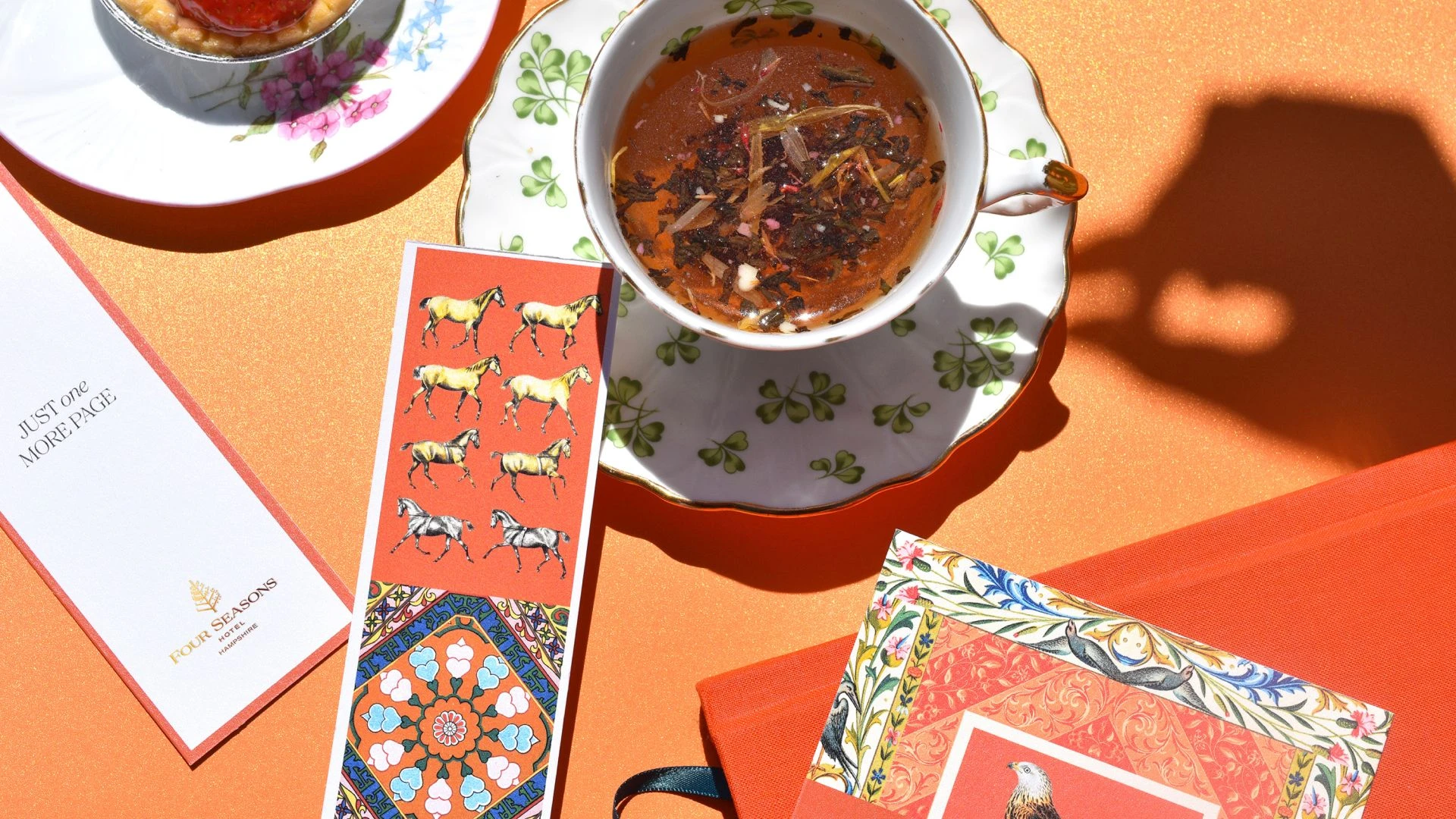
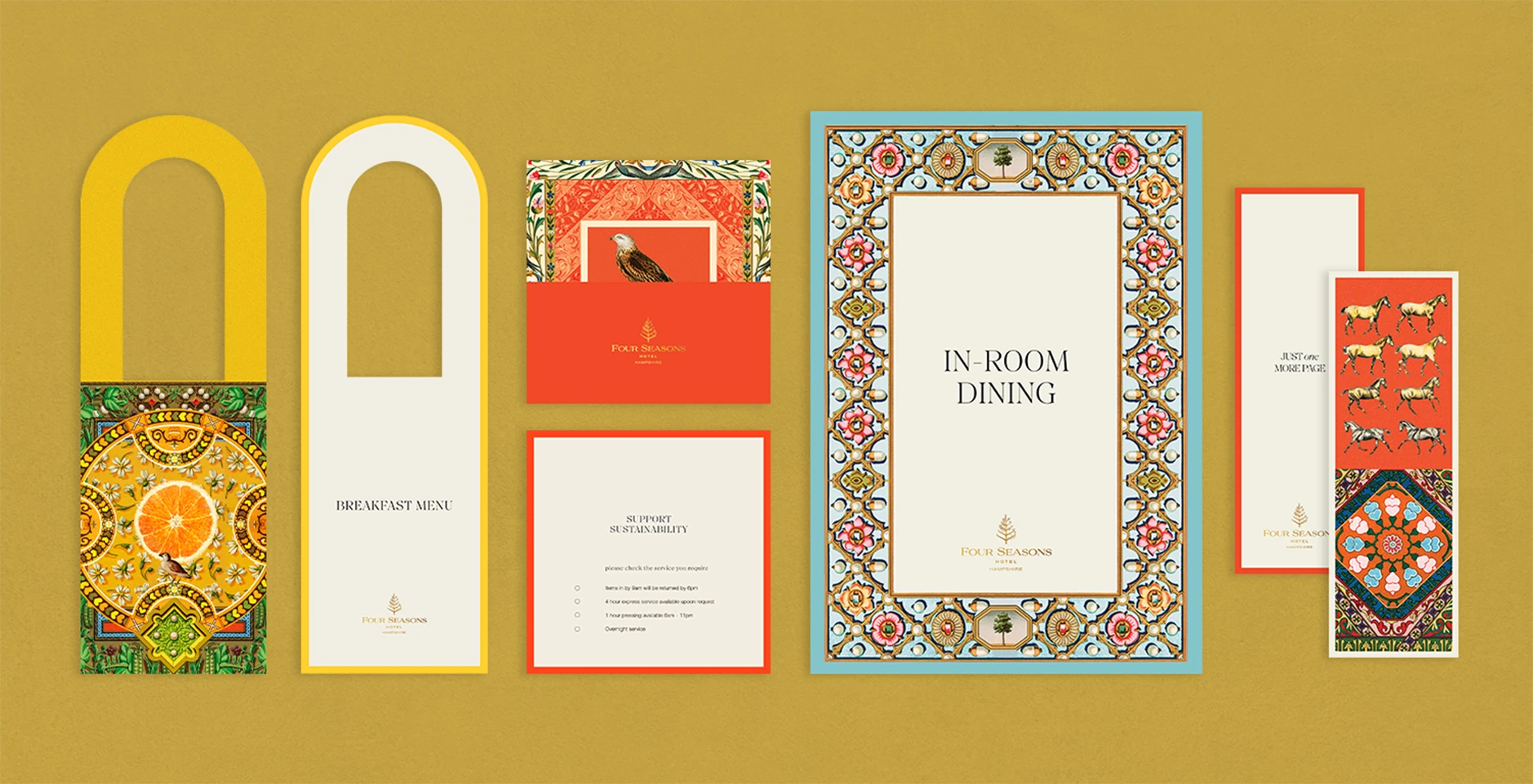
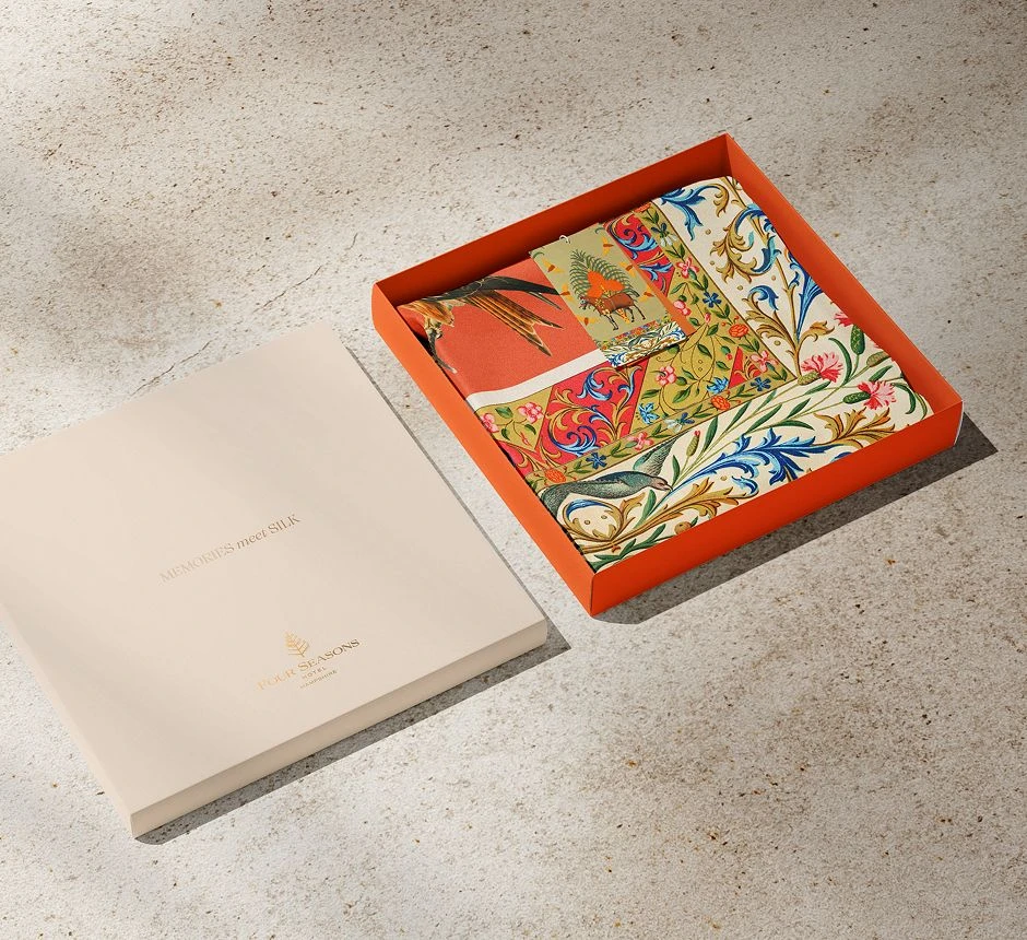
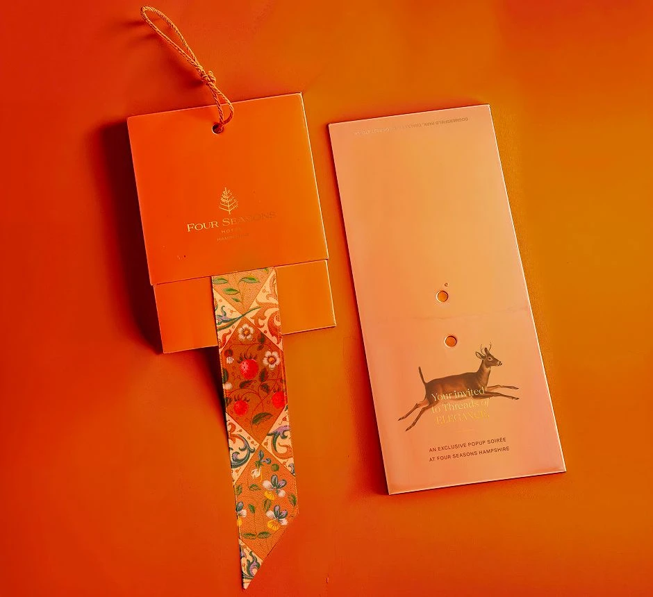
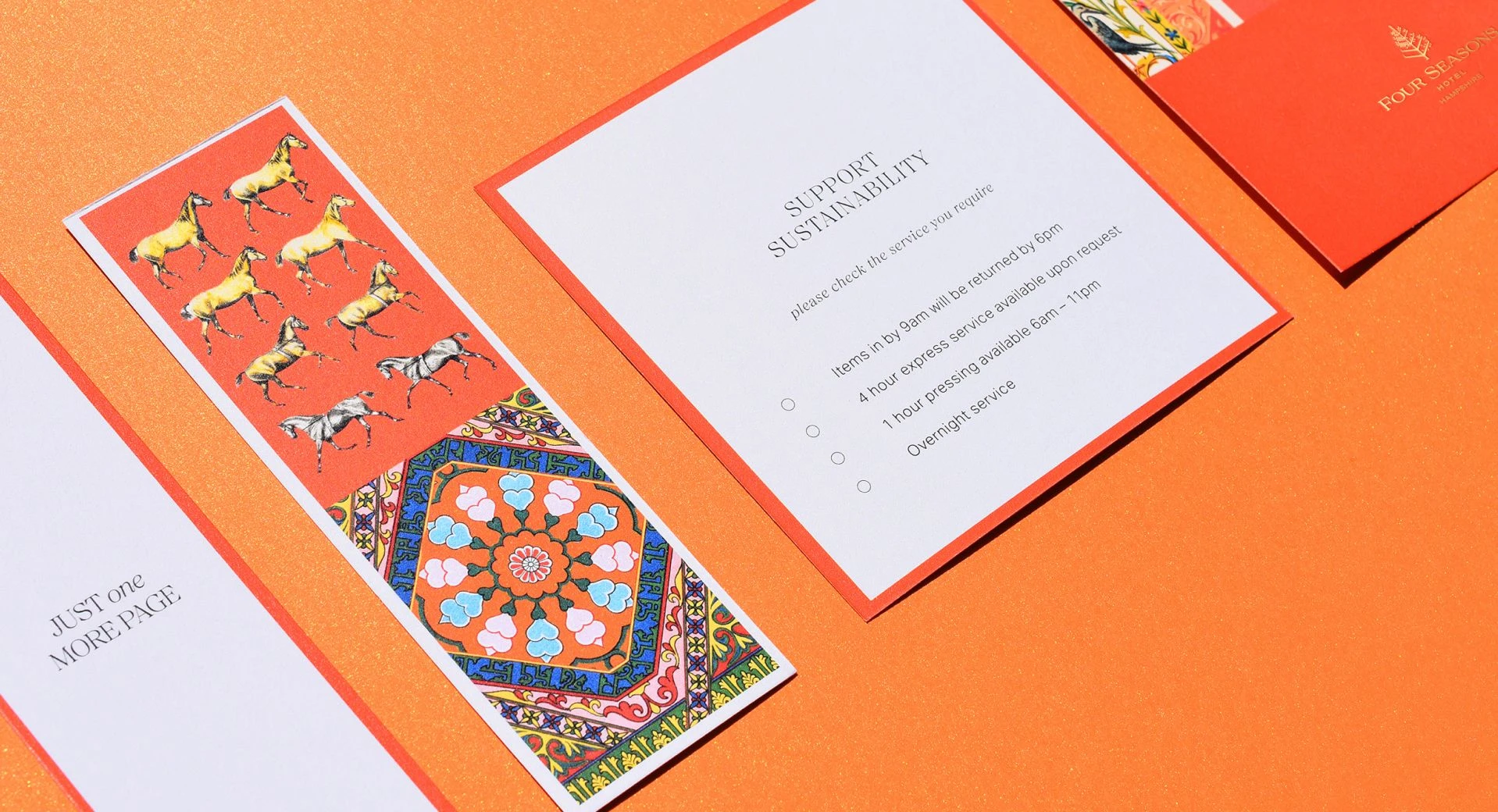
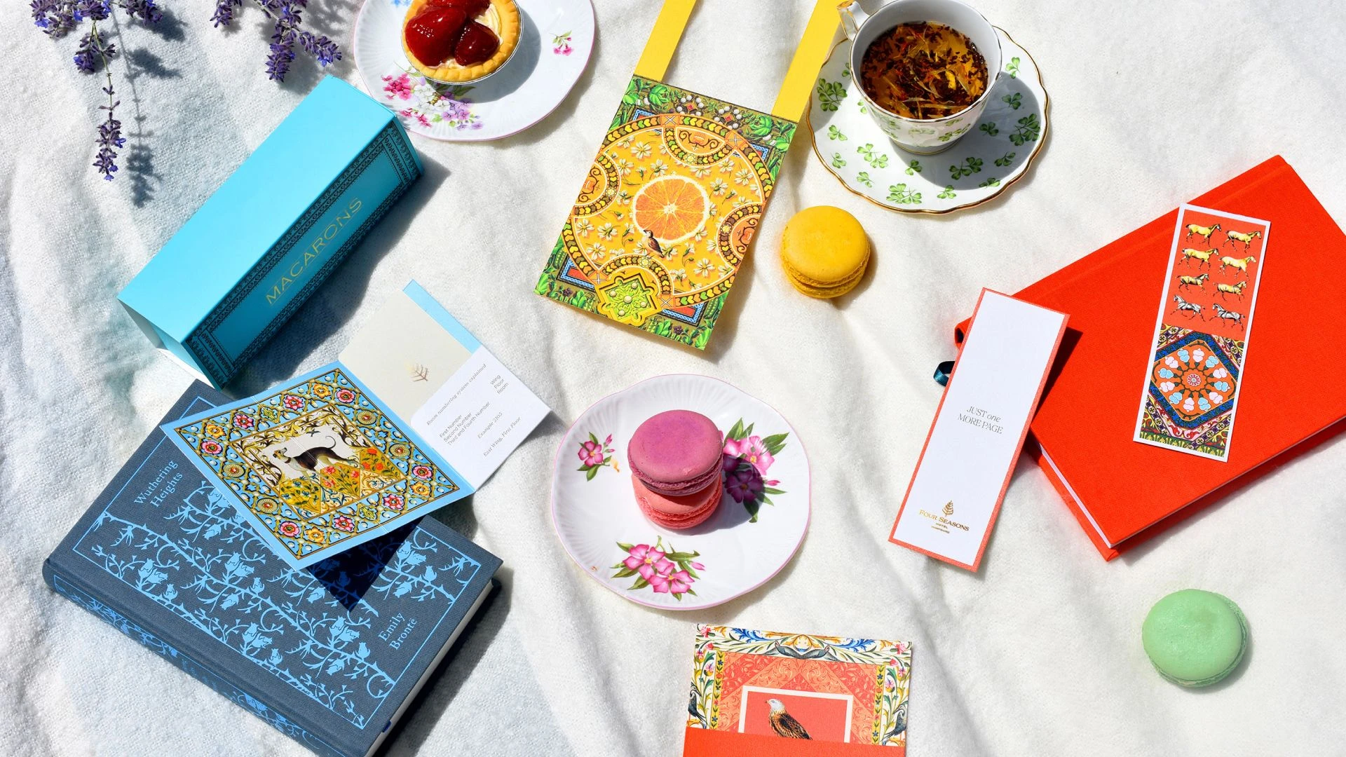
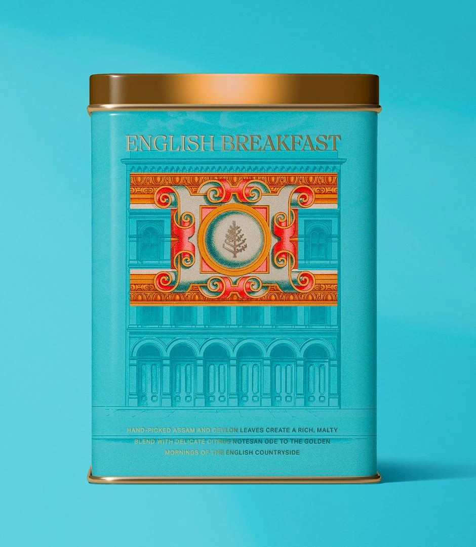
The heart of the design lies in balancing richly crafted illustration with graceful simplicity. Each piece of collateral carries a dual nature: one side detailed, alive with narrative; the other calm and composed.
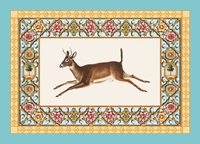
Woodland Creatures
Elegantly rendered animals drawn from the estate’s own habitat, offering glimpses into the life of the land.
English Motifs
Inspired by ornate Tudor textiles and period motifs, these frames add rhythm and richness to the composition.
Maximalist in spirit, the designs are reminiscent of twillys and tapestries.
The collateral now stands as a natural extension of the hotel’s interiors, carrying the story of the estate into every room and touchpoint. It holds the elegance expected of Four Seasons, with a visual language uniquely tailored to this property’s sense of place. A love story of English art, culture, and craftsmanship—held in paper, ink, and form.
Rooted in historical research and guided by restraint, the system brings together handcrafted illustration, bespoke borders, and contemporary typography to create a cohesive whole. Designed to do more than inform, each piece offers a sense of immersion, from arrival through every in-room detail.
At its heart, the work reflects a belief in the nuance of craft and how it’s placed. Maximalist detail, used with care, doesn’t always crowd; it can also add dimension and layers
Image Credits
Hotel photography and property images are © Four Seasons Hotels and Resorts. Used for illustrative purposes only. Four Seasons® is a registered trademark of Four Seasons Hotels Limited. This case study is not affiliated with, endorsed by, or sponsored by Four Seasons.