


Choosing Wisely Canada
A national healthcare advocacy organization in Canada advancing evidence-based care, shaped through strategic branding.
Project Overview
Following a completed brand strategy, Choosing Wisely Canada sought a partner to translate its vision into a distinct visual system. The challenge was to take what had been clearly articulated in words—values, tone, purpose—and turn it into something tangible. This called for a sharp distillation and bold restraint in the creation of a brand that could stand clearly on its own, yet move fluidly alongside the campaign work released.
The brand strategy revealed more than direction. It surfaced a dual point of view: Choosing Wisely Canada would speak as both educator and challenger. One grounded in clinical expertise and evidence. The other encouraging reflection, inviting physicians to reconsider, to act with intention, not convention. Not protocol.
Rather than reinventing, we worked to understand what had already been defined. The thinking was there. The tone was clear. The role of design was to bring it into form. The visual identity needed to hold both. What emerged was a system shaped by the guiding idea: to reduce overuse.
Choosing wisely canada would stand with dual intent: as an educator and a challenger
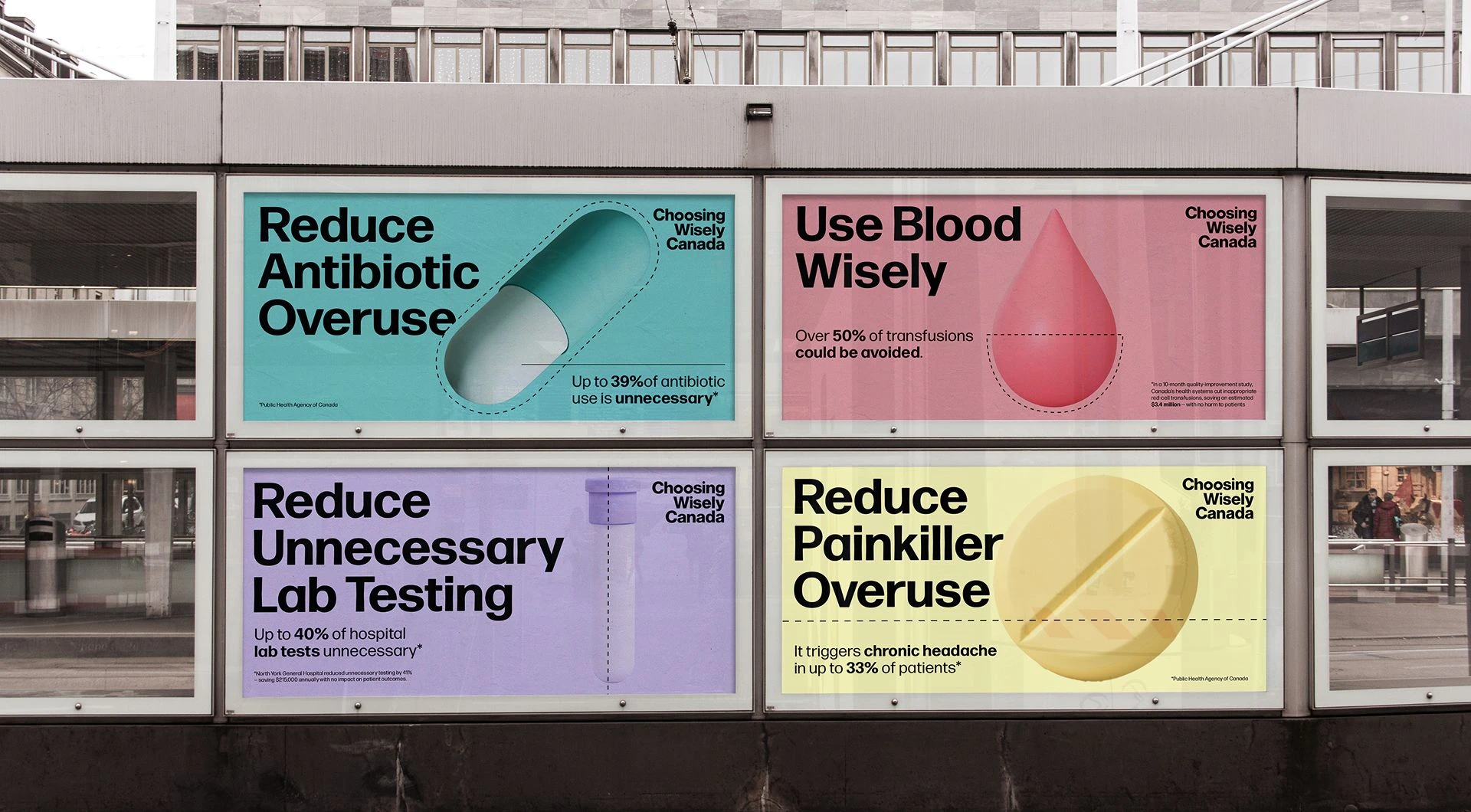
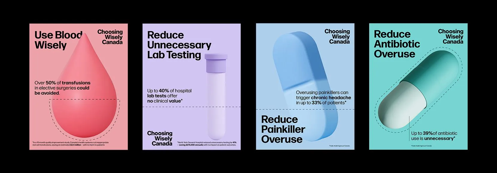
The Cut Line
A simple dash, used with restraint, became a recurring motif. A visual pause. A reminder to subtract, to hold back, to do less when less is right.
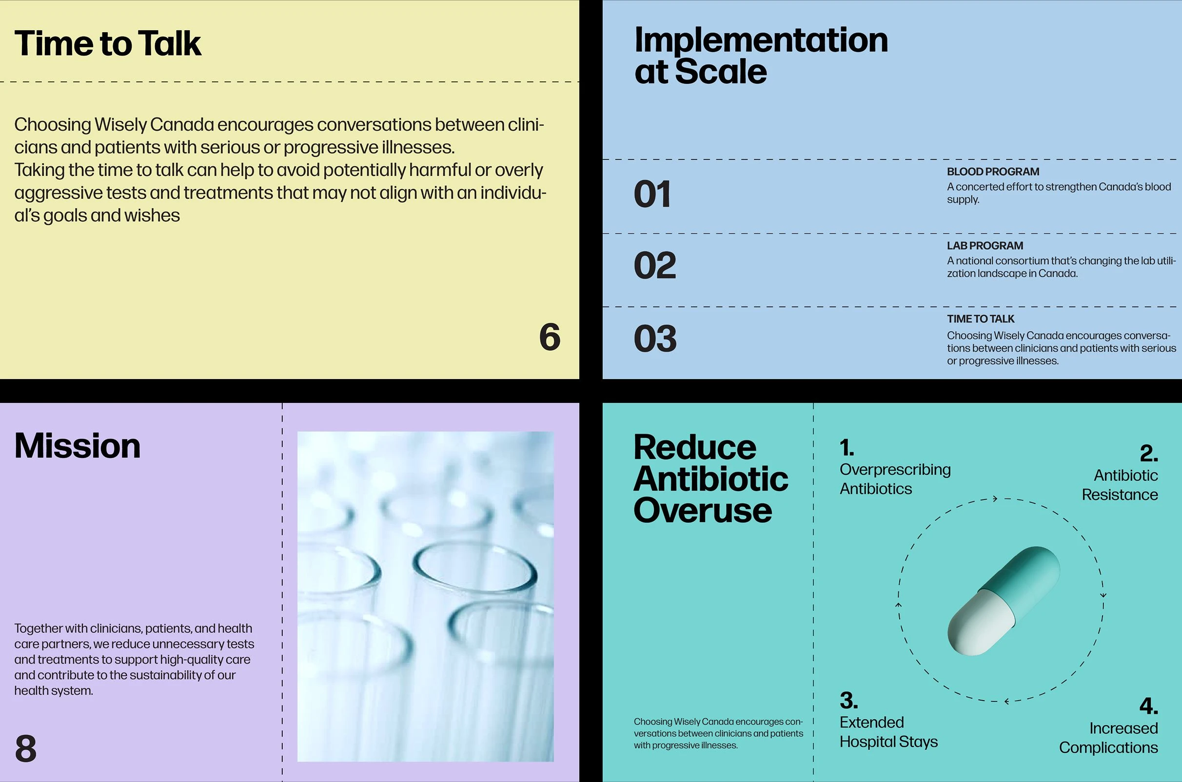
Medical Iconography
Pills, beakers, diagnostic tools formed a language that reflected the subject matter without leaning into the clinical.
Together, these elements created a branding system that is both bold and adaptable. Paired with a flexible grid, modern typography, and a refined colour palette, the brand identity supports a range of applications from editorial reports to campaign messaging to digital communications. Built with clarity and restraint, it stands apart in medical settings while allowing each campaign to carry its own tone, yet remain unmistakably part of the whole.
The result is a brand system that is minimal but stands out. Clear guidelines ensure consistency while giving the Choosing Wisely Canada team the tools to create, share, and evolve with confidence. Designed not just for rollout, but for the long run.